
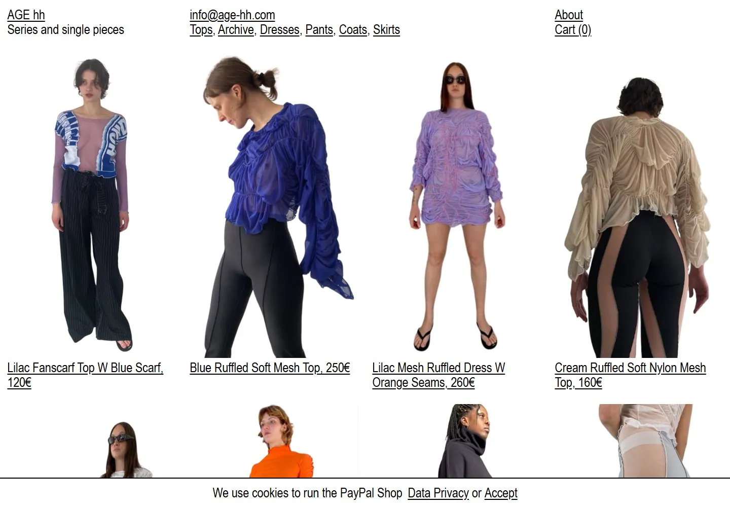
Live capture at 1440px, 2026-10-25
How it’s built
- Layout
- A white shop page displays cutout fashion figures in columns, underlined black product names and prices below, and compact black navigation at top.
- Type
- Small condensed black sans links and labels, mostly underlined.
- Color and surface
- White field with colorful garment cutouts and black text.
- Components
- Cutout figures line up in columns above underlined product labels on white.
What makes it work
- White field
- Cutout subjects or objects in columns
- Underlined product labels and prices
- Compact top navigation
On a new subjectFor a public ceramics collection, line up cutout vessels on white above underlined item labels and prices with compact top navigation.
Prompts
Measured
Fonts loadedarial_narrowregular
Body text25.92px
Page backgroundtransparent
Text color#000000
Page height1,000px
Computed CSS at 1440px, 2026-10-25.
Live behavior
- Today
- The desktop view shows a white fashion-shop catalog with a compact three-part top area: AGE hh and descriptor at left, email and category links near center, About and Cart at right. Four large isolated garment photographs form the first product row, with underlined names/prices. A fixed cookie-consent strip spans the bottom of the desktop and tablet images. On phone the text-first header stacks at the top, one product image occupies most of the screen, and the consent strip covers the bottom.
- Responsive
- Desktop 1440px lays out four product images in a row; tablet 768px shows one large product image in the captured viewport. At 390px the first product becomes a single large image, with identity, about/cart and category links stacked above. The cookie strip remains full-width and wraps to two lines on phone. Captures do not establish further catalog rows or responsive thresholds.
- Scroll
- The desktop-scroll screenshot remains at actual scrollY0 according to its raw measurement. It provides no evidence about lower catalog rows or sticky navigation.


