
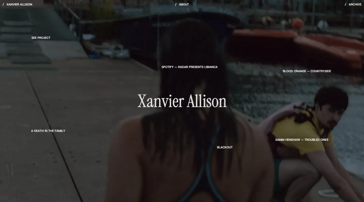
Screenshot from Minimal Gallery, saved 2026-10-24
How it’s built
- Layout
- Dark full-screen photograph with tiny navigation across the top, centered white serif name and small project labels scattered around it.
- Type
- Large narrow serif name contrasts with tiny uppercase sans labels.
- Color and surface
- Dark blue-black photograph with white type and muted yellow clothing.
- Components
- Top navigation, central name and distributed project labels.
What makes it work
- Centered serif name and scattered small labels over a dark image.
On a new subjectFor a public oral-history collection, place a centered serif title and scattered episode labels over a dark photograph.
Live behavior
- Today
- The capture log reports HTTP 403, yet saved screenshots show Xanvier Allison branded states rather than a conventional error page. Desktop t0/t2 show a centered serif name on a nearly black warm field; the scroll-labeled frame shows a monochrome full-screen image with centered name, scattered project labels and a small top navigation. Tablet and ordinary phone show the latter composition with different image crops. The gallery reference separately shows a similar composition over a color scene.
- Responsive
- Desktop, tablet and phone documents match their 1440×1000, 768×1024 and 390×844 viewports, respectively, with y=0. The top brand shortens to XA in narrow screenshots. Different scene and loading phases mean layout differences cannot be attributed solely to viewport width.
- Scroll
- The desktop-scroll-labeled state remains at y=0 with a viewport-height document. It shows a different visual phase rather than an evidenced lower scroll position.


