
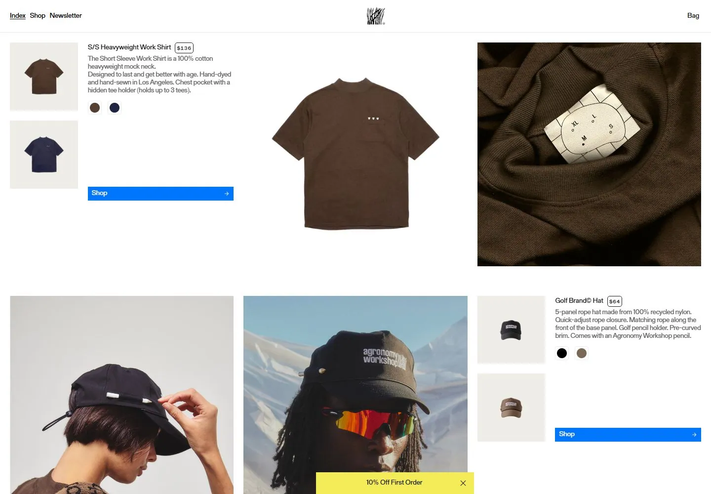
Live capture at 1440px, 2026-10-24
How it’s built
- Layout
- A shallow white header sits above an asymmetrical product catalog: two small thumbnails and a compact text block at left, a tall central model photograph and a broad right detail photograph. Further product rows enter below.
- Type
- Small plain black sans navigation/product copy, tiny outlined price capsules and modest link labels.
- Color and surface
- White ground, black/gray type, neutral beige/brown/navy product imagery and one flat bright-blue rectangular shop bar.
- Components
- Centered small graphic identity, edge links, stacked thumbnails, price chip, swatches, blue shop bar, large model/detail images and lower catalog row.
What makes it work
- A dense square-corner catalog pairing small functional product information with oversized unequal model/detail photographs on white.
On a new subjectFor a mineral teaching collection, pair small specimen thumbnails and compact identification text with oversized unequal whole-specimen and detail photographs, using a single blue request bar.
Measured
Fonts loadedGerstner Programm FSL Regular, ABC Marfa Mono Unlicensed Trial Regular, OT Neue Montreal Medium Semi Squeezed
Body text12px
Page background#ffffff
Text color#000000
Page height8,143px
Computed CSS at 1440px, 2026-10-24.
Live behavior
- Today
- Agronomy Work’s captured shop uses a white canvas, small centered mark and compact Index/Shop/Newsletter links with Bag at the upper right. Large product and lifestyle photographs sit beside product name, price, fabric description, color swatches and a blue Shop action. A yellow “10% Off First Order” strip overlays the lower edge of several frames. The selected gallery reference shows a distinct model photograph and related product-detail layout.
- Responsive
- Desktop is 1440×1000 with an 8143px document; tablet is 768×1024 with a 9218px document; ordinary and reduced-motion phones are 390×844 with 6213px documents. The desktop uses a multi-column product layout, while tablet and phone show a large product image above thumbnails and product details. The discount strip remains visible in sampled frames. These widths do not establish breakpoints.
- Scroll
- The desktop-scroll state records actual scrollY=750 in an 8143px document and shows later product imagery and details, including Golf Brand© Hat and Tree Hat content. The yellow discount strip is visible along the bottom. This describes the saved position only.


