
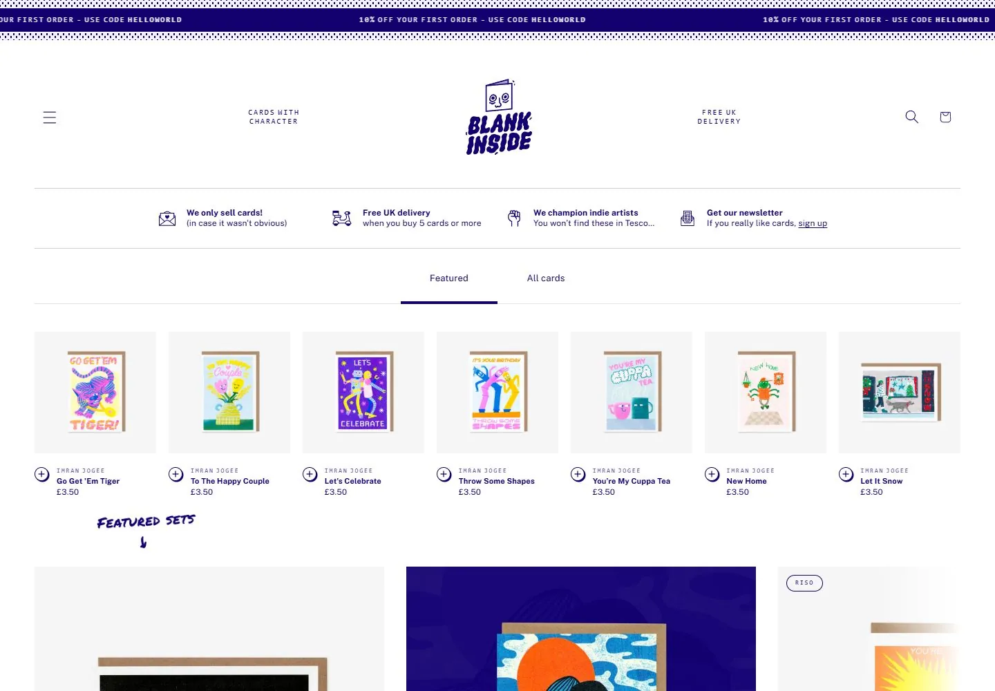
Live capture at 1440px, 2026-10-24
How it’s built
- Layout
- White field with dark purple ink; patterned announcement strip, centered illustrated identity, widely spaced utility icons/benefits, broad product photographs below.
- Type
- Compact dark-purple sans utility copy, tiny tracked uppercase labels and an expressive illustrated identity; product lettering belongs to the images.
- Color and surface
- White field, dark-purple ink, dotted borders, fine light rules and saturated illustration colors within product photographs.
- Components
- Patterned announcement strip, centered identity, spaced utility icons, four compact benefit groups and large product images.
What makes it work
- Ink-like purple utilities and illustrated identity within an airy white retail frame above colorful product photography.
On a new subjectFor a seed-library catalog, use purple line icons and an illustrated identity over a generous white header, then broad colorful specimen-pack photographs.
Measured
Fonts loadedPublic Sans
H223.5px / 500 / -0.235px
Body text12px
Page background#ffffff
Text color#130071
Page height8,724px
Computed CSS at 1440px, 2026-10-24.
Live behavior
- Today
- The shop opens with a narrow purple discount ticker, a wide white header with a centered illustrated Blank Inside mark, and a thin benefits row with small line icons. “Featured” and “All cards” tabs sit above a horizontal run of square-backed greeting-card product tiles, each with maker, title, and £3.50 price. A hand-drawn “Featured sets” label introduces larger card artwork below. At scrollY 750, the viewport is centered on large featured card images and a rounded purple “Browse sets” button. Tablet and phone keep the ticker, compact centered mark, tabs, and horizontally clipped product strips.
- Responsive
- Desktop measures 1440×1000 with document height 8724px; tablet is 768×1024 with 11692px document height; phone is 390×844 with 9175px document height (9160px on the separate reduced-motion load). Captured text samples report Public Sans Thin and Consolas; “Featured” has a measured 16.9px line height. Product imagery and cards remain in horizontal rows at tablet and phone widths, with adjacent cards partly outside the phone viewport. These captures do not establish breakpoints.
- Scroll
- The desktop-scroll screenshot is bound to actual scrollY 750 in an 8724px document. The visible section shows large card-set art, small maker/title/price labels, and the centered “Browse sets” button. It documents that captured position only and does not establish sticky behavior or how the page was scrolled.


