
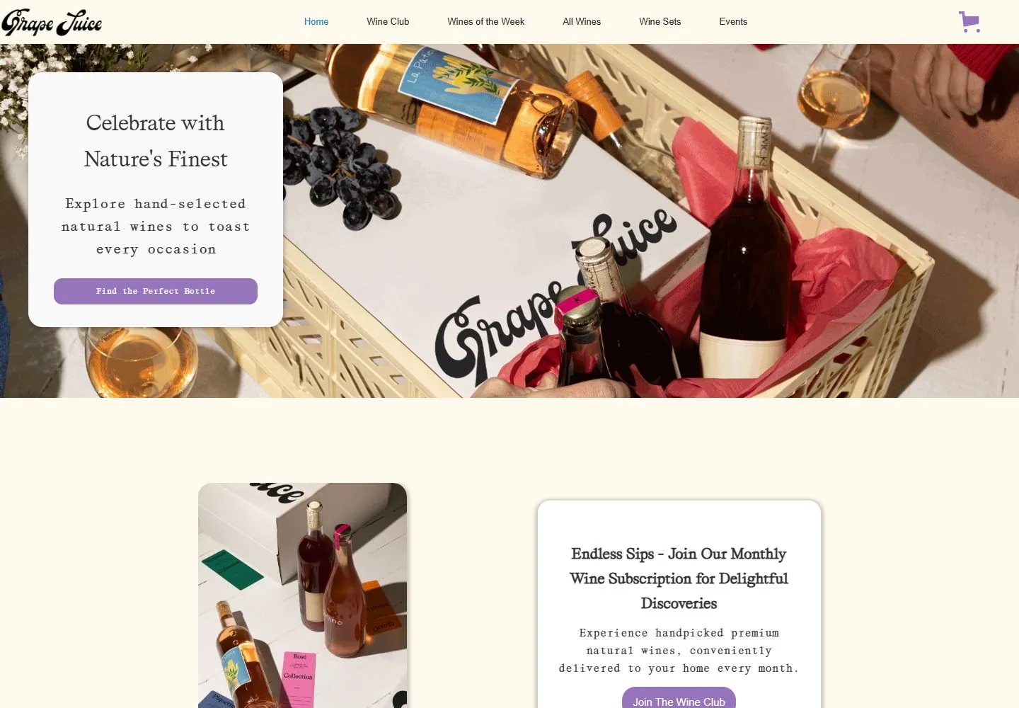
Live capture at 1440px, 2026-10-24
How it’s built
- Layout
- White page has a huge black flowing script identity between thin rules, traditional serif header and subtitle, with a photograph beginning below.
- Type
- Oversized thick flowing italic script with elaborate loops; smaller black upright serif header and subtitle.
- Color and surface
- White field, black type and warm image colors below.
- Components
- Ruled header, giant script identity, serif subtitle and image edge.
What makes it work
- Huge black looping script
- thin rules
- upright serif header and subtitle
- image below
On a new subjectFor a public garden club, use a huge black looping script identity between thin rules, upright serif header and subtitle, with a garden image below.
Measured
Fonts loadedAffairs mono, Affairs, Lato
H129.952px / 400
Body text18.72px
Page background#fffaed
Text color#333333
Page height2,815px
Computed CSS at 1440px, 2026-10-24.
Live behavior
- Today
- An edge-to-edge overhead wine hamper photograph fills the hero beneath a slim navigation bar. A rounded light copy panel with serif heading, short monospace supporting line, and lavender CTA sits at left. Lower cream space leads to a bottle image and subscription panel. t0/t2 are visually the same; hover underlines Home. At y=750 a community signup form over bottle photography appears. Tablet condenses navigation and keeps the panel left; mobile places the panel centrally.
- Responsive
- 1440x1000 shows full horizontal navigation and left-overlay card; 768x1024 centers the logo/hamburger/cart and keeps a smaller left-positioned copy card over the image; 390x844 similarly condenses nav and places a larger centered card over the photograph, with the next product section beginning below. The tablet document is 900px wide at a 768px viewport; document heights are 2815, 3012, and 4936 CSS px.
- Scroll
- At scrollY=750, lower content shows the wine subscription message/button and a community email signup section over bottle imagery.


