
Gallery screenshot, saved 2026-10-24
How it’s built
- Layout
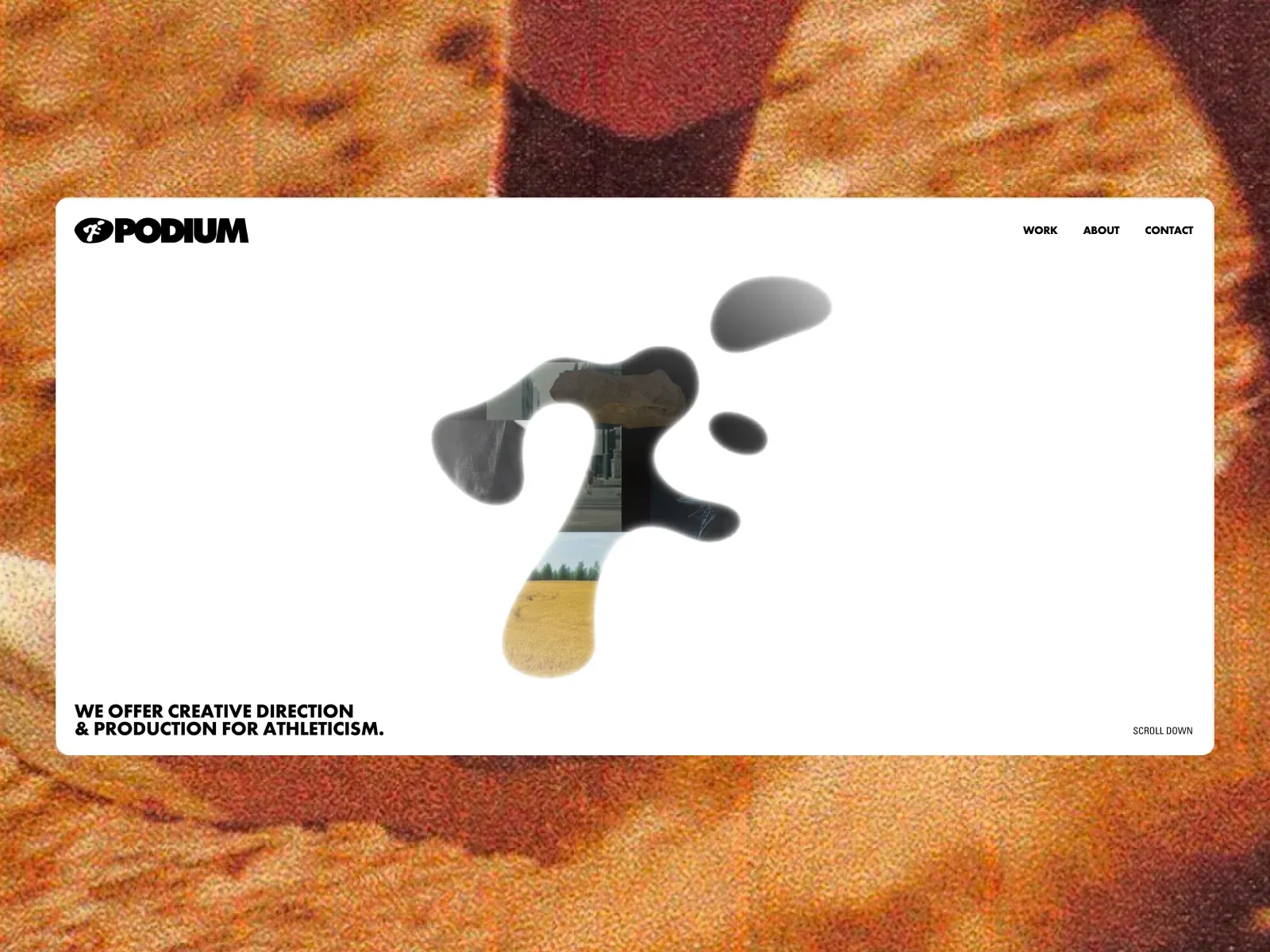
- A large white rounded page sits over a warm, textured photographic surround. A soft-edged central black form contains image fragments; the PODIUM mark and work/about/contact navigation sit along the top. A bold two-line offer anchors lower-left, with a small scroll cue lower-right. Outer surround is gallery framing.
- Type
- Heavy black uppercase sans offer; bold compact wordmark and small uppercase navigation. Exact typeface and metrics are unknown.
- Color and surface
- White page and black central organic form contrast with the grainy orange/rust exterior; cropped image colors appear inside the central shape.
- Components
- Rounded white page, top identity/navigation, central irregular image-bearing silhouette, lower-corner statement and scroll cue.
What makes it work
- Open light page field
- Central irregular image-bearing silhouette
- Bold lower-left service statement
- Compact top identity/navigation
On a new subjectFor a municipal water-quality service, place original watershed or lab images inside one irregular central shape on a light bounded page, keep service identity/nav compact above, and anchor a plain-language water-safety statement at lower left. Replace the source agency content and omit the gallery surround.
Live behavior
- Today
- The Oct 29 live screenshots show a nearly white, viewport-filling portfolio landing scene. A large irregular dark form dominates the center, with small photographic scenes appearing within parts of its silhouette and separate dark shapes nearby. Compact black PODIUM identity and navigation sit along the top edge. At the lower left, heavy two-line copy reads “WE OFFER CREATIVE DIRECTION & PRODUCTION FOR ATHLETICISM.”; “SCROLL DOWN” sits at the lower right. In the desktop scroll capture, measured at actual scrollY 750, the dark form and inset media are dramatically enlarged and cropped across the viewport, while a navigation fragment remains at the top. These are sampled views; the captures do not establish the transition mechanism.
- Responsive
- At 1440x1000, the dark media-bearing form is centered within broad white negative space; identity/navigation align to the top edge and the statement sits near the bottom. At 768x1024, the form fills more of the available height and the same edge-anchored content remains visible; the measured document is 769x6989 CSS px, one pixel wider than the viewport. At 390x844, the form is smaller and centered vertically, while PODIUM and MENU occupy the top edge and the statement wraps into multiple lines near the bottom. The reduced-motion mobile frame is a separate load and differs visually. These three widths do not define a complete breakpoint system.
- Scroll
- The desktop-scroll capture records actual scrollY 750 with a 1440x1000 viewport and a 1440x7187 document. It shows a close, cropped view of the central dark form and inset media, with the content changing position and scale relative to the viewport. This single sampled position does not establish a full scroll sequence or the cause of the visual change.


