
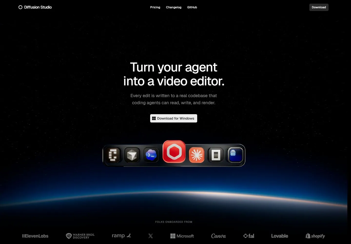
Live capture at 1440px, 2026-10-24
How it’s built
- Layout
- White sparse header; small red eyebrow, large regular black two-line left title, gray support and black pill; broad pale editor-interface illustration begins below.
- Type
- Large regular black sans two-line introduction, small red uppercase eyebrow, gray supporting copy and tiny header links.
- Color and surface
- White page, black type and primary pill, pale gray nested interface illustration with muted colorful media inside.
- Components
- Slim header, left eyebrow/title/support/action and broad editor-interface preview below.
What makes it work
- Sparse left introduction and black pill above a broad pale interface preview on white.
On a new subjectFor a public map archive, use a sparse left introduction and black browse pill above a broad pale map-reader interface illustration.
Prompts
Create a visual direction for {{website_name}} in {{industry}} for {{audience}}, shaping {{content}} and supporting {{functionality}}.
COMPOSITION INVARIANTS: Center a short product statement and support copy on a deep dark field, followed by one clear action. Anchor the lower composition with a single horizontal dock of repeated product marks above a quiet horizon or footer band. Preserve the observed visual hierarchy and spacing relationships, not the source-specific object inventory.
TYPE: Use centered white sans display text, smaller muted support copy, and tiny navigation. Keep the button readable; repeated marks should not compete with the headline. Set a readable scale step between display text, supporting copy, captions, and utilities. Do not name a font family.
SURFACE AND COMPONENTS: Use near-black surfaces with a restrained deep-blue lower glow and a small set of vivid mark colors. Keep partner/footer content muted and secondary. Component roles: Compact top identity/nav, centered headline and description, download or primary action, one horizontal icon dock, and subdued footer proof. Keep controls visually distinct and subordinate to the main content.
IMAGE DIRECTION: The dock should contain original subject-relevant product/service symbols; match its visual weight and repeated rhythm without copying the pictured icons. Proportion estimate from the selected still: Visual estimate: headline/copy occupy central fifth of height; icons span about 40% width near lower middle; partner row runs near full width. Treat it as an estimate, not fixed CSS geometry.
VARIABLES: Adapt names, details, image subjects, palette accents, and working actions to {{website_name}}, {{industry}}, {{audience}}, {{content}}, and {{functionality}}.
PROHIBITIONS: Use original copy and assets. Do not reproduce the source brand, exact wording, photographs, illustrations, products, people, or signature artwork; source-specific objects and motifs are optional only when they genuinely fit the new subject.
CONTINUATION: Follow with a useful product explanation; keep dark negative space and the horizontal dock as a one-time anchor rather than repeating it in every section.
RESPONSIVE PROPOSAL: Wrap or horizontally scroll the icon dock accessibly below the action; keep headline measure short and move footer marks below the first screen. These are design proposals, not observed mobile behavior. The selected still does not establish source fonts, CSS, implementation technology, motion, or control behavior. Do not present any of those as observed. Implement requested {{functionality}} as working new behavior without implying source validation.
Implement a responsive page for {{website_name}} in {{industry}} for {{audience}}, presenting {{content}} and working {{functionality}}.
INVARIANTS: Center a short product statement and support copy on a deep dark field, followed by one clear action. Anchor the lower composition with a single horizontal dock of repeated product marks above a quiet horizon or footer band. Keep the same relative prominence and spacing without requiring the same source objects.
TYPE AND SURFACES: Use centered white sans display text, smaller muted support copy, and tiny navigation. Keep the button readable; repeated marks should not compete with the headline. Use near-black surfaces with a restrained deep-blue lower glow and a small set of vivid mark colors. Keep partner/footer content muted and secondary. Maintain clear display/body/utility scale, readable line lengths, and sufficient contrast. Components: Compact top identity/nav, centered headline and description, download or primary action, one horizontal icon dock, and subdued footer proof.
IMAGERY AND SCALE: The dock should contain original subject-relevant product/service symbols; match its visual weight and repeated rhythm without copying the pictured icons. Visual estimate only: Visual estimate: headline/copy occupy central fifth of height; icons span about 40% width near lower middle; partner row runs near full width. Use flexible widths and content-led dimensions; do not copy this screenshot's coordinates as fixed values.
VARIABLES: Adapt names, details, image subjects, palette accents, and working actions to {{website_name}}, {{industry}}, {{audience}}, {{content}}, and {{functionality}}.
PROHIBITIONS: Use original copy and assets. Do not reproduce the source brand, exact wording, photographs, illustrations, products, people, or signature artwork; source-specific objects and motifs are optional only when they genuinely fit the new subject.
CONTINUATION: Follow with a useful product explanation; keep dark negative space and the horizontal dock as a one-time anchor rather than repeating it in every section.
RESPONSIVE PROPOSAL: Wrap or horizontally scroll the icon dock accessibly below the action; keep headline measure short and move footer marks below the first screen. Use semantic content, keyboard-operable controls, visible focus, meaningful alt text, and no clipped content. The selected still does not establish source fonts, CSS, implementation technology, motion, or control behavior. Do not present any of those as observed. Implement requested {{functionality}} as working new behavior without implying source validation.
Measured
Fonts loadedGeist Variable-0cf583679a4981ad, Geist Mono Variable-7d878cbffeba6d60, Geist Mono Variable-7d878cbffeba6d60 fallback: Courier New
H152px / 470 / -1.3px
Body text16px
Page backgroundoklch(0 0 0)
Text coloroklch(1 0 0)
Page height9,808px
Computed CSS at 1440px, 2026-10-24.
Live behavior
- Today
- Current desktop capture is a black product-marketing page with a compact top bar, centered two-line white proposition, short gray support copy and a Windows download action. A horizontal row of large rounded software icons sits beneath it over a subtle starfield and blue horizon glow; a customer-logo row is visible near the bottom. Tablet/mobile collapse navigation to a menu and stack the hero, download control, icon row and customer marks vertically. The mobile layout shows fewer/wrapped customer logos than desktop. Desktop-scroll at scrollY=750 shows the customer row followed by a two-column product statement/actions and a large editor-interface image.
- Responsive
- Captured at 1440×1000, 768×1024, and 390×844. Desktop has centered hero over a wide field and horizontal client logos; tablet/mobile use a compact menu, narrower centered headline, smaller icon strip and vertically wrapped client logos. Only the sampled sizes are described.
- Scroll
- Desktop-scroll is a successful capture at scrollY=750 in a 1440×1000 viewport. It reveals the customer/logo row, then a two-column 'Professional video editor built for agents' statement and support/actions above a large editor-interface image. The sampled document height is 9808px. No download or navigation action was activated.


