
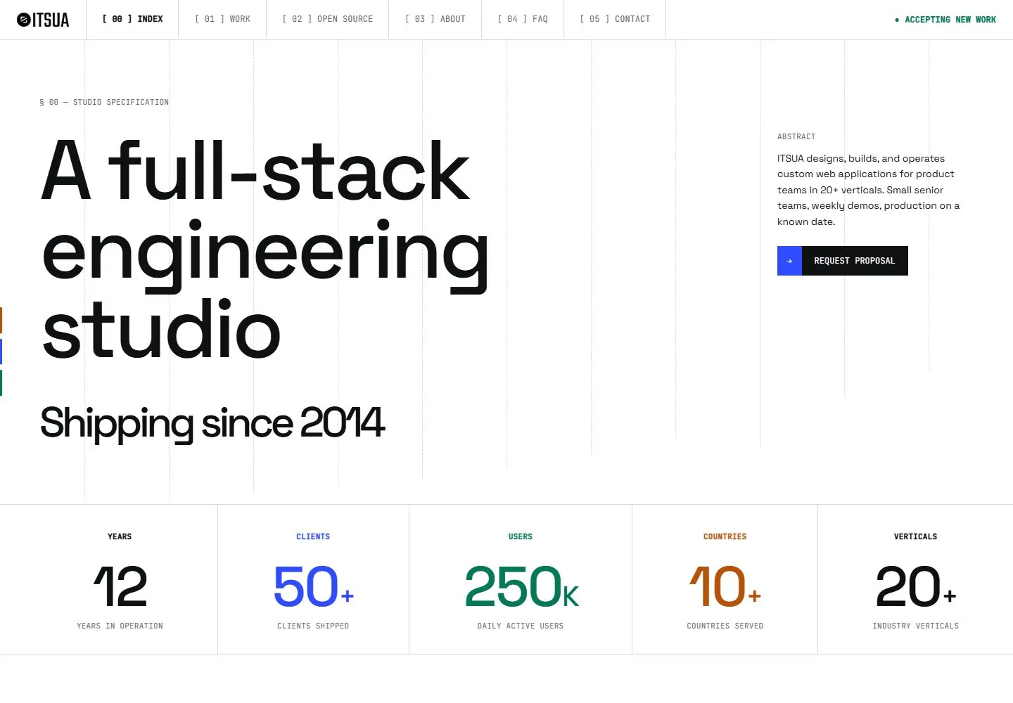
Live capture at 1440px, 2026-10-24
How it’s built
- Layout
- A white engineering portfolio has segmented numbered navigation and availability status. The opening balances a huge left-aligned multi-line sans statement with a narrow right paragraph and dark action; fine vertical grid lines run down the page. A five-column metric band follows, then a numbered section and ruled multi-column table.
- Type
- Very large clean sans statement; compact monospaced-looking uppercase nav/section labels; large numerals with tiny captions; regular sans body. Exact font and metrics unknown.
- Color and surface
- White page, black type, pale-gray grid/dividers and small blue/green/orange/purple metric accents.
- Components
- Numbered navigation/status, large intro, right-side abstract/action, five-column metrics, numbered section and structured table.
What makes it work
- White field with fine grid/dividers
- Compact numbered navigation and section labels
- Oversized left proposition balanced by concise side copy/action
- Ruled numeric summary and numbered sections
On a new subjectFor a public-health nonprofit, build a white fine-grid page with compact numbered navigation, a large health-access promise, concise side explanation/action, a ruled row of sourced service metrics and numbered program sections. Replace engineering content and verify every statistic.
Measured
Fonts loadedJetBrains Mono, Space Grotesk
H1120px / 500 / -4.8px
Body text16px
Page background#ffffff
Text color#0e1012
Page height5,681px
Computed CSS at 1440px, 2026-10-24.
Live behavior
- Today
- White specification-sheet composition with a thin ruled navigation strip, numbered monospaced labels, huge tightly spaced black geometric sans statement and a narrow abstract column/action at right. Faint dashed vertical guides run through the hero. A bordered metric strip uses black, blue, green and rust numerals. The next section is a thin-rule table with small tinted highlights and pale category cells, preceded by a slash-prefixed heading.
- Responsive
- Desktop hero has936px and312px tracks with80px gap; tablet stacks to656px with40px gap and phone342px with40px gap. Primary title local size120px/112.8px desktop,96px/90.24px tablet and48px/45.12px phone, weight500/tracking-0.04em. The Shipping since2014 child is separately60px desktop and24px phone; it must not inherit parent120/48px. Header changes from one57px row to identity/status above a second tab row. Phone tabs overflow horizontally with a visible bar, but horizontal scrolling was not exercised. Phone metrics remain in one compact row with32px values; suffixes are16px, not32px.
- Scroll
- At actual scrollY750 the57px navigation remains at top over partially clipped metric numerals. A /start heading72px/72px leads to a detailed ruled table. Table grid columns measure477.469px,409.266px,409.266px and30px for the final arrow track. Rows mix13px sans content with11px mono labels, pale pink/blue category cells and small highlighted phrases. Bottom row content is partly outside the frame; no full-table phone transformation is observed.


