
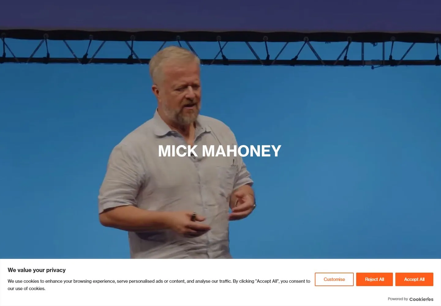
Live capture at 1440px, 2026-10-24
How it’s built
- Layout
- An orange bounded page shows small teal identity upper left and teal hamburger upper right. Two equal large portraits stand side by side with a narrow orange gutter. A single heavy white uppercase role line crosses both photos and the gutter at mid-height, using round dot separators. A short white mono-like tagline is centered beneath the images. Exterior classroom-like photograph is gallery staging.
- Type
- Heavy clean uppercase sans role line at large scale; small bold sans identity and distinct monospaced/typewriter-like lower tagline.
- Color and surface
- Highly saturated orange field, white statement/tagline, small teal utilities and naturally colored portraits; one image has a dark backdrop, the other a pale domestic interior.
- Components
- Compact identity/hamburger, equal portrait pair, continuous overlaid role line and separate lower tagline.
What makes it work
- Saturated orange field and two equal large portraits
- Continuous heavy white uppercase line across both images
- Small contrasting utility identity/navigation
- Separate compact mono-like tagline
On a new subjectFor a wildlife field-research collective, pair original portraits of field and lab contributors on orange, overlay one continuous heavy white role line and put a compact mono-like mission below. Keep small teal identity/menu marks, replacing consultancy roles and source portraits.
Measured
Fonts loadedDmmono, neue-haas-grotesk-display, neue-haas-grotesk-text, dm-mono
H2112px / 700
Body text16px
Page background#ffffff
Text color#000000
Page height14,353px
Computed CSS at 1440px, 2026-10-24.
Live behavior
- Today
- Full-viewport live-action speaker footage with a centered white uppercase name and otherwise very little visible chrome. A large white consent bar overlays the bottom, using orange solid/outline actions. At the scroll observation, a flat saturated orange content field rises over the lower footage and a large white uppercase role list enters near its lower edge. The sampled view is dominated by an introductory media state and consent.
- Responsive
- VIDEO and IMG both measure full viewport1440x1000 desktop,768x1024 tablet and390x844 phone. Narrow frames crop the speaker differently and use a visibly smaller centered name; the name has no matching sampled text selector, so its size/family remain visual estimates. Consent grows from a desktop bottom strip to a phone panel beginning aroundy456 and occupying almost half the viewport. Its three actions stack vertically on phone, obscuring underlying site content. The underlying navigation and orange content-page transformation on phone remain unobserved.
- Scroll
- Actual scrollY750 retains viewport media geometry while the visible name moves to a small orange label near upper left and a large flat orange panel covers most of the lower screen. A white uppercase role sequence at48.6px begins near y806, partly covered by consent at y846. Hidden large-menu HOME/ABOUT/BLOG/contact labels and a contact footer are returned at viewport-like coordinates but are not painted in this screenshot and are excluded.


