
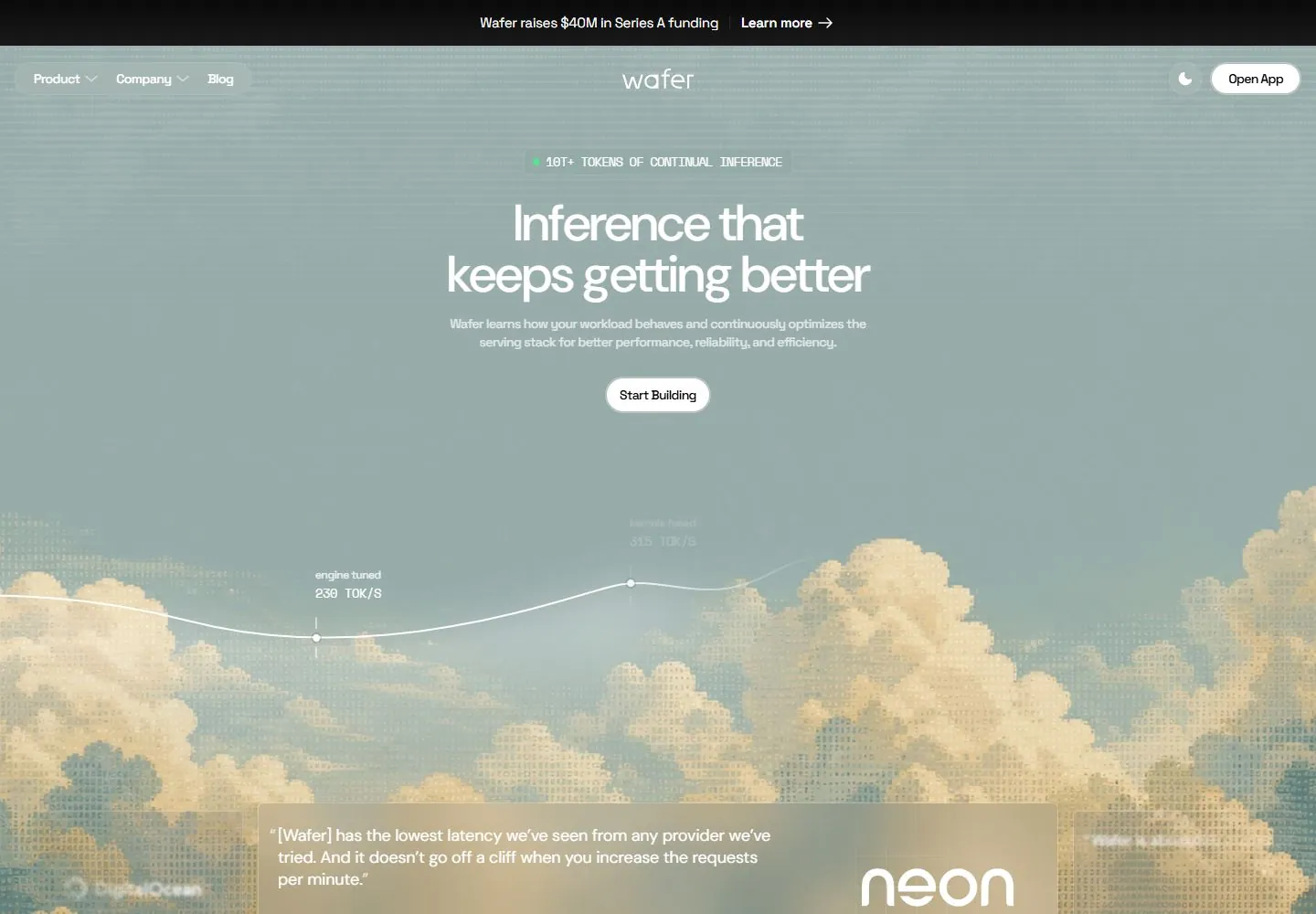
Live capture at 1440px, 2026-10-24
How it’s built
- Layout
- A muted sage page centers a small technical kicker, two-line white headline, short explanation and white pill. A thin white rising curve with labeled dots crosses the lower half above pale pixelated clouds; translucent testimonial cards and a black logo strip sit below. Outside dark bands are presentation.
- Type
- Medium-large regular sans title, tiny mono-like data labels and small sans body. Exact font and metrics unknown.
- Color and surface
- Sage field, white text/curve, cream pixel-like clouds, translucent cards and black bottom strip.
- Components
- Center white headline, support and pill over sage with a labeled thin rising curve above cream pixel-like clouds and translucent testimonials.
What makes it work
- Sage field and centered white title/support
- Thin labeled white curve
- Cream pixel-like cloud landscape
- Translucent testimonial cards
On a new subjectFor a public adult-literacy service, center white title and support on sage, place a thin labeled progress curve over cream pixel-like clouds and use translucent testimonial cards with verified statements.
Measured
Fonts loadedSpace Grotesk, Space Mono, DM Sans
H156px / 500 / -1.12px
Body text16px
Page background#0a0a0a
Text color#ffffff
Page height7,829px
Computed CSS at 1440px, 2026-10-24.
Live behavior
- Today
- A muted sage sky and golden halftone cloud landscape fills the hero behind centered white sans title/description and a compact mono status badge. A thin white rising curve with small dots, ticks and technical labels crosses the image below the main white capsule action. Navigation uses translucent pill surfaces around compact links, centered wordmark and a white app action; a black announcement strip sits above. A broad translucent testimonial panel overlays the clouds. The next section switches to black, with fine grid lines, small mono section labels, a character-built head silhouette and three dark technical diagrams.
- Responsive
- Title56px/56px desktop with-1.12px tracking becomes32px/34px and-0.64px tracking on tablet/phone, retaining two centered lines. Wide header shows grouped links at left/wordmark center/action right; narrow header moves identity left and keeps app action plus round menu control. Phone announcement wraps to two lines and64px height versus50px wide. Desktop chart shows three labeled milestones; phone shows only its first label in the retained crop. Testimonial is a wide centered card desktop,560px tablet and roughly342px phone; narrow card runs below the saved viewport and its right-side circular controls remain visible. The photo-like halftone scene is an IMG layer wider than each viewport; narrowing is a cropped/framed image treatment, not evidence for a live rendered landscape.
- Scroll
- Actual scrollY750 shows the centered testimonial fully and a row of small circular previous/pause/next controls beneath it. Original wide header becomes a compact centered floating pill near y16 with icon, links, theme and app action; the announcement is gone. A black client-logo strip precedes a dark gridded section. Its left36px/38px title and description pair with a right PRE-based head silhouette made from tiny monospace glyphs. Three bordered dark diagram panels start below, using thin white rings/paths, small colored markers and micro labels. PRE bounds extend below the panels; only the upper visible silhouette is characterized, not every raw character. No further scroll region or panel interaction was inspected.


