
Live capture at 1440px, 2026-10-24
How it’s built
- Layout
- Dark green-black page has a huge lime condensed uppercase statement at left and fine-line diagram at right; lime announcement bar and dark navigation sit above.
- Type
- Heavy condensed lime uppercase display, tiny monospaced-looking labels and fine diagram lettering.
- Color and surface
- Very dark green, bright pale lime and thin lime outlines.
- Components
- Split headline and diagram, top announcement bar, compact navigation and outlined action.
What makes it work
- Dark green field
- huge condensed lime uppercase statement
- fine-line diagram
- lime top strip
On a new subjectFor a public water-monitoring program, pair a huge condensed lime statement with a fine-line water flow diagram on very dark green beneath a lime top strip.
Measured
Fonts loadedOnest Variable
H148px / 600
Body text16px
Page background#f4f4f4
Text color#0a090c
Page height5,131px
Computed CSS at 1440px, 2026-10-24.
Live behavior
- Today
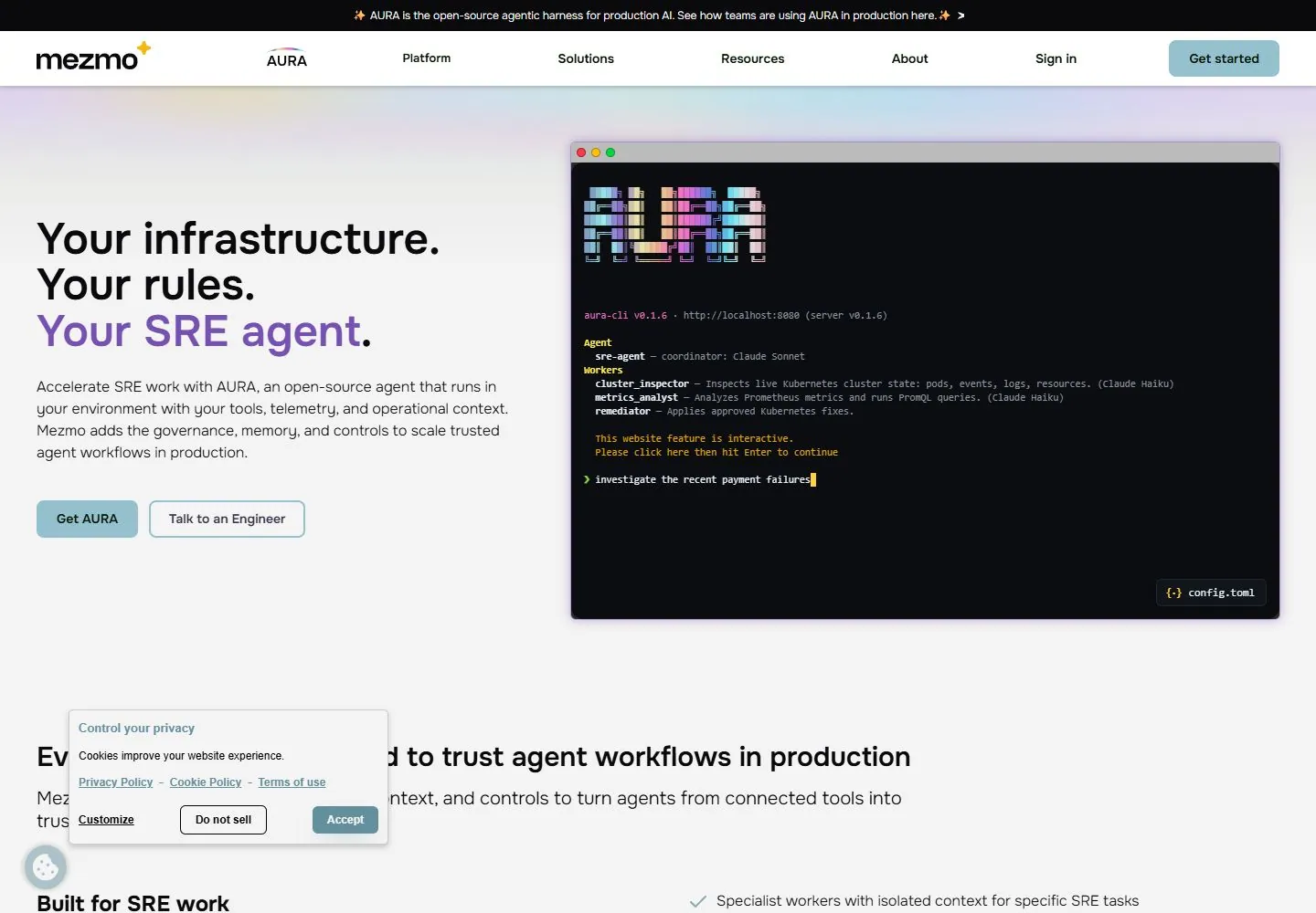
- The captured Mezmo page opens with a narrow black announcement strip above a white navigation row containing the Mezmo mark, AURA, Platform, Solutions, Resources, About, Sign in and a pale teal Get started button. A very light gray-lavender gradient hero places a large three-line headline on the left, with its final line in violet, followed by explanatory copy and two pale teal actions. A broad black terminal-style product illustration fills the right side. A privacy panel overlaps the next content section at the lower left.
- Responsive
- At 1440×1000, the document measures 5131px high; the hero uses a text/action column beside a large terminal illustration, with the next SRE section beginning at the bottom. Tablet (768×1024; document 8156px) and phone (390×844; document 8709px) reflow the headline, copy and actions above the terminal. The compact header uses a hamburger at narrow widths, and the privacy panel covers part of the phone terminal. These sampled widths do not establish breakpoint thresholds.
- Scroll
- At actual desktop scrollY=750 in a 1440×5131 document, the frame shows the SRE content sections “Built for SRE work,” “Governed for production & trust,” and “Designed to scale,” with lists aligned to their right and the privacy panel still visible. The header remains in the screenshot, but this single frame does not establish its behavior at other positions or how the state was reached.


