
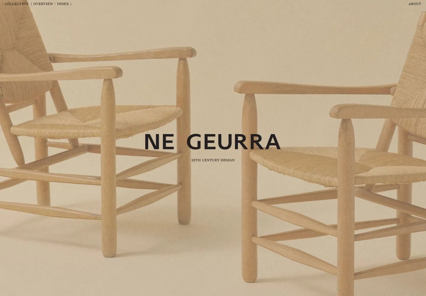
Live capture at 1440px, 2026-10-25
How it’s built
- Layout
- A white collection page has a central column of large product images, small metadata to the left and tiny category labels to the right.
- Type
- Tiny serif metadata and category labels.
- Color and surface
- Warm white and muted brown product imagery.
- Components
- A central vertical image column is flanked by tiny metadata and category labels on white.
What makes it work
- White field
- Central vertical photographic-looking image column
- Tiny flanking metadata and category labels
On a new subjectFor a public ceramics archive, use a central vertical column of vessel images with tiny flanking metadata and category labels on white.
Measured
Fonts loadedtypefaceABCDiatype, typefaceIvory
H212px / 400 / 0.48px
Body text14px
Page background#fffcf8
Text color#231f20
Page height29,914px
Computed CSS at 1440px, 2026-10-25.
Live behavior
- Today
- The 1440×1000 initial screenshot is a full-bleed warm, low-contrast photograph of woven wooden chairs with a centered “NE GEURRA” title and small “20TH CENTURY DESIGN” subtitle. Tiny Collection/Overview/Index navigation sits at upper left and About at upper right. The scroll screenshot shows a light catalog surface: object descriptions and dimensions sit to the left of large furniture photographs, with category labels at the far right. On the phone item view, the description and dimensions precede one large nearly full-width photo.
- Responsive
- The 1440-pixel initial view is a full-screen image-led title. At 768×1024, the saved state shows the item title, description, dimensions, and a 736-pixel-wide photo below the compact header. At 390×844, the same content column narrows, with the image 358 pixels wide; the reduced-motion fresh load instead displays a full-screen chair image and centered title. These differing saved states do not establish responsive breakpoints or a user-visible navigation path between them.
- Scroll
- The desktop-scroll capture records scrollY 750 in a 1440×29914 document. Its screenshot shows the Pfister sofa description and image followed by the Francis Jourdain chair entry; raw text geometry and image bounds also place a second item in the viewport. This sampled position does not establish sticky behavior, the full catalog, or how the page reached this state.


