
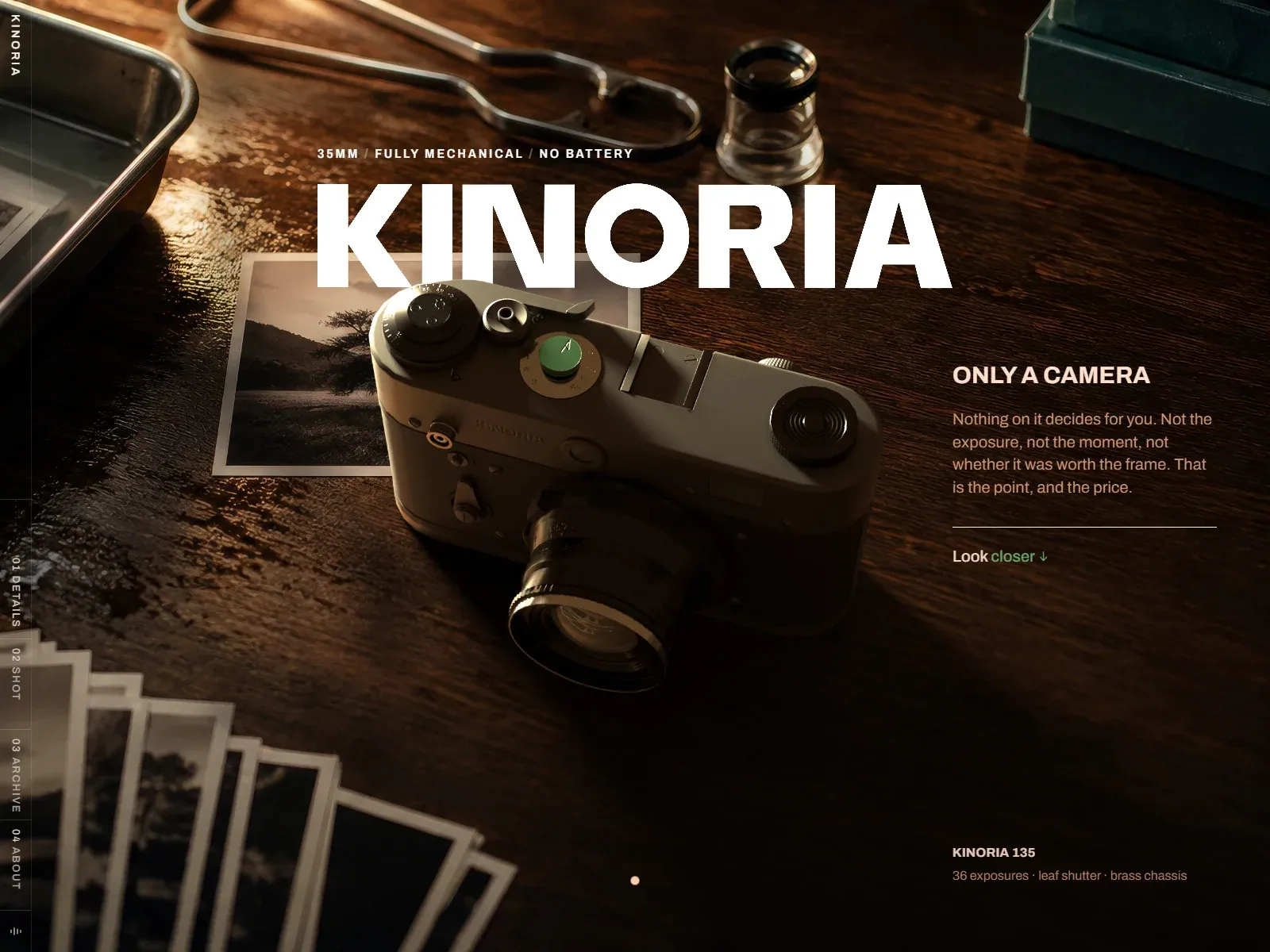
Gallery screenshot, saved 2026-10-24
How it’s built
- Layout
- A warm dark tabletop still life fills the page, with a large camera angled across center-left, prints underneath and small technical objects above. Huge heavy white uppercase identity spans upper middle over the scene; a small tracked technical descriptor precedes it. A narrow left rail carries vertical identity and numbered section labels separated by fine rules. Right-side compact heading/body is followed by a hairline and small green-accent link. Tiny product metadata sits low right and a small dot near bottom center.
- Type
- Very heavy broad uppercase sans identity, compact bold sans subheading, warm smaller regular sans description, tiny tracked uppercase technical kicker and vertical labels.
- Color and surface
- Rich brown/black wood and low warm raking light, dark metallic object, white headline, muted tan copy, hairline white separators and isolated muted green accent.
- Components
- Full-scene product still life, oversized identity, narrow vertical section rail, separate explanatory block and low product metadata.
What makes it work
- Warm dark tactile workspace and dominant physical object
- Huge heavy white uppercase identity
- Fine numbered vertical rail
- Compact right explanation and subordinate technical metadata
On a new subjectFor a handcrafted string-instrument workshop, compose an original warmly lit wood-table still life with one instrument dominating center-left. Set a huge white uppercase workshop name above it, a narrow numbered vertical rail and compact warm right-side process explanation with technical metadata; replace camera claims and objects.
Live behavior
- Today
- A dark, warmly lit photographic tabletop fills the opening view, with a large camera in the foreground, prints and photographic tools around it. Oversized white KINORIA lettering and a small spaced uppercase strapline overlay the image; a concise camera description sits at right on desktop. A narrow vertical rail contains numbered section labels, while a scroll cue appears near the bottom. The camera has a dimensional appearance, but the stills do not establish how it is rendered.
- Responsive
- The camera and headline remain dominant at 1440×1000, 768×1024 and 390×844. At tablet the descriptive block moves below the camera; at mobile the camera is tightly cropped, the description sits below it, and a horizontal top bar with Menu and an audio icon replaces the visible vertical rail. These are three sampled widths, not measured breakpoints. The desktop Look closer link and lower-right specification are not visible in the saved narrow frames.
- Scroll
- The desktop-scroll measurement records actual scrollY 0, with a 1440×1000 document matching the viewport. The screenshot remains on the opening composition with a changed camera orientation; the timed and hover frames also vary, so this does not isolate a scroll effect or show navigation to a later section.


