
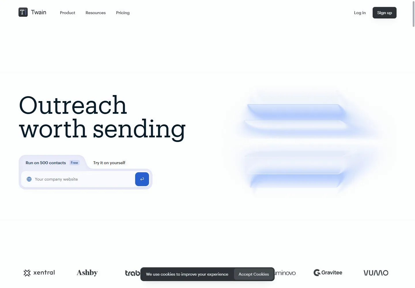
Live capture at 1440px, 2026-10-24
How it’s built
- Layout
- Sparse white page shows small identity upper left and a large dark serif two-line headline at left; its last letters shift blue beside a paper plane. A pale blue tabbed outlined input block and blue square action sit below; a faint translucent stack-like image occupies the right.
- Type
- Large regular high-contrast serif title, small bold sans input labels and compact sans utilities. Exact font and metrics unknown.
- Color and surface
- White field, near-black text, pale blue translucent forms and vivid blue action.
- Components
- Place a large left serif headline with blue ending and small paper-plane image above a pale blue tabbed input block; balance with a faint translucent stack on the right.
What makes it work
- White field and oversized left serif headline with blue ending
- Small paper plane and faint blue translucent stack
- Pale blue tabbed input with vivid blue square action
On a new subjectFor a public literacy service, place a large serif invitation with blue ending and a paper plane above a pale blue tabbed inquiry field, balanced by a faint translucent book stack at right.
Measured
Fonts loadedGraphik, Produkt
H184px / 400 / -0.84px
Body text14px
Page background#ffffff
Text color#16181d
Page height11,104px
Computed CSS at 1440px, 2026-10-24.
Live behavior
- Today
- A very pale spacious product page pairs a large dark slab-like serif two-line statement at left with a soft icy-blue stack of floating translucent planes at right. A small blue paper-plane mark moves near a changing final word. Below the heading, a lavender shaped two-tab input surface contains a website field and compact blue square action. Plain compact sans navigation runs along the top with a dark rectangular signup action, and a monochrome client-logo row anchors the opening bottom. Scrolled content presents three large pastel rounded cards with tiny capsule labels and restrained serif results.
- Responsive
- Hero declared type84px/73.92px with-0.84px tracking becomes44px/38.72px on narrow screens. Desktop uses a two-column visual balance and broad64px side inset; narrow states keep20px side inset, remove the right floating-plane scene from visible evidence and preserve extensive blank space above the title. Header reduces to identity, dark signup and a menu icon. The lavender two-tab website-input cluster becomes a single muted capsule row with professional-profile icon/text and a separate56px round icon action. Narrow screenshots show different input wording, so do not treat that as a tested tab switch. Mobile first headline y342 is much lower than header; avoid collapsing this whitespace into a conventional compact stack. Narrow client logos are occluded by the consent panel.
- Scroll
- Actual desktop scrollY750 keeps the top navigation fixed, places the monochrome logo row near y186, and reveals three equal cards beginning near y406. First two measure336x400px with16px gap; third differs slightly due to sampled transform/phase. Surface wrappers have36px corners and soft green, lavender and gray vertical gradients. Tiny capsule labels sit top-left,38px/33.44px serif result text near center, smaller descriptions below and faint client marks bottom-right. Specific metrics and client relationships are source copy only. Most of the18756px document is unexamined.


