
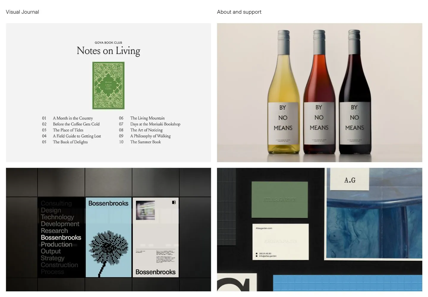
Live capture at 1440px, 2026-10-24
How it’s built
- Layout
- White field with identity at upper left and a narrow column of paragraphs occupying the right half; large blank left area.
- Type
- Regular black sans body with muted gray links, consistent modest scale.
- Color and surface
- White, black and gray.
- Components
- Identity, close label and right-aligned text column.
What makes it work
- Spacious white field with modest sans text confined to the right half.
On a new subjectFor a public science journal, place a concise introduction in a right column on white.
Live behavior
- Today
- The desktop opening uses a white background, two small sans header labels and a two-column grid of large rectangular project images separated by narrow white gutters. No captions are visibly overlaid on these first tiles; the varied typography and colors inside them belong to the project imagery.
- Responsive
- Tablet retains a two-column image grid and the same two header labels. Phone changes to one column while the two labels remain opposite one another. These observed widths do not establish the exact breakpoint.
- Scroll
- At actual desktop scrollY 750 the screenshot shows later rows of the same two-column image grid while the two-label header remains at the top. The recorded document height increases between opening and scroll states; the saved measurements do not establish the mechanism.


