
Live capture at 1440px, 2026-10-24
How it’s built
- Layout
- A white page has an irregular organic opening around a central white area through which a photographic figure appears around the top and sides. In the center, a fine horizontal rule supports three columns of tiny black serif credits and description; a thin progress line and play/pause labels sit near bottom.
- Type
- Tiny traditional serif text with occasional italic emphasis; small serif header links. Exact font and metrics unknown.
- Color and surface
- White field, muted brown photographic image, thin black rule and type.
- Components
- Surround a white central information area with an irregular organic photographic opening, arrange tiny serif credits in ruled columns and add a fine lower progress line.
What makes it work
- Irregular organic photographic perimeter
- White central area with tiny serif ruled credits columns
- Fine lower progress line and small media labels
- Sparse header
On a new subjectFor a public museum oral-history exhibit, surround a white central credits table with an irregular opening containing original interview photographs, using tiny serif columns and a fine lower progress line.
Measured
Fonts loadedCentury
Body text14px
Page background#f5f5f5
Text color#000000
Page height1,000px
Computed CSS at 1440px, 2026-10-24.
Live behavior
- Today
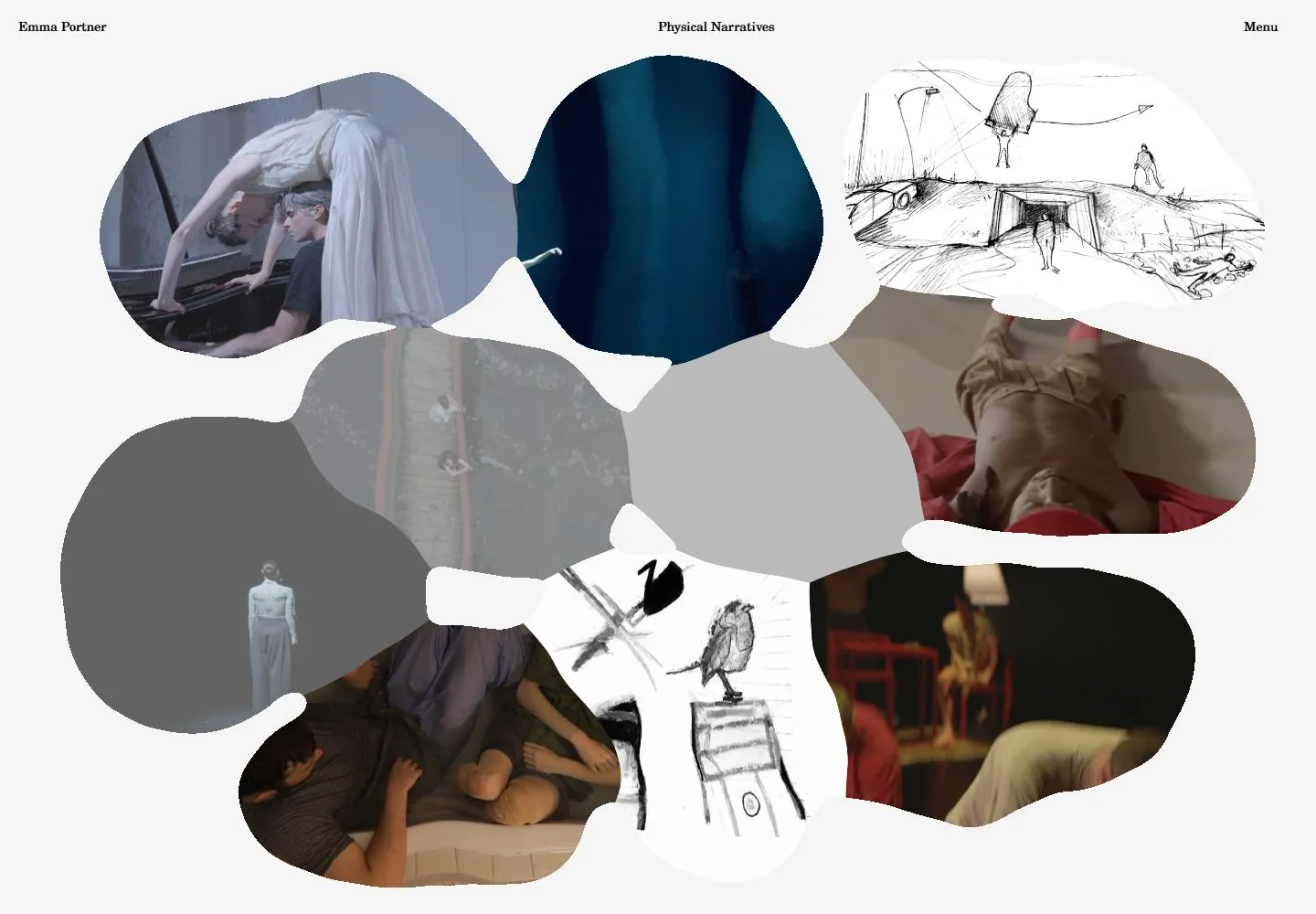
- A pale-gray screen is filled by a loose mosaic of photographic/film-like scenes and monochrome sketches, each clipped through a different irregular rounded organic aperture. The forms vary in orientation and size with small light gaps and occasional near contact. There are no rectangular cards, captions or large heading. Three tiny black serif utilities run along the top: identity left, short descriptor near the center and Menu right. Choreography images, dark stage views and ink sketches supply the visual density while the interface stays almost absent.
- Responsive
- CANVAS fills1440x1000,768x1024 and390x844. Header stays14px normal line height; narrow positions remain20px from top with identity at x20, descriptor x156 and Menu x311. Tablet packs the same organic mosaic tightly across a tall field. Ordinary phone scales the mosaic into a compact central cluster with considerable pale space above/below, rather than converting to a list. Fresh phone shows a different taller two-column-like arrangement; that is a different captured layout, not proof of a deterministic breakpoint or reduced-motion reflow.
- Scroll
- Attempted desktop scroll remains actual scrollY0 and document1440x1000. Mosaic boundaries and scene frames continue changing while the header remains in place. This is evidence of a viewport stage, not a scrollable project archive; possible custom wheel/scene behavior was not isolated.


