
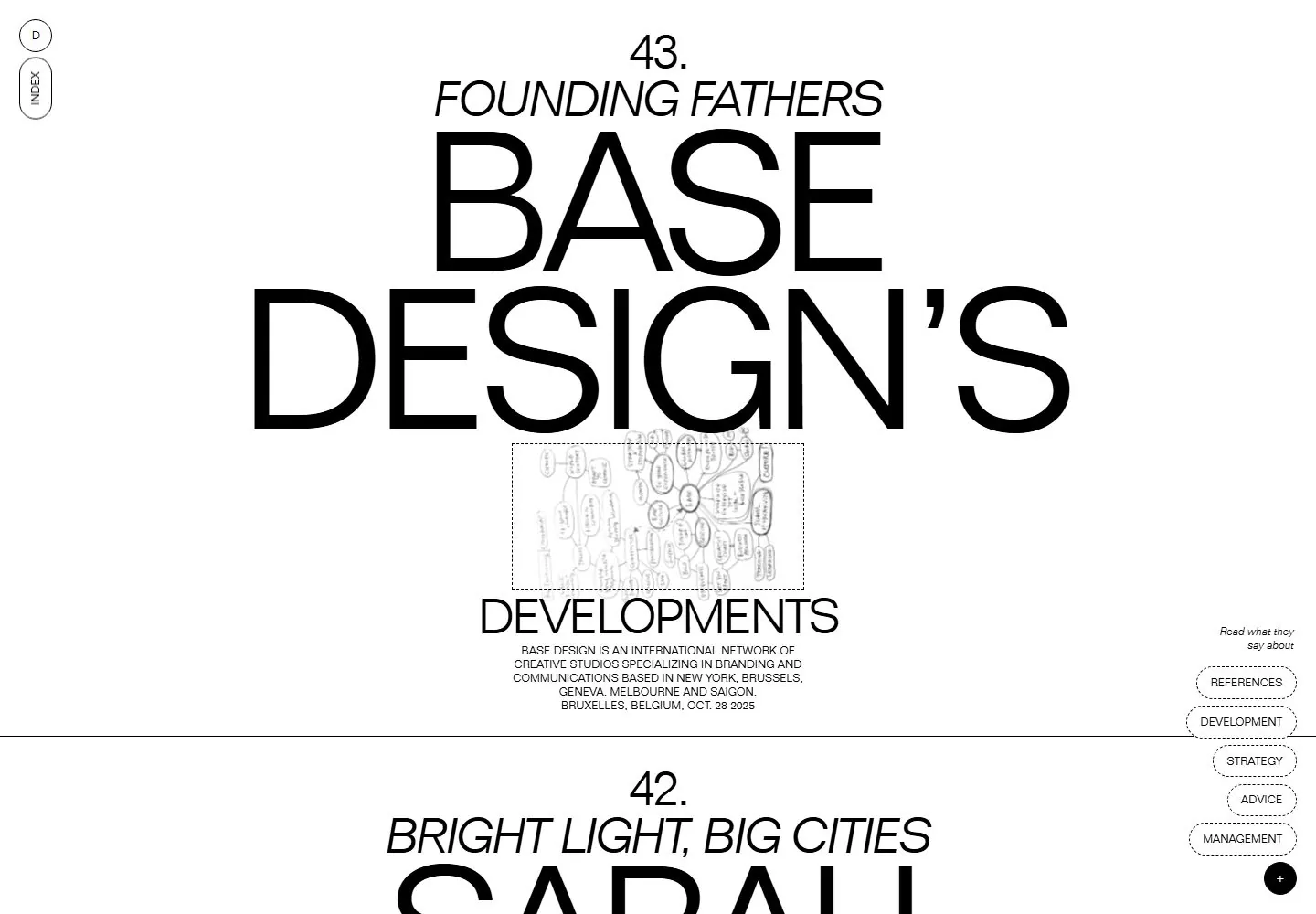
Live capture at 1440px, 2026-10-24
How it’s built
- Layout
- White field with centered index number and huge two-line title, a small hand-drawn overlapping-circle graphic and small right-side outlined tags.
- Type
- Huge regular uppercase black sans title with smaller italic and handwritten elements.
- Color and surface
- White and black, with fine dashed outlines.
- Components
- Number, massive title, circle graphic, vertical index and tag pills.
What makes it work
- Oversized centered uppercase title with a hand-drawn circle graphic and small outlined tags.
On a new subjectFor a public history series, pair a numbered oversized title with a hand-drawn diagram and tags.
Live behavior
- Today
- A monochrome editorial index centers a small item number, italic uppercase subtitle and enormous two-line uppercase sans title. A small pale illustration, medium title and compact uppercase description sit beneath. Fine horizontal rules divide entries; small outlined vertical controls sit at upper left and dotted-outline topic pills align at right.
- Responsive
- Tablet retains the centered typographic stack with a title spanning most of the width. Phone scales the title and illustration down, keeps the vertical left controls, and shows fewer right-side topic pills in the visible area. These sampled widths do not establish the exact breakpoint.
- Scroll
- The desktop scroll-labeled frame reports actual scrollY 0 in a viewport-height document and looks like the initial composition. The next entry is partly visible below a horizontal rule, but successful scrolling or its mechanism is not established.


