
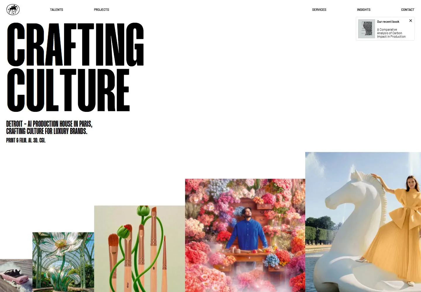
Live capture at 1440px, 2026-10-24
How it’s built
- Layout
- White page with enormous condensed black two-line title at upper left, compact condensed explanatory text beneath and a widely distributed tiny navigation row. A staircase of project images rises from the bottom toward a large image at right.
- Type
- Extremely tall heavy condensed uppercase title and smaller condensed uppercase explanatory text; tiny narrow navigation. Exact fonts and metrics unknown.
- Color and surface
- White ground, black text, photographic imagery dominated by blue and black.
- Components
- Place huge condensed black stacked type at upper left above small condensed explanatory copy; arrange varied image rectangles as an ascending staggered sequence across the bottom.
What makes it work
- White field and enormous condensed upper-left title
- Small condensed supporting text
- Ascending staggered lower image sequence
- Tiny spread header links
On a new subjectFor a municipal food distribution service, pair a huge condensed black access headline and small condensed explanation with staggered documentary food-distribution photos ascending across the lower page.
Measured
Fonts loadedMangogrotesque, Barlow
H128.8px / 700
Body text14.4px
Page background#000000
Text color#000000
Page height1,000px
Computed CSS at 1440px, 2026-10-24.
Live behavior
- Today
- Detroit Paris current desktop is a white sparse field with extremely tall heavy condensed black CRAFTING/CULTURE at upper left, a much smaller condensed supporting block beneath, widely distributed tiny top navigation and a small book notice at upper right. Rectangular project photographs rise in a stair-step band toward the lower right, with the leftmost image clipped by the viewport. Broad white space separates title and imagery. Current evidence is separately versioned from selected gallery imagery.
- Responsive
- At768px and390px full header links become a MENU label while the circular mark stays left. Huge letter samples reduce from207px to124px, while the supporting H1 increases from28.8px to32px. Tablet screenshot shows only typography and empty lower white space; its sampled media array is empty. Ordinary mobile shows a horizontal, edge-clipped image strip beginning around572px with small dot/project labels, rather than the desktop rising stair-step. Tablet absence cannot establish an intentional hidden-images rule because loading/layout progression was not isolated.
- Scroll
- The labeled desktop-scroll state remains at scroll_y0 with document1440x1000, equal to viewport dimensions. Image layout remains at the same position; a dot/OJAI label appears over the right image. This is not evidence of vertical scrolling or a scroll-caused effect. Custom horizontal/pointer navigation was not tested and requires recovery.


