
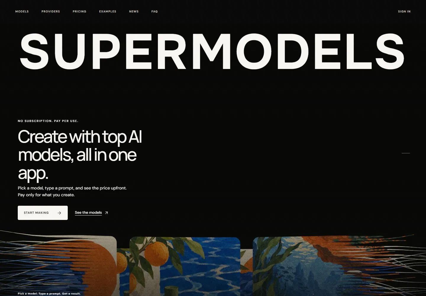
Live capture at 1440px, 2026-10-24
How it’s built
- Layout
- Tiny tracked navigation runs along the very top of a black canvas. An enormous bold uppercase identity spans nearly the full width beneath it. A much smaller left-aligned multiline proposition and paired solid/link actions sit below a large band of negative space. Along the bottom, colorful rounded artwork panels are interrupted by narrow horizontal streak-like fragments extending sideways.
- Type
- Extremely large heavy sans uppercase masthead; the proposition is a lighter tightly spaced sans over three lines, with small tracked uppercase navigation/eyebrow and compact body text. Exact font and dimensions unknown.
- Color and surface
- Almost black field with warm-white type/action, plus muted textured multicolor artwork at the lower edge. Fine colored horizontal fragments connect the bottom imagery visually; no shadows or material values are measured.
- Components
- Micro-navigation, full-width masthead, left promise and paragraph, rectangular solid action, underlined secondary link and fragmented artwork strip.
What makes it work
- Nearly full-width heavy uppercase masthead
- Large dark negative-space field with isolated left message/actions
- Colorful lower artwork strip with horizontally fragmented edges
On a new subjectFor a seed-conservation collection, use an enormous collection name above a small left mission/action group on black, then anchor original botanical plates along the bottom with edges broken into short horizontal image fragments. Keep the large right-side negative space and replace all AI and artwork content.
Measured
Fonts loadedDM Sans, Manrope, Impact Label, Onest
H158.32px / 500 / -3.7908px
Body text16px
Page background#000000
Text color#ded5c5
Page height16,406px
Computed CSS at 1440px, 2026-10-24.
Live behavior
- Today
- Black textured hero with a near-full-width white SUPERMODELS wordmark, tiny uppercase navigation, left-aligned product pitch and paired actions. Colorful layered image panels enter at the bottom.
- Responsive
- Tablet retains horizontal nav and hero; mobile reduces navigation to sign-in and menu, moves pitch over the lower image area and keeps the oversized wordmark above.
- Scroll
- At scrollY 750 the image band gives way to a light section with three large artwork cards.


