
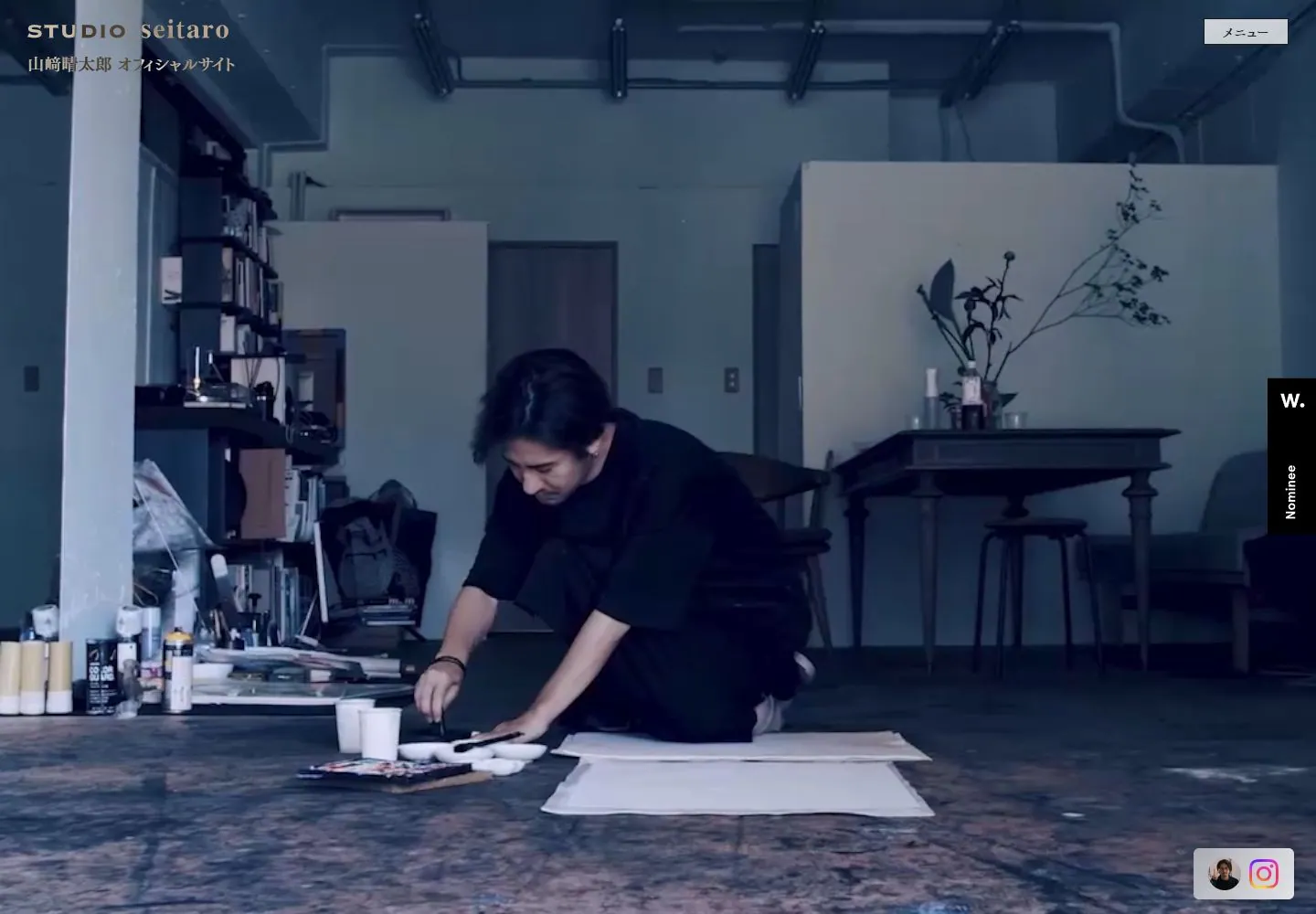
Live capture at 1440px, 2026-10-24
How it’s built
- Layout
- Broad landscape image centered in a near-black navy field, with generous dark margins. Cool blue-tinted studio image fills most of the inner rectangle. Tiny bilingual identity upper-left, menu upper-right, social/profile capsule lower-right. Single continuous image field, no card grid.
- Type
- Very small white/cream identity labels and compact menu label; no large headline. Tiny lettering does not support a reliable font identification or precise metrics.
- Color and surface
- Deep navy surround, low-key blue-gray studio image, subdued white and warm workbench tones. Overlay appears cool and dark. Small white controls provide bright accents; no prominent borders or shadows.
- Components
- One dominant cinematic image, compact identity, menu control, profile and social links. The photograph is the primary visual carrier; whether the media is video is unknown.
What makes it work
- single image field
- quiet dark surround
- tiny edge annotations
On a new subjectUse one uninterrupted documentary image for a different maker or place, retain a low-key dark surround and tiny identification, and avoid cards or oversized headline overlays.
Prompts
Create an original website image for {{website_name}} in {{industry}}, serving {{audience}}, presenting {{content}} and making {{functionality}} apparent.
INVARIANTS: Give one wide cinematic image the principal opening region, with tiny identity and menu labels at opposite top edges and a small lower-edge control; leave the center free of headline copy.
TYPOGRAPHY: Use very small restrained sans labels with clear separation from the image.
COLORS AND SURFACES: Dark blue-black values and pale labels; keep surface treatment minimal.
IMAGERY: Use one new low-key photograph appropriate to the subject. Gallery framing and source studio contents are incidental.
VARIABLES: Supply original identity, writing, imagery, accent hues and tasks for {{website_name}}, {{industry}}, {{audience}}, {{content}} and {{functionality}}.
PROHIBITIONS: Do not copy source branding, wording, photographs or signature artwork. Do not turn privacy notices, submission frames or cut-off essential text into style rules. Avoid generic card stacks, extra decorative panels or an unrelated large hero heading when they erase the specified hierarchy.
CONTINUATION: Translate the same relative type scale, alignment and image treatment into the next real content section; give that section a clear purpose rather than duplicating the hero.
RESPONSIVE PROPOSAL: Crop the single photograph intentionally to preserve its focal subject; move edge labels into safe readable margins without adding a central headline. Render clear, readable original text and subject-appropriate controls with consistent spacing. These proportions are visual reproduction targets, not common measured CSS. The selected still does not establish source fonts, technology, motion, hover or responsive behavior. Preserve those evidence limits; this prompt remains unvalidated.
Build a functioning responsive website for {{website_name}} in {{industry}} for {{audience}}, using {{content}} and working {{functionality}}.
INVARIANTS: Give one wide cinematic image the principal opening region, with tiny identity and menu labels at opposite top edges and a small lower-edge control; leave the center free of headline copy.
TYPOGRAPHY: Use very small restrained sans labels with clear separation from the image.
COLORS AND SURFACES: Dark blue-black values and pale labels; keep surface treatment minimal.
IMAGERY: Use one new low-key photograph appropriate to the subject. Gallery framing and source studio contents are incidental.
VARIABLES: Supply original identity, writing, imagery, accent hues and tasks for {{website_name}}, {{industry}}, {{audience}}, {{content}} and {{functionality}}.
PROHIBITIONS: Do not copy source branding, wording, photographs or signature artwork. Do not turn privacy notices, submission frames or cut-off essential text into style rules. Avoid generic card stacks, extra decorative panels or an unrelated large hero heading when they erase the specified hierarchy.
CONTINUATION: Carry the relative type scale, alignment and image treatment into appropriate content sections without repeating the hero or inventing irrelevant features.
RESPONSIVE PROPOSAL: Crop the single photograph intentionally to preserve its focal subject; move edge labels into safe readable margins without adding a central headline. Use semantic reading order, meaningful image descriptions, keyboard-operable controls and visible focus. Check display text bounds after the chosen fonts load at desktop and phone widths; keep complete essential text inside its container. Verify the actual requested actions rather than styling inert controls. Respect reduced-motion preferences if new motion is added. These proportions are visual reproduction targets, not common measured CSS. The selected still does not establish source fonts, technology, motion, hover or responsive behavior. Preserve those evidence limits; this prompt remains unvalidated.
Measured
Fonts loadedfpbf_ac93d8111, TsukuMinPr6-M, TsukuMinPr6-M2, TsukuMinPr6-M1
Body text16px
Page background#e5e5e5
Text color#000000
Page height1,000px
Computed CSS at 1440px, 2026-10-24.
Live behavior
- Today
- Full-viewport photographic scenes sit behind a compact upper-left studio identity and Japanese subtitle, an outlined menu upper-right, a right-edge nominee badge and lower-right social tile. Desktop frames show different scenes. The dominant STUDIO seitaro identity appears at the upper left, but no matching visible text run or platform-font sample was captured; its typography cannot be measured from these fields. Subtitle computed color may differ from its paint over imagery.
- Responsive
- Tablet and mobile retain edge controls and crop imagery to a tall frame.
- Scroll
- Scroll snapshot has scrollY 0, with a different photographic frame; no successful page scroll is established.


