
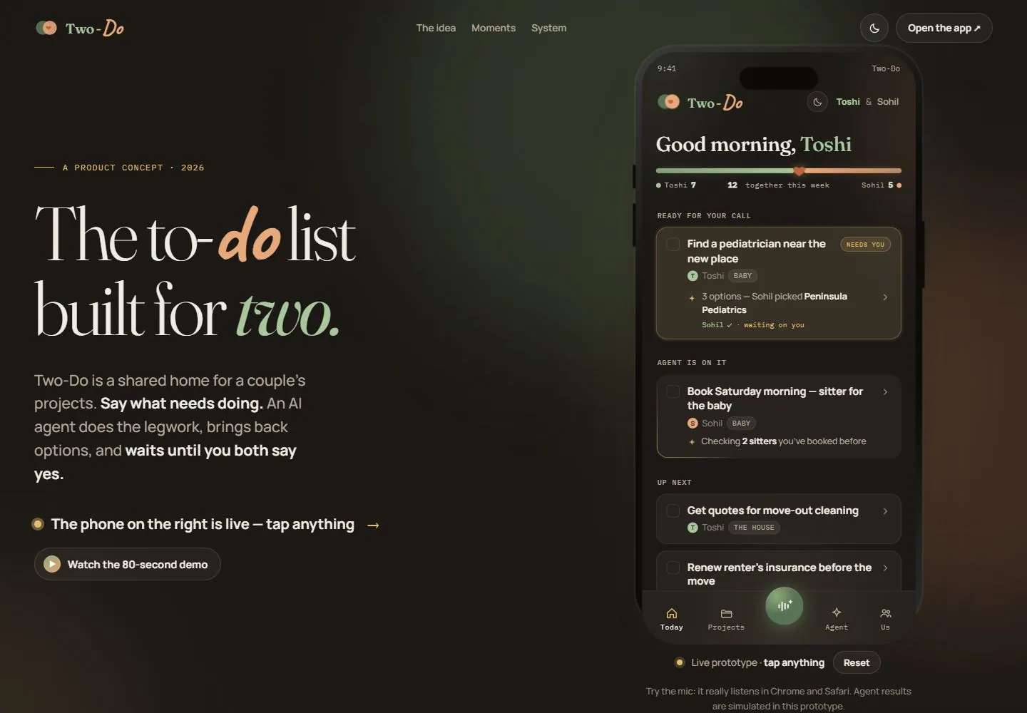
Live capture at 1440px, 2026-10-24
How it’s built
- Layout
- A warm near-black page places a small two-tone identity left, centered compact navigation and outlined utilities at right. The main opening is a wide left text column opposite a tall phone product demonstration. A tiny tracked eyebrow precedes a large two-line serif statement, explanatory paragraph with selective bold text, a demo hint and small outlined pill action. Rounded phone cards and bottom tabs reveal a compact secondary hierarchy.
- Type
- Large light high-contrast serif statement mixes ordinary words with softer handwritten-looking italic emphasis in two accent colors. Small tracked monospaced-looking eyebrows/status labels and plain sans explanatory text contrast with the display line. Exact fonts unknown.
- Color and surface
- Brown-black background with broad low-contrast sage and terracotta glows; warm off-white text, pale sage/peach emphasis and muted gold details. Phone cards use slightly lighter dark rounded surfaces and fine subdued outlines.
- Components
- Compact header, mixed-style display heading, emphasized paragraph, demo hint/action, phone-frame preview, small status labels, rounded task cards and bottom icon tabs.
What makes it work
- Warm dark field with restrained soft accent glows
- Large light serif headline with contrasting loose/italic emphasized words
- Tall compact rounded product preview beside explanatory copy
On a new subjectFor a community clinic scheduling service, combine a large serif care-access message with a few loosely styled sage/peach key words on a warm dark field. Put a tall appointment-preview interface to the right, using quiet rounded slots/status cards; retain concise explanation and one demo action. Replace household task content and verify appointment behavior separately.
Measured
Fonts loadedCaveat, Fraunces
H1105.6px / 300 / -3.696px
Body text17px
Page background#1b1815
Text color#f1ece3
Page height11,716px
Computed CSS at 1440px, 2026-10-24.
Live behavior
- Today
- Two-Do uses a warm brown-black field with subdued sage/peach glows, a large light serif promise mixing a peach handwritten word and sage italic ending, compact status-like labels and a tall rounded phone preview. Desktop places explanatory copy/action beneath the left title and phone at right. Rounded dark phone cards, small status pills and a glowing central microphone-like tab repeat the warm restrained material system. The saved text claims live/prototype and simulated agent behavior; those claims were not functionally tested.
- Responsive
- At1440px the phone is tall beside the large left heading/support stack. At768px the two-column arrangement remains narrower, while the central desktop navigation links are omitted and identity/theme/app controls remain. At390px a smaller heading appears above a nearly full-width phone preview; explanatory copy visible on desktop is outside the selected mobile view. The app action becomes pale-filled and theme utility remains at the header edge. These captures establish only sampled widths, not all breakpoints or destinations.
- Scroll
- Desktop scroll reaches750px with11716px document height. The first narrative section appears at left with a smaller serif heading, italic emphasis, paragraph and separated roman-numbered points, while the phone preview and header remain visible in their right/top regions. This demonstrates one scroll composition, not the entire app-demo or narrative sequence.


