
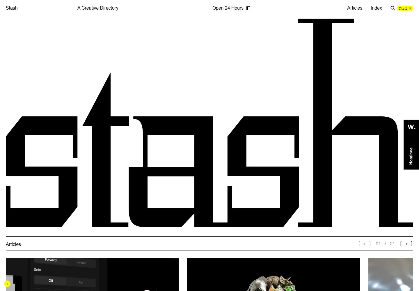
Live capture at 1440px, 2026-10-24
How it’s built
- Layout
- White website rectangle against black margin. Tiny nav runs along its top edge. Huge black custom-looking word fills almost all central height. A fine rule separates it from an Articles label, pagination, and a three-column strip of cropped editorial images.
- Type
- Extremely large geometric/custom-looking display lettering; tiny regular sans utilities and pagination; one thumbnail includes contrasting serif editorial type. Exact font, size, leading, and tracking unknown.
- Color and surface
- Black and white dominate; image strip adds warm pixelated photo, reflective gold, and bright yellow. Thin divider rule; no obvious rounded panels or shadows.
- Components
- Micro navigation, oversized name, thin rule, article label, pagination, and three image previews. Search glyph has a small yellow badge.
What makes it work
- radical display scale
- tiny peripheral nav
- compact editorial continuation
On a new subjectUse a new oversized identity on white with tiny navigation and a thin-rule editorial index with a few new image previews below.
Prompts
Create an original website image for {{website_name}} in {{industry}}, serving {{audience}}, presenting {{content}} and making {{functionality}} apparent.
INVARIANTS: Within the website canvas, put a tiny utility rail above a near-full-width angular identity, followed by a thin rule and the beginning of an image sequence.
TYPOGRAPHY: Use an original geometric display treatment with heavy angular strokes for the identity and very small neutral labels.
COLORS AND SURFACES: White page with black lettering; imagery introduces secondary color.
IMAGERY: Show the tops of several new project/content images below the identity. The surrounding black gallery frame is not required page chrome.
VARIABLES: Supply original identity, writing, imagery, accent hues and tasks for {{website_name}}, {{industry}}, {{audience}}, {{content}} and {{functionality}}.
PROHIBITIONS: Do not copy source branding, wording, photographs or signature artwork. Do not turn privacy notices, submission frames or cut-off essential text into style rules. Avoid generic card stacks, extra decorative panels or an unrelated large hero heading when they erase the specified hierarchy.
CONTINUATION: Translate the same relative type scale, alignment and image treatment into the next real content section; give that section a clear purpose rather than duplicating the hero.
RESPONSIVE PROPOSAL: Fit a deliberately broken or scaled identity across the width, then expose the first image sequence; do not recreate a screenshot inside a mock browser. Render clear, readable original text and subject-appropriate controls with consistent spacing. These proportions are visual reproduction targets, not common measured CSS. The selected still does not establish source fonts, technology, motion, hover or responsive behavior. Preserve those evidence limits; this prompt remains unvalidated.
Build a functioning responsive website for {{website_name}} in {{industry}} for {{audience}}, using {{content}} and working {{functionality}}.
INVARIANTS: Within the website canvas, put a tiny utility rail above a near-full-width angular identity, followed by a thin rule and the beginning of an image sequence.
TYPOGRAPHY: Use an original geometric display treatment with heavy angular strokes for the identity and very small neutral labels.
COLORS AND SURFACES: White page with black lettering; imagery introduces secondary color.
IMAGERY: Show the tops of several new project/content images below the identity. The surrounding black gallery frame is not required page chrome.
VARIABLES: Supply original identity, writing, imagery, accent hues and tasks for {{website_name}}, {{industry}}, {{audience}}, {{content}} and {{functionality}}.
PROHIBITIONS: Do not copy source branding, wording, photographs or signature artwork. Do not turn privacy notices, submission frames or cut-off essential text into style rules. Avoid generic card stacks, extra decorative panels or an unrelated large hero heading when they erase the specified hierarchy.
CONTINUATION: Carry the relative type scale, alignment and image treatment into appropriate content sections without repeating the hero or inventing irrelevant features.
RESPONSIVE PROPOSAL: Fit a deliberately broken or scaled identity across the width, then expose the first image sequence; do not recreate a screenshot inside a mock browser. Use semantic reading order, meaningful image descriptions, keyboard-operable controls and visible focus. Check display text bounds after the chosen fonts load at desktop and phone widths; keep complete essential text inside its container. Verify the actual requested actions rather than styling inert controls. Respect reduced-motion preferences if new motion is added. These proportions are visual reproduction targets, not common measured CSS. The selected still does not establish source fonts, technology, motion, hover or responsive behavior. Preserve those evidence limits; this prompt remains unvalidated.
Measured
Fonts loadedSpace Mono
H142.2195px / 700
Body text21.1098px
Page background#ffffff
Text color#000000
Page height10,727px
Computed CSS at 1440px, 2026-10-24.
Live behavior
- Today
- White editorial directory with tiny distributed top navigation, a huge angular black wordmark and a red rounded volumetric character layered over it in the desktop frames. Below, thin black rules label horizontal image-led article strips; monospace-looking article titles and small metadata contrast with the large branding graphic. Yellow shortcut/pause accents are small.
- Responsive
- Tablet and phone retain the large black wordmark, thin rules and horizontally clipped article strip with a following-card preview. The prominent red character is not visible in the saved smaller hero regions; lossless diagnostic crops and dominant-red pixel counts corroborate this region-specific observation. This does not prove a CSS breakpoint, permanent removal or a preference implementation. Phone top navigation omits some descriptive text while retaining Articles, Index and the shortcut hint.
- Scroll
- At the actual750px desktop scroll position, the top navigation persists and the article strip exposes image panels, monospace-looking titles, descriptions and bracketed read links. A second ruled section begins below. Horizontal navigation controls are visible but were not clicked.


