
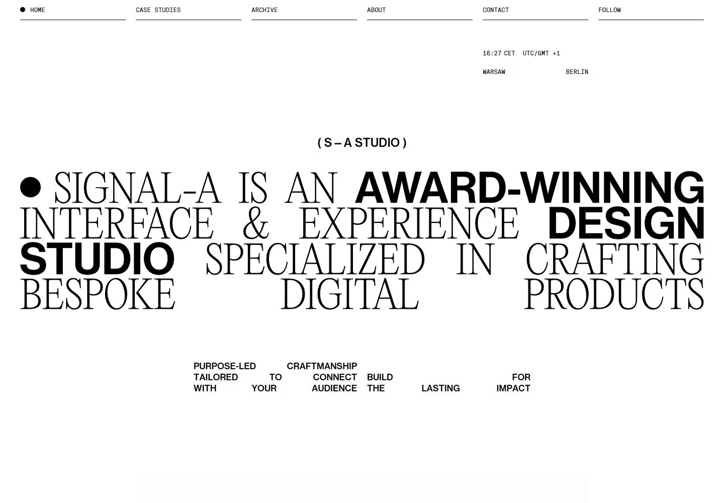
Live capture at 1440px, 2026-10-24
How it’s built
- Layout
- The actual page is a white canvas inside a black gallery surround; the surround is not page chrome. A six-item, thin-rule utility rail spans the top. Under a broad pause, small centered studio identity precedes an oversized four-row manifesto. Lines deliberately change alignment and width, with a black dot anchoring the first line. A compact sequence of short claims sits below, then a wide dark project preview begins near the lower edge. The statement occupies most of the viewport width, while generous top and lower gaps keep it from reading as a conventional packed headline.
- Type
- The headline alternates high-contrast, thin serif capitals with heavy sans capitals, sometimes within one sentence. The contrast is weight and stroke character more than color. Line breaks create an irregular but carefully fitted rectangle; some words start flush left while other phrases fill to the right. Utility text is tiny, uppercase, monospaced in appearance, and widely distributed. The image does not identify the face, so no font name is asserted. Body/metadata is much smaller than the statement; leading is tight enough that the lines read as one typographic composition.
- Color and surface
- Near-monochrome black on white. The page field is flat and clean, with fine gray-black rules separating the top navigation labels. There are no visible cards, rounded surfaces, gradients, or shadows in the text area. The lower project image introduces dark photographic color and is clearly secondary. The outer black frame belongs to the submitted reference presentation, not a page border.
- Components
- Navigation consists of equal-width text-and-rule cells. A small black circular marker precedes Home. The studio mark and city clock are modest utility details. There are no prominent buttons or icon systems. One rectangular media preview is partially visible below the statement, establishing portfolio context without competing with the words.
What makes it work
- sentence-length display copy as the primary graphic
- visible serif/sans or thin/heavy contrast within the statement
- hard arranged line breaks
- quiet utility rail
On a new subjectReplace the manifesto with a concise mission or product proposition; retain mixed display roles, deliberate line breaks, and modest utility rail. Use domain imagery only below the statement.
Prompts
Create an original website image for {{website_name}} in {{industry}}, serving {{audience}}, presenting {{content}} and making {{functionality}} apparent.
INVARIANTS: Make a compact, wide typographic statement from interlocking lines of contrasting type; place a fine ruled utility rail above and tiny aligned metadata groups plus a project preview below.
TYPOGRAPHY: Mix high-contrast serif phrases with bold sans phrases in the same statement; align their baselines and keep the lines tightly spaced.
COLORS AND SURFACES: Black type on a white ground; color belongs mainly to the lower media preview.
IMAGERY: Use one original content preview below the manifesto. The black submission surround is incidental.
VARIABLES: Supply original identity, writing, imagery, accent hues and tasks for {{website_name}}, {{industry}}, {{audience}}, {{content}} and {{functionality}}.
PROHIBITIONS: Do not copy source branding, wording, photographs or signature artwork. Do not turn privacy notices, submission frames or cut-off essential text into style rules. Avoid generic card stacks, extra decorative panels or an unrelated large hero heading when they erase the specified hierarchy.
CONTINUATION: Translate the same relative type scale, alignment and image treatment into the next real content section; give that section a clear purpose rather than duplicating the hero.
RESPONSIVE PROPOSAL: Recompose the mixed-type statement into shorter complete lines; preserve the changing type character and small metadata groups without overlap. Render clear, readable original text and subject-appropriate controls with consistent spacing. These proportions are visual reproduction targets, not common measured CSS. The selected still does not establish source fonts, technology, motion, hover or responsive behavior. Preserve those evidence limits; this prompt remains unvalidated.
Build a functioning responsive website for {{website_name}} in {{industry}} for {{audience}}, using {{content}} and working {{functionality}}.
INVARIANTS: Make a compact, wide typographic statement from interlocking lines of contrasting type; place a fine ruled utility rail above and tiny aligned metadata groups plus a project preview below.
TYPOGRAPHY: Mix high-contrast serif phrases with bold sans phrases in the same statement; align their baselines and keep the lines tightly spaced.
COLORS AND SURFACES: Black type on a white ground; color belongs mainly to the lower media preview.
IMAGERY: Use one original content preview below the manifesto. The black submission surround is incidental.
VARIABLES: Supply original identity, writing, imagery, accent hues and tasks for {{website_name}}, {{industry}}, {{audience}}, {{content}} and {{functionality}}.
PROHIBITIONS: Do not copy source branding, wording, photographs or signature artwork. Do not turn privacy notices, submission frames or cut-off essential text into style rules. Avoid generic card stacks, extra decorative panels or an unrelated large hero heading when they erase the specified hierarchy.
CONTINUATION: Carry the relative type scale, alignment and image treatment into appropriate content sections without repeating the hero or inventing irrelevant features.
RESPONSIVE PROPOSAL: Recompose the mixed-type statement into shorter complete lines; preserve the changing type character and small metadata groups without overlap. Use semantic reading order, meaningful image descriptions, keyboard-operable controls and visible focus. Check display text bounds after the chosen fonts load at desktop and phone widths; keep complete essential text inside its container. Verify the actual requested actions rather than styling inert controls. Respect reduced-motion preferences if new motion is added. These proportions are visual reproduction targets, not common measured CSS. The selected still does not establish source fonts, technology, motion, hover or responsive behavior. Preserve those evidence limits; this prompt remains unvalidated.
Measured
Fonts loadedGt America Mono, Neue Haas Grotesk Text Pro, PPEditorialNew
Body text12px
Page background#ffffff
Text color#000000
Page height6,022px
Computed CSS at 1440px, 2026-10-24.
Live behavior
- Today
- Signal A Studio pairs a white field and six thin-ruled uppercase mono navigation cells with a large justified all-caps statement, alternating thin high-contrast serif words and heavy sans words. A black lead dot and tiny parenthesized centered introduction punctuate the statement; a small widely distributed supporting text block and inset media sit below. Clock/location utilities sit upper right. Serif appearance is visually estimated; sparse actual-glyph sampling does not identify the hero serif.
- Responsive
- At768px six ruled navigation cells remain and the mixed-type statement wraps into more lines with wide word gaps. At390px the header becomes S A left and bracketed MENU right, the introduction shrinks, and the hero wraps into a centered narrow multi-line block while retaining the serif/heavy-sans contrast. The media is inset by10px and its metadata uses tiny mono labels below. Menu opening and downstream layout were not tested.
- Scroll
- At actual document scroll750 the six-cell header remains at the top, the hero is out of view and a centered large media panel with SHOWREEL, year and COMING SOON metadata is visible. Header persistence across these two positions is observed; precise sticky/fixed implementation and all-scroll behavior are unknown. Media content differs and time was not isolated.


