
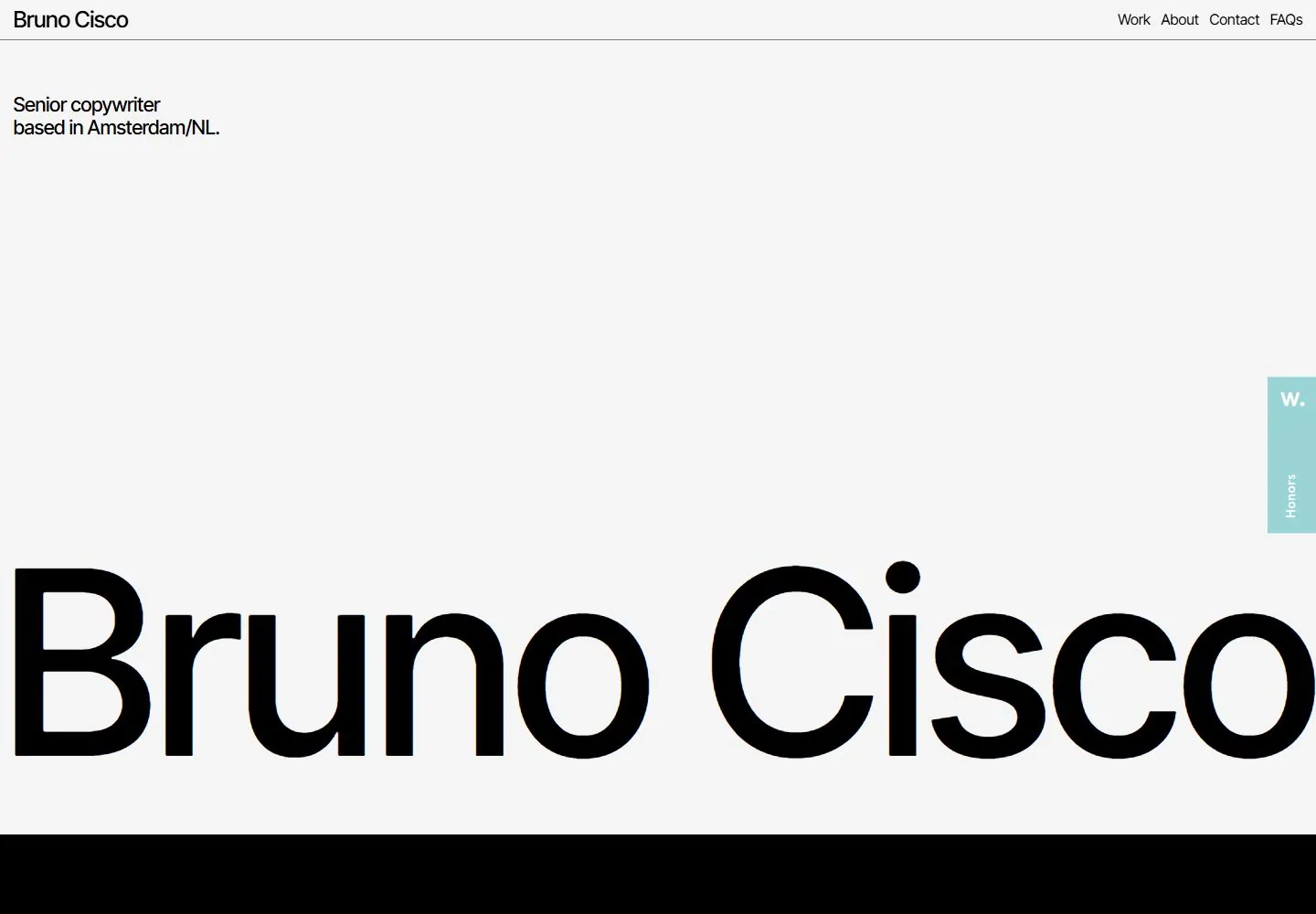
Live capture at 1440px, 2026-10-24
How it’s built
- Layout
- A nearly white page places a thin rule under a minimal header with the name at upper left, a short professional description beneath it, and work/about/contact/FAQ links at upper right. A vast blank interval separates the header from a huge black sans-serif name spanning the lower portion, cropped at the left edge; the lower letter edges remain visible with white space below.
- Type
- Small black sans-serif identity, bio and navigation at top; a very large lightweight black sans-serif name forms the dominant lower graphic. Font metrics are not measured from this gallery image.
- Color and surface
- White or very pale gray background, black type and one subtle horizontal rule. No images, cards, shadows or decorative color are visible.
- Components
- Minimal identity/navigation header, short description, oversized cropped name, large negative space.
What makes it work
- Broad pale negative space
- Small compact factual header
- Oversized identity as the main graphic mass
On a new subjectKeep navigation and factual context compact, then use a short oversized identity or category phrase as the main graphic element. Replace the individual identity and profession with unrelated content.
Prompts
Measured
H2282px / 500 / -5.64px
Body text16px
Page background#e9e9e9
Text color#000000
Page height10,467px
Computed CSS at 1440px, 2026-10-24.
Live behavior
- Today
- Bruno Cisco’s captured portfolio uses a thin header with the name at upper left and Work/About/Contact/FAQs at upper right. A role and Amsterdam location sit near the upper left of the white hero, while an oversized “Bruno Cisco” wordmark fills the lower portion above a black section. Desktop t0 reads “Senior copywriter based in Amsterdam/NL”; desktop t2 and the hover-labeled image read “Associate creative director based in Amsterdam/NL.” Desktop-scroll at y=750 shows an oversized white paragraph beginning “By the end of the day, you’ll have seen 5,000 ads.” Tablet and phone scale the wordmark and show the black paragraph below; ordinary phone’s role is Associate creative director, while the fresh reduced-motion capture shows Senior copywriter. The gallery reference shows a separate “Senior creative” role line.
- Responsive
- Desktop is 1440×1000 with a 1440×10467 document; desktop-scroll records actual y=750. Tablet is 768×1024 with a 768×8098 document. Phone and reduced-motion phone are 390×844 with 390×9792 documents. At tablet and phone widths the large wordmark and black introductory section stack vertically; tablet uses a plus/Open Menu control. Animation samples are 3 on desktop and phone, and 5 on tablet. Captures do not establish breakpoints.
- Scroll
- The desktop-scroll screenshot records actual scrollY 750 in a 1440×10467 document. It shows a large white-on-black paragraph about the number and quality of ads, followed by text about earning an audience and making a brand readable, clickable and watchable. This saved position does not test navigation or establish sticky behavior.


