
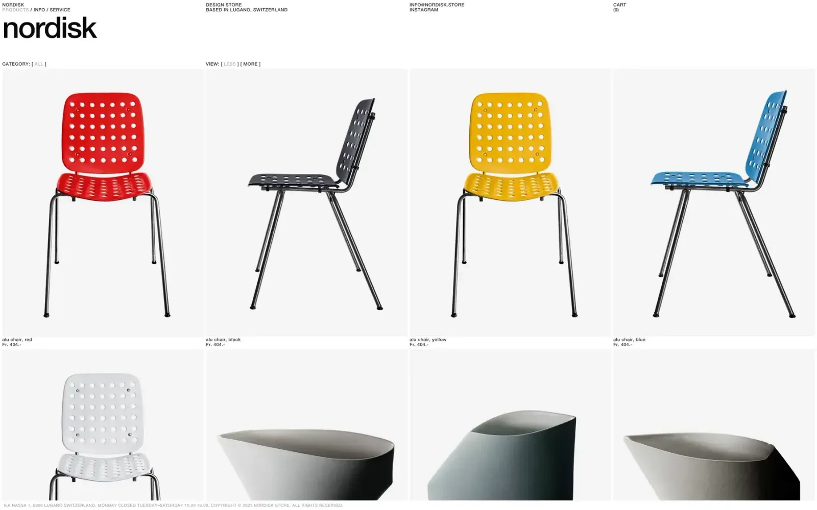
Screenshot from Httpster, saved 2026-10-24
How it’s built
- Layout
- Minimal white storefront with oversized black lowercase wordmark at upper left and tiny utility/location text distributed across the top edge. Small category/view controls sit just above a four-column product grid. The first row shows chairs front and side views in red, black, yellow and blue; next row begins below. Small labels and prices sit under each tile; tiny shop/copyright line runs along the bottom.
- Type
- Oversized heavy lowercase sans wordmark; utilities and category labels are very small uppercase sans; product labels/prices are compact and understated.
- Color and surface
- White background and very pale gray image fields; products supply saturated red, yellow and blue accents alongside black, white and gray. Divisions are minimal and square-edged, without card shadow or decoration.
- Components
- Wordmark, compact contact/address/cart links, category and view filters, four-column product image grid, captions/prices and bottom information line.
What makes it work
- Repeated aligned product images
- Consistent column grid
- Small identifying captions/prices
- Restrained white framing
On a new subjectPresent comparable examples in a consistent grid with concise labels and relevant sorting categories. Replace chair imagery and product-specific details with the new subject's items.
Prompts
Create an original visual direction for {{website_name}} in {{industry}}, for {{audience}}, presenting {{content}} and supporting {{functionality}}. Composition invariant: Set a neutral specimen/catalog page with compact controls above a row of equal-width pale image fields. Center each relevant item within its field and place a tiny aligned caption directly below; repeat the rhythm on following rows. Typography: Make the identity more visible than the tiny utility labels; keep item names and secondary details in a compact readable sans hierarchy. Palette and contrast: Pair a white page with soft gray specimen fields and dark text; let new item imagery provide any accent color. Image and component hierarchy: Use subject-appropriate products or objects from {{content}} only when that fits {{industry}}; otherwise present relevant samples or records with generous empty surround. Visual estimate from the supplied reference, not measured CSS: Visual estimate: four columns span nearly full width; images fill most of tiles; controls shallow and captions tiny. Adjust this relationship to content and screen size; do not copy pixels. Variables: replace the source name, writing, industry-specific objects, people, images, colors and controls with original material for {{website_name}}, {{industry}}, {{audience}}, {{content}} and {{functionality}}. Keep the composition rule, not the source's identity or subject matter. Never make a source logo, product, person, artwork or exact text essential to either the image or page. Do not infer a font family, software framework, CSS value, motion or tested control behavior from a still. Continue the system into appropriate sections using the new content's real hierarchy rather than adding unrelated decoration. Reduce columns while keeping item-to-caption association; avoid shrinking labels until they are hard to read.
Implement a responsive page for {{website_name}} in {{industry}} for {{audience}}, with real {{content}} and working {{functionality}}. Wide-screen structure: Set a neutral specimen/catalog page with compact controls above a row of equal-width pale image fields. Center each relevant item within its field and place a tiny aligned caption directly below; repeat the rhythm on following rows. Type hierarchy: Make the identity more visible than the tiny utility labels; keep item names and secondary details in a compact readable sans hierarchy. Surface treatment: Pair a white page with soft gray specimen fields and dark text; let new item imagery provide any accent color. Component and image roles: Use subject-appropriate products or objects from {{content}} only when that fits {{industry}}; otherwise present relevant samples or records with generous empty surround. Visual estimate from the supplied reference, not measured CSS: Visual estimate: four columns span nearly full width; images fill most of tiles; controls shallow and captions tiny. Adjust this relationship to content and screen size; do not copy pixels. Variables: replace the source name, writing, industry-specific objects, people, images, colors and controls with original material for {{website_name}}, {{industry}}, {{audience}}, {{content}} and {{functionality}}. Keep the composition rule, not the source's identity or subject matter. Never make a source logo, product, person, artwork or exact text essential to either the image or page. Do not infer a font family, software framework, CSS value, motion or tested control behavior from a still. Continue the system into appropriate sections using the new content's real hierarchy rather than adding unrelated decoration. Reduce columns while keeping item-to-caption association; avoid shrinking labels until they are hard to read. Use semantic text and meaningful image descriptions. Keep each item label with its item, and give interactive controls clear accessible names, keyboard operation and visible focus. Build the requested functionality as working new behavior; static reference controls remain unverified.
Live behavior
- Today
- No current-site visual state was captured. The original URL attempt did not render in the dated pass; see evidence_gap and the directly bound zero-state log.
- Responsive
- Not assessed: the original URL did not render from this capture environment on 2026-11-02.
- Scroll
- Not assessed: no current-site scroll state was captured.


