
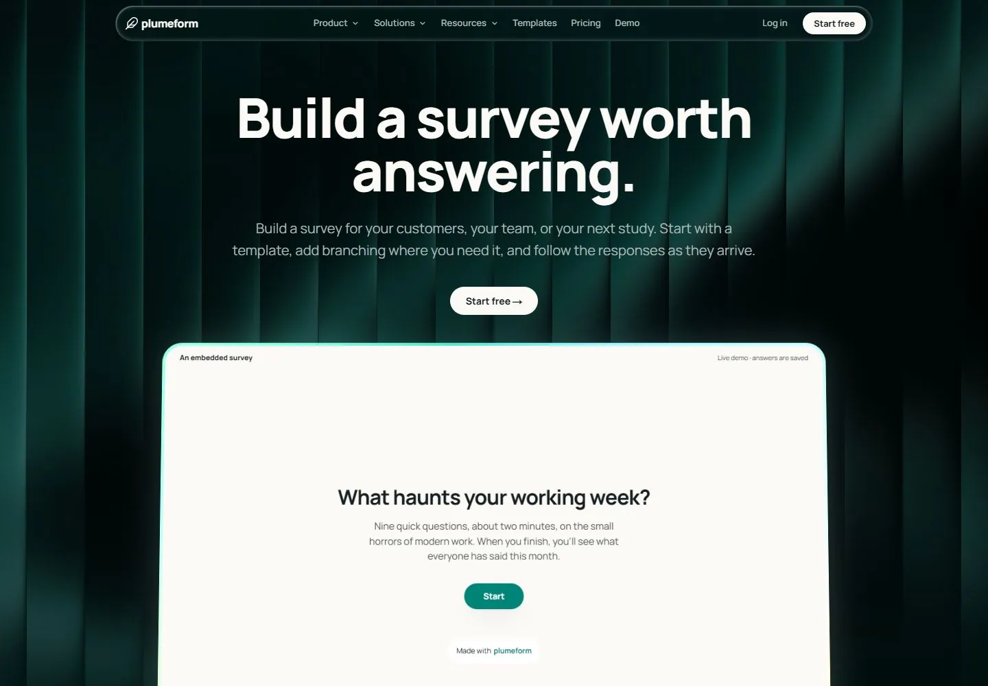
Live capture at 1440px, 2026-10-24
How it’s built
- Layout
- A near-black green opening uses softly lit irregular vertical rib/curtain-like strips as the field. A long thin rounded header capsule sits above a centered large white two-line headline, gray support and small pale pill action. A huge warm-white rounded embedded-content panel begins below with a subtle bright rim, small top context labels and its own centered smaller question/body/teal action. A tiny Hero chip at lower left has uncertain membership.
- Type
- Bold clean white sans outer headline, subdued gray sans support and compact nav; the inset uses smaller bold dark sans question and lighter body text. Exact faces unknown.
- Color and surface
- Deep green/black ribbed shading, restrained translucent-looking header edge, warm-white inner panel with cyan/yellowish rim light and teal inset action.
- Components
- Capsule navigation, dark ribbed hero, centered title/action, large contrasting rounded embedded panel and nested question/action.
What makes it work
- Dark softly lit vertical-rib surface
- Large centered white outer headline and restrained support
- Large pale rounded inset with fine luminous rim
- Smaller dark question/action hierarchy inside inset
On a new subjectFor a regional emergency-preparedness service, place a bold white preparedness message over a dark green ribbed field, then embed a large pale rounded readiness-check panel with a fine luminous rim, smaller question text and a teal start action. Replace survey-brand content and verify the assessment flow separately.
Measured
Fonts loadedManrope, Manrope Fallback, Instrument Serif Fallback
H180px / 800 / -2px
Body text16px
Page backgroundlab(98.1701 -0.0120103 1.90748)
Text colorlab(10.7916 -4.00715 -2.65618)
Page height16,766px
Computed CSS at 1440px, 2026-10-24.
Live behavior
- Today
- Very dark teal/black ground with luminous vertical fluted bands, a translucent dark capsule navigation bar and large tight white sans title centered above muted copy and a white pill action. A large warm-white rounded demonstration panel has a bright cyan/yellow-green rim and soft glow. Below, the page opens into a warm near-white field with centered dark text.
- Responsive
- Hero title changes80px/78.4px at desktop to60px/58.8px tablet and49.6px/48.608px phone; weight800, letter-spacing remains about-0.025em. Supporting copy changes20px/32.5px to18px/29.25px phone and wraps into more lines. Header changes from1104px wide at x168 to358px at x16 on phone; narrow navigation uses a menu icon, tablet keeps Log in while phone does not visibly show it. The demonstration panel fits between narrow side margins and continues below the viewport; its internal question is partly clipped on phone.
- Scroll
- At actual scrollY750 the capsule header remains at y8 over the departing demonstration panel. Warm-white space follows with a small centered link and a large two-line dark section heading; its local48px/50.4px typography and a separate9px PRO badge are measured. The heading aggregate includes PRO, but the badge must not inherit the48px typography. The demonstration interior remains screenshot evidence without matching main-document samples for its large question.


