
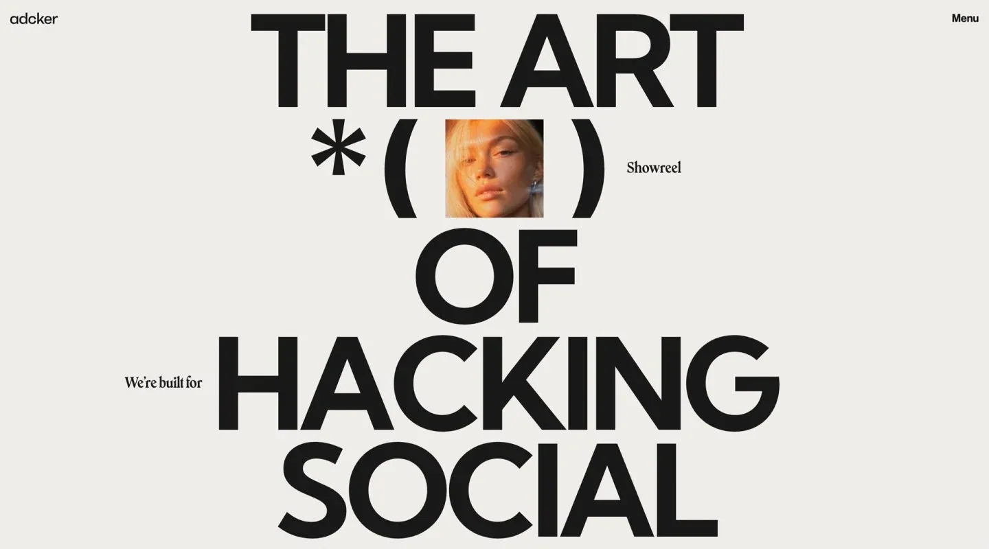
Screenshot from Minimal Gallery, saved 2026-10-24
How it’s built
- Layout
- Pale gray canvas with tiny lowercase mark upper left and Menu upper right. Very large black uppercase type stacks vertically through center, with a small square portrait embedded within punctuation-like glyphs and tiny serif labels placed beside the display statement. The final line reaches near lower edge.
- Type
- Oversized bold geometric sans headline as primary composition; tiny serif phrases serve as counterpoint. Asterisk and parentheses function as typographic framing. No exact metrics or family known.
- Color and surface
- Near-white gray ground, black text and symbols, warm portrait image as sole color accent. Flat, unboxed surface with no visible shadows.
- Components
- Small identity and menu, gigantic multi-line statement, typographic symbols, inserted square portrait, small side labels.
What makes it work
- Oversized stacked statement
- Strong negative space around glyphs
- Small image embedded in composition
- Minimal corner navigation
On a new subjectMake one short, bold statement the central visual structure and use a small related image within it. Preserve the scale contrast; replace advertising-specific message and imagery.
Live behavior
- Today
- The live page presents an off-white canvas with a small adcker wordmark at upper left and “Menu” at upper right. The central composition uses enormous black uppercase text, “THE ART OF HACKING SOCIAL,” arranged around a star, large parentheses, and a small square portrait/video tile labeled “Showreel”; small phrases “We’re built for” and “Showreel” flank the typography. Desktop t0/t2/hover and desktop-scroll retain this opening composition, with the small media tile showing different frames. Tablet and ordinary phone scale the same type-and-image composition down. The fresh reduced-motion phone image instead shows a centered crop of parentheses, a small image, and “88%,” with the main headline absent.
- Responsive
- Desktop uses a 1440×1000 viewport and viewport-sized 1440×1000 document; all desktop states report actual scrollY 0. Tablet is 768×1024 with a viewport-sized document. Ordinary and reduced-motion phones are 390×844 with viewport-sized documents. Animation samples are 1, 0, 2, 0, 0, 3, and 0 for desktop t0/t2/hover/scroll, tablet, phone, and reduced phone respectively. The measurements do not identify what animates or explain the reduced-load image.
- Scroll
- The desktop-scroll image is measured at actual scrollY 0 in a viewport-sized 1440×1000 document. It retains the same “THE ART OF HACKING SOCIAL” opening composition, so it does not show a lower page section or establish scroll behavior.


