
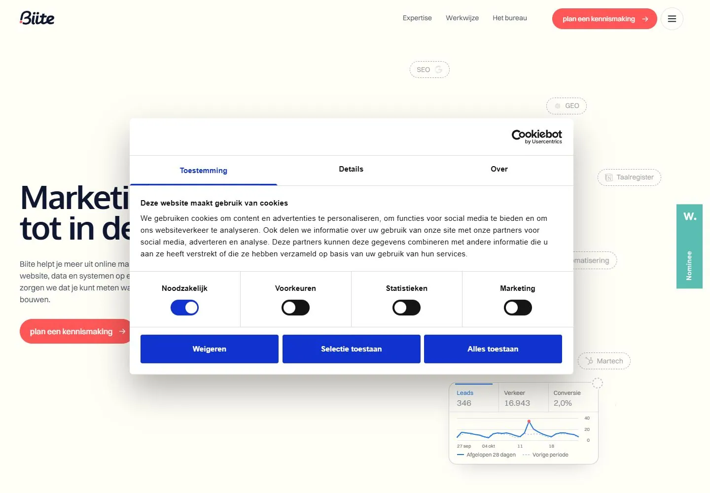
Live capture at 1440px, 2026-10-24
How it’s built
- Layout
- Within the red-edged monitor display, a white page has small identity/nav, a large two-line dark headline and short copy at left, a thin connected map of rounded service labels at right, and a compact metrics chart with handwritten note low right. Monitor, bezel and stand are staging.
- Type
- Large bold dark sans headline, smaller gray body and quiet rounded labels; small red action, blue chart line and handwritten annotation. Exact type metrics unknown.
- Color and surface
- White page, navy type, pale gray connectors/pills, small red action, blue chart and green check. Outer monitor is framing.
- Components
- Compact header, left promise/copy/action, connected service-label diagram, small chart/metric card and annotation.
What makes it work
- Spacious white page and restrained header
- Large left headline with concise support/action
- Thin connected diagram of rounded labeled nodes
- Compact chart/metric card with small annotation
On a new subjectFor a public transit accessibility office, use a spacious white page with a large access promise, a thin connected diagram of rider services and a compact chart of sourced accessibility progress. Replace marketing labels; keep diagram and chart distinct and test links separately.
Measured
Fonts loadedSchoolbell, Switzer, Oxygen
H166.24px / 700 / -2.6496px
Body text16px
Page background#fffef7
Text color#101731
Page height5,409px
Computed CSS at 1440px, 2026-10-24.
Live behavior
- Today
- Warm ivory ground, dark navy sans display, coral capsule actions and small circular menu. A right-side diagram uses thin pale connector lines, dashed capsule labels, small colored marks and a white rounded line-chart card with a handwritten navy annotation. A very large white/blue consent dialog covers the central composition, leaving only edge fragments of the main statement visible.
- Responsive
- Desktop and tablet raw hero grids have two tracks with48px and32px gaps respectively; phone grid has one335px track and44px gap. These are measurements of an obscured underlying layout, not proof of a visible phone design. Tablet removes the visible link row while retaining the coral top action and menu. On phone, consent occupies nearly the full viewport, with vertically stacked preference rows and three full-width actions. The page title/navigation underneath cannot be meaningfully inspected there.
- Scroll
- Actual scrollY750 moves the underlying diagram/card upward and reveals edge fragments of a large quote plus a lower section heading. Consent remains fixed over the center. The quote samples are51.84px/53.3952px Oxygen at weight400, while the visible lower heading is34.56px/37.3248px. Their full text/layout remains partly hidden. A small top coral action/menu remains visible, but no complete header-scroll rule is established.


