
Live capture at 1440px, 2026-10-24
How it’s built
- Layout
- Equal full-height photographic halves: grayscale close face and warm sea/birds; white mono-like uppercase phrase spans seam, sparse white header and pale cart control.
- Type
- Medium white uppercase monospaced-looking phrase across the middle; small tracked utilities and compact sans identity.
- Color and surface
- Two contrasting photographic halves: grayscale face and warm sea scene, with white typography and a pale cart surface.
- Components
- Sparse top navigation, split imagery, midline statement, cart/account cue and small round chat-like control.
What makes it work
- Equal contrasting photographic halves united by a restrained white monospaced-looking midline statement.
On a new subjectFor a coastal archaeology exhibition, pair a grayscale artifact detail with a warm shoreline photograph and bridge them with a restrained white midline sentence.
Measured
Fonts loadedDiatype, Diatype Semi-Mono
H114px / 400 / -0.14px
Body text14px
Page background#ffffff
Text color#000000
Page height4,875px
Computed CSS at 1440px, 2026-10-24.
Live behavior
- Today
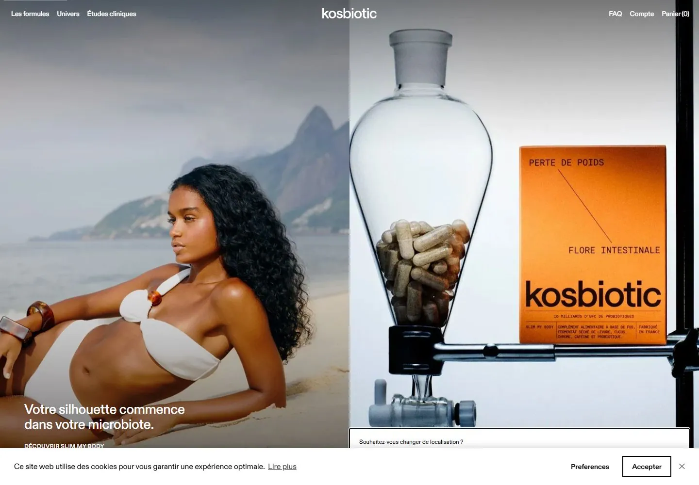
- The desktop opening view is split into two full-height photographic panels: a woman seated at a beach with the French headline “Votre silhouette commence dans votre microbiote.” on the left, and a large clear bottle with an orange Kosbiotic product box on the right. Small French navigation sits along the top with the Kosbiotic wordmark centered. A cookie consent bar covers the bottom edge, while a location prompt is partially visible above it. At actual desktop scrollY 750 the lower hero gives way to a scenic bay and French explanatory copy. Tablet and phone show the woman/beach image as the main composition with a compact Menu/Kosbiotic/Panier header. The tablet capture includes cookie and location prompts near the bottom; the two phone frames show the cookie panel, with no location prompt visible.
- Responsive
- Desktop is 1440×1000 with a 1440×4875 document; tablet is 768×1024 with a 768×7039 document; ordinary and reduced-motion phone are 390×844 with 390×5885 documents. Desktop t0/t2/hover and both phone states report zero sampled animation entries; desktop-scroll reports 15, while tablet reports zero. Desktop first view has a split image composition; tablet and phone show the beach image with the product panel not visible in the viewport. These captures do not establish breakpoints.
- Scroll
- The desktop-scroll frame is measured at actual scrollY 750 in a 1440×4875 document. The top of the screenshot shows the lower portion of the beach hero with the French headline; below it appears a scenic bay and French philosophy copy. The cookie banner remains overlaid along the bottom. This single frame does not establish sticky behavior or the scroll mechanism.


