
Live capture at 1440px, 2026-10-24
How it’s built
- Layout
- A shallow white header sits above a dense irregular image catalog. A broad central tile is flanked by narrower tiles; caption baselines and image heights vary, with more tiles entering below.
- Type
- Small plain black sans identity, links and captions, with muted gray inline tags; no large editorial headline.
- Color and surface
- White page, black text and gray tags; imagery supplies most color. Images have square corners and narrow white gutters.
- Components
- Small left identity, centered monogram, right contact/navigation, unequal project images with captions and a small dark corner filter cue.
What makes it work
- An unequal modular image catalog with small direct captions and a very shallow utilitarian header on white.
On a new subjectFor a geological specimen archive, show unequal square-corner specimen images with plain captions, narrow gutters and a shallow contact/index header.
Measured
Fonts loadedkGKWJBAwqz
Body text14.5px
Page backgroundtransparent
Text color#000000
Page height1,498px
Computed CSS at 1440px, 2026-10-24.
Live behavior
- Today
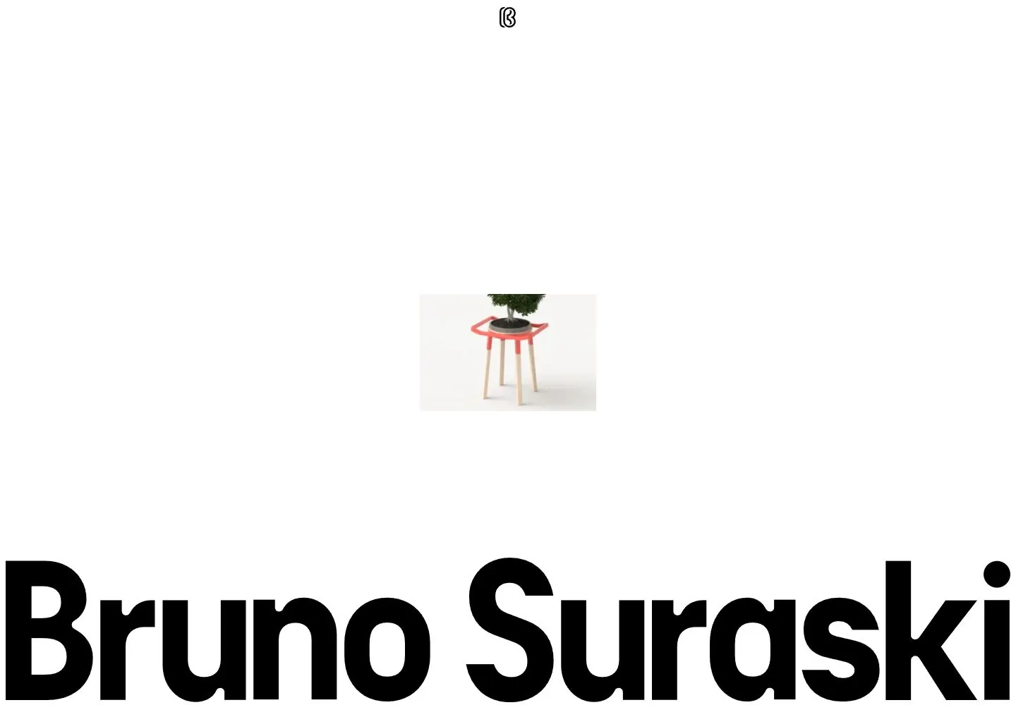
- Bruno Suraski’s captured portfolio opens with a small “Industrial Designer / Bruno Suraski” label at upper left, a centered monogram, and email plus Projects/About at upper right. A tight asymmetrical grid fills most of the viewport with project imagery and compact captions, including “JEEP CMF,” “Infracommerce Logistics,” “Bonsai,” “Nylon Bubble,” and “Additive Vision Animation.” The desktop t0 and t2 frames appear materially the same; the hover-labeled frame shows a different crop/frame inside the Jeep project tile while other visible panels remain similar. At y=750, the viewport shows further project tiles. Tablet preserves a multi-column grid; ordinary phone stacks the projects in a single column. The fresh reduced-motion phone image is a white screen with a centered blue square graphic and a large cropped “Bruno” wordmark.
- Responsive
- Desktop uses 1440×1000 with a 1440×4347 document; desktop-scroll is actual y=750. Tablet is 768×1024 with a 776×2971 document, eight pixels wider than its viewport. Phone and reduced-motion phone are 390×844 with 390×10563 documents. Tablet retains several project columns; ordinary phone stacks cards vertically. The reduced-motion reload shows a separate logo-like composition. All sampled states report zero animation entries; these measurements do not explain the logo frame or establish breakpoints.
- Scroll
- The desktop-scroll state records actual scrollY 750 in a 1440×4347 document. It shows additional grid content, including Additive Vision Animation, Smileys Balloons, Energy Solutions Interactive Model and a close-up phone-on-table project image. This saved position does not test card navigation or sticky behavior.


