
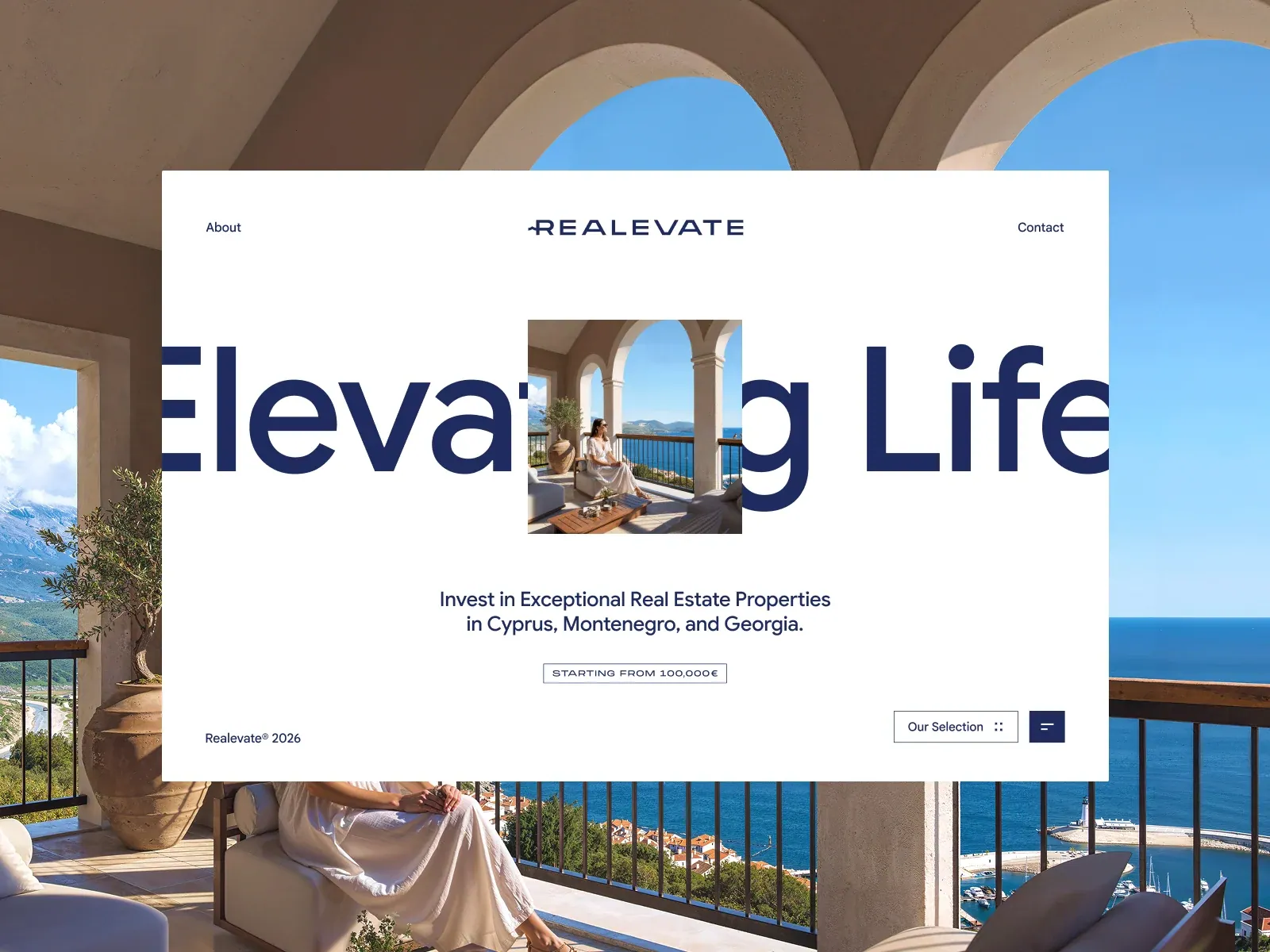
Gallery screenshot, saved 2026-10-24
How it’s built
- Layout
- A white rectangular page is centered over a full-bleed coastal villa photograph. Within it, compact About/Contact flank centered REALEVATE mark. Huge dark-blue two-word proposition stretches across the middle and is interrupted by a small lifestyle photo. Below are centered support copy and a narrow outlined starting-price label; copyright lower left and selection/menu controls lower right. The outer villa image may be site backdrop or gallery presentation.
- Type
- Large heavy dark-blue sans proposition, compact simple navigation/support and narrow tracked uppercase price label. Exact metrics and face unknown.
- Color and surface
- White in-panel field over warm stone, blue sky/sea. Navy type, fine gray-blue offer outline and muted support. External photo is an uncertain layer.
- Components
- White page panel, identity/navigation, giant proposition interrupted by small photo, support, price label, copyright and lower-right controls.
What makes it work
- Bright clean page
- Oversized proposition
- Small image interrupts the proposition
- Concise supporting explanation
On a new subjectPresent an unrelated proposition on a bright field, punctuate it with a small subject-relevant image, then add concise support and optional factual label. Do not assume an external backdrop.
Live behavior
- Today
- Realevate’s live capture is a restrained white real-estate landing screen. A small navy REALEVATE wordmark sits at top center between About and Contact. Oversized navy “Elevating Life” lettering stretches beyond the viewport with a centered photograph of a woman on a sea-view terrace layered over it. Below are a two-line investment statement, a thin outlined “STARTING FROM 100,000€” label, a copyright notice and “Our Selection” plus a square menu control. Tablet retains the same centered composition at reduced scale. Phone shows the wordmark, cropped oversized text behind the terrace image, statement, price threshold and selection/menu controls. The separate reduced-motion phone capture shows the wordmark and photo plus menu/copyright, but lacks the headline, statement and selection controls. The selected gallery image includes an exterior architecture background around a white panel, unlike the captured white page.
- Responsive
- Desktop, tablet and phone measurements are viewport-sized: 1440×1000, 768×1024 and 390×844, all at scrollY=0. The oversized headline and centered terrace photograph persist across the sampled widths; supporting investment copy and the selection/menu controls fit beneath on desktop, tablet and ordinary phone. The fresh reduced-motion phone frame retains the wordmark and photo but omits that copy and the selection control. These captures do not establish breakpoints or the reason for the separate-load difference.
- Scroll
- The state named desktop-scroll measures a 1440×1000 document and actual scrollY=0. It matches the desktop hero composition rather than a lower section; no scroll behavior or below-fold content is established.


