
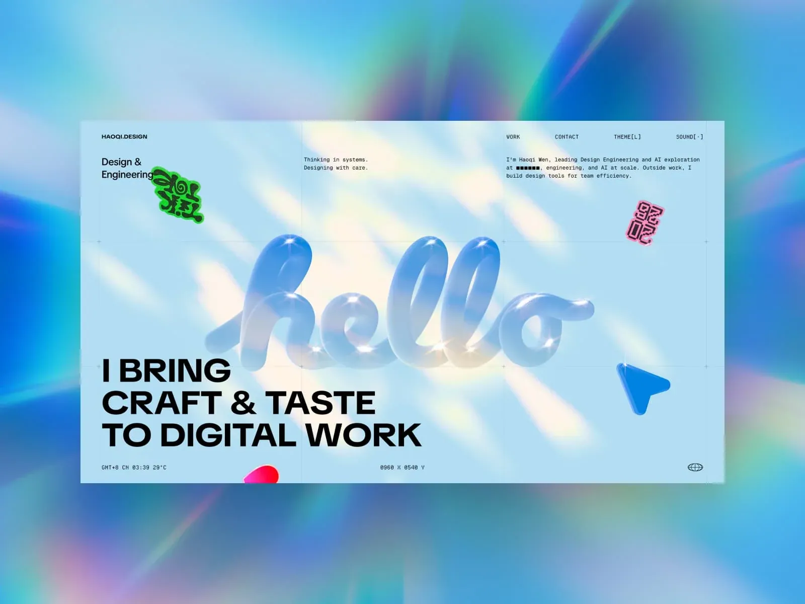
Gallery screenshot, saved 2026-10-24
How it’s built
- Layout
- A pale-blue page sits over a soft saturated blue/teal surround. A slim top row splits identity/role, short note, navigation and bio. A translucent inflated-looking wordform fills the center behind a bold black three-line statement at lower left. Small sticker-like graphics and tiny technical-looking labels punctuate the page. Outer surround is framing.
- Type
- Bold sans statement; compact monospaced-looking labels and bio; sculptural translucent letterform. Exact font and metrics unknown.
- Color and surface
- Pale cyan page, black type, translucent blue-white central lettering and colorful accents; saturated outer surround excluded as likely framing.
- Components
- Three-zone information row, central sculptural graphic, large lower-left proposition, decorative accents.
What makes it work
- Pale page
- Large sculptural graphic
- Oversized lower proposition
- Compact peripheral information
On a new subjectFor a public-science literacy campaign, place a bold lower-left statement across a new translucent central form, add a few science-related sticker-like accents and compact factual metadata, and retain the pale bounded field. Replace the source wordform, identity and claim.
Live behavior
- Today
- The live captures show a pale blue full-viewport canvas overlaid with a fine modular grid and small crosshair marks. A huge glossy blue 3D “hello” word and a blue cursor-like object occupy the center; a heavy black three-line “I BRING / CRAFT & TASTE / TO DIGITAL WORK” headline anchors the lower-left area. At the top, the HAOQI.DESIGN identity sits left, with WORK, CONTACT, THEME and SOUND controls aligned to the right; two short positioning lines and a monospace bio fill the center and right columns. Tiny time/weather and coordinate readouts sit along the bottom.
- Responsive
- At 1440x1000 the first view uses a three-part horizontal text layout above the headline and central 3D word. At 768x1024 the headline moves to the top and shrinks while the 3D word and bio stack vertically; the logo and a hamburger icon are visible. At 390x844 the same stack remains, with the headline at 28.08px and 36px line boxes, followed by the 3D word and bio; the mobile capture shows the logo and hamburger. Each measured document matches its viewport dimensions, with no measured overflow. desktop-t0: viewport 1440x1000; document 1440x1000; measured scrollY 0; reduced_motion false; 0 sampled animation entries. tablet: viewport 768x1024; document 768x1024; measured scrollY 0; reduced_motion false; 0 sampled animation entries. mobile: viewport 390x844; document 390x844; measured scrollY 0; reduced_motion false; 0 sampled animation entries.
- Scroll
- The file named desktop-scroll remains measured at scrollY 0 and document size 1440x1000. Its screenshot shows the same first-view composition with changed floating decorations and 1430 x 0990 Y coordinate text, not a scrolled page section. The sampled document has no measured vertical scroll range, so lower-page content and scroll-triggered states are unobserved. desktop-scroll: viewport 1440x1000; document 1440x1000; measured scrollY 0; reduced_motion false; 0 sampled animation entries.


