
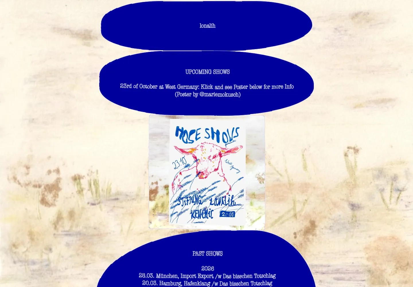
Live capture at 1440px, 2026-10-25
How it’s built
- Layout
- A painterly pale landscape fills the image behind deep blue irregular oval panels of small centered white serif text; a rectangular painted image appears below. No conventional controls visible; full UI unknown.
- Type
- Tiny centered white serif text.
- Color and surface
- Cream painterly texture, saturated deep blue ovals and muted painted image.
- Components
- Deep blue irregular ovals of small centered serif text overlay a pale painterly landscape.
What makes it work
- Pale painterly field
- Deep blue irregular oval panels with centered white serif text
- Rectangular painted image
On a new subjectFor a public poetry archive, place centered white serif excerpts in deep blue irregular ovals over a pale painterly landscape with a rectangular painted image.
Prompts
Create an original event homepage for {{website_name}} in {{industry}} speaking to {{audience}}. Invariants: Organize {{content}} and make useful {{functionality}} discoverable. Preserve the live screenshot’s centered vertical sequence: a textured pale ground; broad irregular cobalt bands carrying small centered section names and event details; one portrait poster interrupting those bands; and the next section beginning below it. Visual estimate at 1440x1000: the narrow center column is a little over half the viewport width; blue shapes occupy roughly half of the visible area; the poster is about one quarter of viewport width. Matching live DOM measurements record the visible poster image as a 398x398px rectangle at x521/y400; this is the current poster element’s actual measured box, not a target for every subject. Typography hierarchy is essential: small pale serif-like labels inside large saturated forms, then separate expressive lettering within the poster. Surface relationship: warm off-white paper texture behind deep blue, with the poster’s own white field and hand-drawn color. The middle image must interrupt the rhythm, not become a card beside text. Variables: adapt subject-appropriate color, organic form, poster content, section labels, and event actions to {{website_name}}, {{industry}}, {{audience}}, {{content}}, and {{functionality}}, while keeping band-to-poster hierarchy. Prohibitions: no source identity, event copy/date, animal drawing, or poster artwork; do not claim the visible design has particular scroll or animation behavior. Responsive proposal: keep the column centered, reduce poster size, let bands narrow, and maintain generous side margins without horizontal overflow.
Implement a responsive event or release page for {{website_name}} in {{industry}} for {{audience}}, with {{content}} and working {{functionality}}. Preserve the selected page’s Invariants: geometry: one centered vertical column on a textured light surface; big irregular saturated bands for small event headings and compact notices; one central poster image breaking up the information bands; following content continues beneath the fold. Screenshot-estimated column width is around 52% of the 1440px viewport and the poster around 25% of viewport width. The matching 1440x1000 live DOM measurement reports the poster image rect as 398x398 at x521/y400; see research/evidence/div2-0008/measurements-desktop.json. Treat that as a measurement of this current live image only. Do not infer a general poster size from it. Use new palette and original poster art/content suited to {{website_name}}, {{industry}}, {{audience}}, {{content}}, and {{functionality}}, while preserving contrast between warm textured ground and bold band forms, small centered labels, and the interrupting image. Choose fonts and implementation tools for the new project; the reference family and technology are unknown. No motion, scroll transition, or hover was tested, so don't claim those as reference facts. You may implement appropriate new links or controls for {{functionality}}. Variables: adapt event details, poster art, labels, palette, and actions while retaining the central image interrupting the stacked bands. Prohibitions: do not copy source identity, poster artwork, or wording, and do not claim unknown font, technology, or behavior as observed. Responsive proposal: bands fit screen width, poster scales without losing legibility, and sections remain a single readable sequence. Add semantic headings, descriptive image text, keyboard-accessible actions, focus indication, and sufficient text contrast.
Measured
Fonts loadedAmerican Typewriter Condensed
Body text16px
Page backgroundtransparent
Text color#000000
Page height1,000px
Computed CSS at 1440px, 2026-10-25.
Live behavior
- Today
- A pale, mottled paper-like background frames a centered vertical sequence of vivid cobalt panels with irregular rounded silhouettes. A small “lonalih” identity sits in the first panel; an UPCOMING SHOWS heading and centered event copy sit in the next. A square illustrated gig poster follows, then a larger PAST SHOWS panel with a compact chronological list. White condensed type contrasts sharply with the blue panels.
- Responsive
- The same centered panel sequence appears at the captured 768px tablet and 390px phone widths, with the cobalt shapes and poster spanning most of the available width. The measured American Typewriter Condensed declaration is 21.6px on desktop, 28.8px at tablet and 14.625px on phone. The tablet screenshot reaches only the upper part of the poster; phone screenshots include the beginning of the past-show list, whose measured text box extends below the 844px viewport. These observations cover only the captured widths.
- Scroll
- The desktop scroll-labeled capture records scrollY 0 in a 1000px document and matches the opening composition; it does not demonstrate a scroll transition. The tablet and both phone captures also record scrollY 0. The phone past-show text box extends below the screenshot edge, so the full list is not claimed as visible.


