
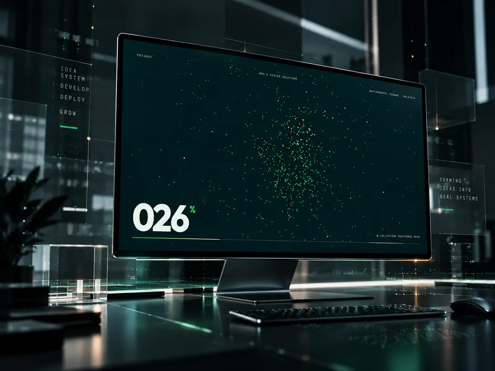
Gallery screenshot, saved 2026-10-24
How it’s built
- Layout
- Gallery image depicts a monitor within a dark glass-like studio environment. Inside its screen is a dark green-black field with a central cloud of green/white points, thin rules and small technical labels; “026%” appears in large white type at lower left with a green percent mark, and a small “collecting scattered data” label sits lower right. Separate floating text panels outside the monitor list service/process words at left and right. The monitor and surrounding plaques may be presentation framing rather than site layers.
- Type
- In-screen numerals are large bold sans; small technical labels are tracked monospaced-looking text. External plaques use small spaced uppercase. No face or metrics.
- Color and surface
- In-screen deep teal/black, green and white data-like points, white numeral and fine rules. The surrounding studio is near-black glass with reflected green highlights and pale floating labels; uncertain page relationship.
- Components
- In-screen field of points, sparse technical labels, large metric-like numerals and thin baseline; surrounding monitor and glass plaques.
What makes it work
- Dark in-screen field
- One data-like visual cluster
- One prominent numeric display
- Sparse technical annotations
On a new subjectFor an unrelated subject, pair one informative visual cluster with one clearly explained headline metric and sparse annotation on a dark field. Do not copy the unverified outer studio arrangement or imply a numeric meaning not supported by content.
Live behavior
- Today
- The Potadot home capture uses a pale cool-gray surface and a floating white pill navigation. The desktop hero places the large bold “Your digital transformation partner.” headline and explanatory copy on the left, with a green-toned particle sphere, a small Potadot/progress badge and scattered colored dots on the right. Rounded “Let’s talk” and “See our work” actions sit below the copy, with two compact proof chips and a WhatsApp control near the lower right. Tablet and phone frames stack the copy, particle graphic and actions. The selected gallery reference is a distinct dark green monitor scene and does not match the saved current hero.
- Responsive
- Desktop is 1440×1000 with a 12192px document; tablet is 768×1024 with a 15451px document; phone is 390×844 with a 16621px document. The desktop uses a two-column hero, while tablet and phone place the headline, body copy, particle illustration and actions in a vertical sequence. The saved widths do not establish breakpoint thresholds or a full responsive specification.
- Scroll
- The desktop-scroll state measures actual scrollY=750 in a 1440×12192 document. It shows the lower portion of the hero above a “WHO WE ARE” label and the large following statement beginning “Still running your business on Excel, paper and manual records?”


