
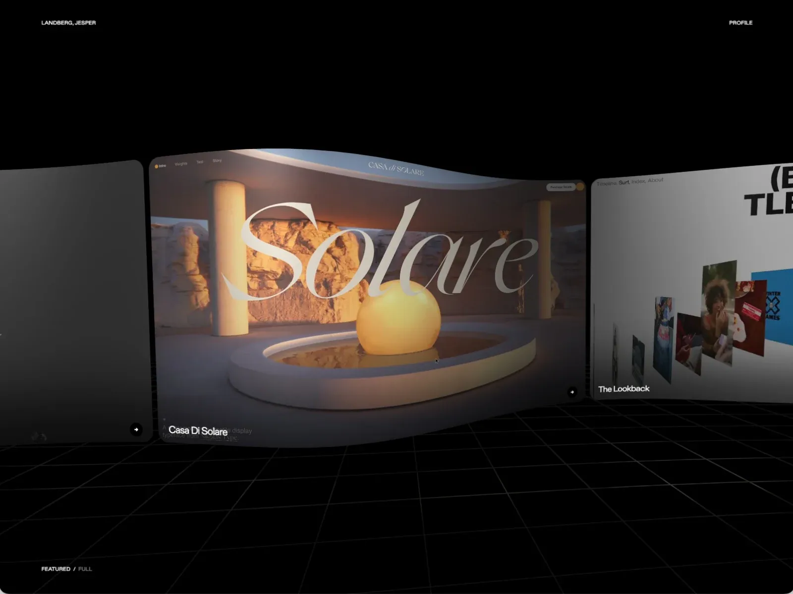
Gallery screenshot, saved 2026-10-24
How it’s built
- Layout
- Black page with small identity at upper left and PROFILE upper right. A large curved-edge project panel dominates center, showing warm architecture, sculptural glowing sphere and large fine serif title. Partial neighboring panels appear at left and right, including a loose collage on the right. A fine perspective grid covers the lower black area; small featured/full label near bottom left.
- Type
- Small uppercase sans navigation; huge thin high-contrast serif project title; smaller sans labels. Exact metrics/resolved face unknown.
- Color and surface
- Black stage and fine gray perspective grid; warm amber central image; pale title; neighboring light project panel with colorful samples.
- Components
- Identity/profile labels, featured center project surface, partial adjacent project surfaces, title, small next control, perspective grid and status.
What makes it work
- Dark stage
- Dominant featured project surface
- Partial neighboring work
- Compact identity/status labels
On a new subjectFeature one unrelated project while allowing adjacent work to peek in from the sides. Keep labels sparse and replace architecture and identity.
Live behavior
- Today
- Jesper Landberg’s captured portfolio uses a black full-screen canvas with a perspective gallery of large project panels above a fine perspective grid. A warm-toned “Casa Di Solare” architecture image and oversized high-contrast serif title dominate the center; other image-led projects sit to either side. “JESPER LANDBERG” and “PROFILE” anchor the upper corners, while “FEATURED / FULL” and “NEWSLETTER” sit near the bottom. Desktop t0, t2 and desktop-scroll show the same central project but different neighboring previews. Tablet preserves the horizontal gallery at a smaller scale. Phone changes to vertically stacked rounded project cards; the ordinary and reduced-motion phone captures show different card frames. The selected gallery reference is a distinct capture of the same gallery concept and is kept separate from live states.
- Responsive
- Desktop, tablet and phone measurements are viewport-sized: 1440×1000, 768×1024 and 390×844, each at scrollY=0. The desktop and tablet use a wide horizontal perspective gallery over a dark grid; phone presents a vertically stacked series of image cards with captions and circular arrow controls. These sampled widths do not establish breakpoints or interaction behavior.
- Scroll
- The desktop-scroll measurement is a 1440×1000 viewport-sized document at actual scrollY=0; its screenshot retains the gallery opening with Casa Di Solare centered. The filename does not represent a scrolled section, and no page-scroll behavior is established.


