
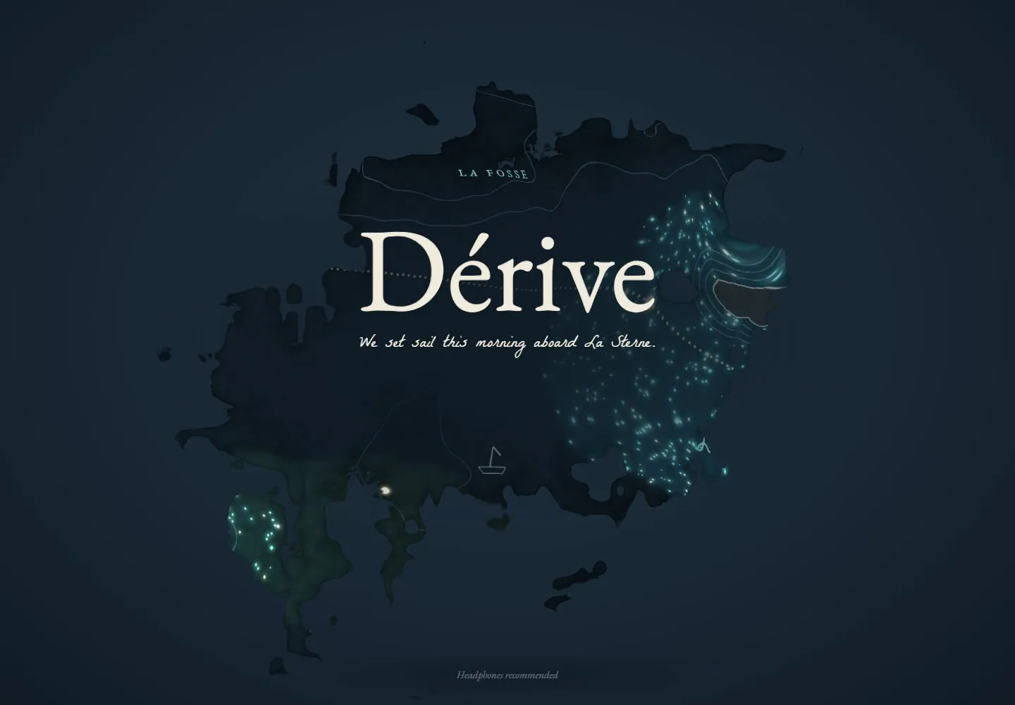
Live capture at 1440px, 2026-10-24
How it’s built
- Layout
- A broad ocean illustration or rendered sea fills a page-like landscape rectangle, with turquoise currents and many small pastel coral/rock forms around a tiny boat near center. A large elegant serif Dérive title and short French description sit at upper left, with a vertical set of voyage/navigation labels below. A postcard-like inset with map image and handwritten note overlays lower right; tiny links run along the bottom. A blurred turquoise surround sits outside the page rectangle and may be gallery framing.
- Type
- Large refined serif title, smaller serif descriptive text and compact menu labels; handwritten-style postcard note. Exact face/metrics unknown.
- Color and surface
- Bright turquoise sea, pastel coral/objects, brown boat, ivory type and pale postcard. Outer field is blurred sea-toned image and not confirmed page content.
- Components
- Title/description, vertical navigation, full-bleed ocean scene, lower-right postcard/map, tiny bottom links and small audio icon.
What makes it work
- Immersive illustrated or constructed scene as the primary visual field
- Concise title or description with a compact navigation layer
- A small focal object within the scene
- A secondary postcard-like information inset
On a new subjectFor an unrelated setting, use an immersive illustrated or constructed scenic field, concise title/navigation, a small subject-relevant focal object and a secondary postcard-like information inset. Replace the ocean, boat, map and copy; do not require the blurred outer field.
Measured
Fonts loadedDerive Titre, Derive Main, EB Garamond, La Belle Aurore
Body text16px
Page background#162430
Text color#eef6f4
Page height1,000px
Computed CSS at 1440px, 2026-10-24.
Live behavior
- Today
- A full-viewport illustrated maritime map combines pale cream, washed blue and green, contour lines, islands, hand-lettered labels and fine route lines. Centered over it is a very large dark serif Dérive identity, handwritten blue subtitle, sound entry with speaker icon, underlined silence option, tiny boat and small bottom caption.
- Responsive
- Tablet retains centered title and entry over a tighter map crop; phone retains the composition at smaller apparent title scale and trims the side artwork. The phone SVG glyph CSS remains 168px, so scaled on-screen bounds do not imply a 168px painted title.
- Scroll
- The attempted desktop scroll remains at actual scroll 0 with document 1440 by 1000 and an identical image; no lower page was observed.


