
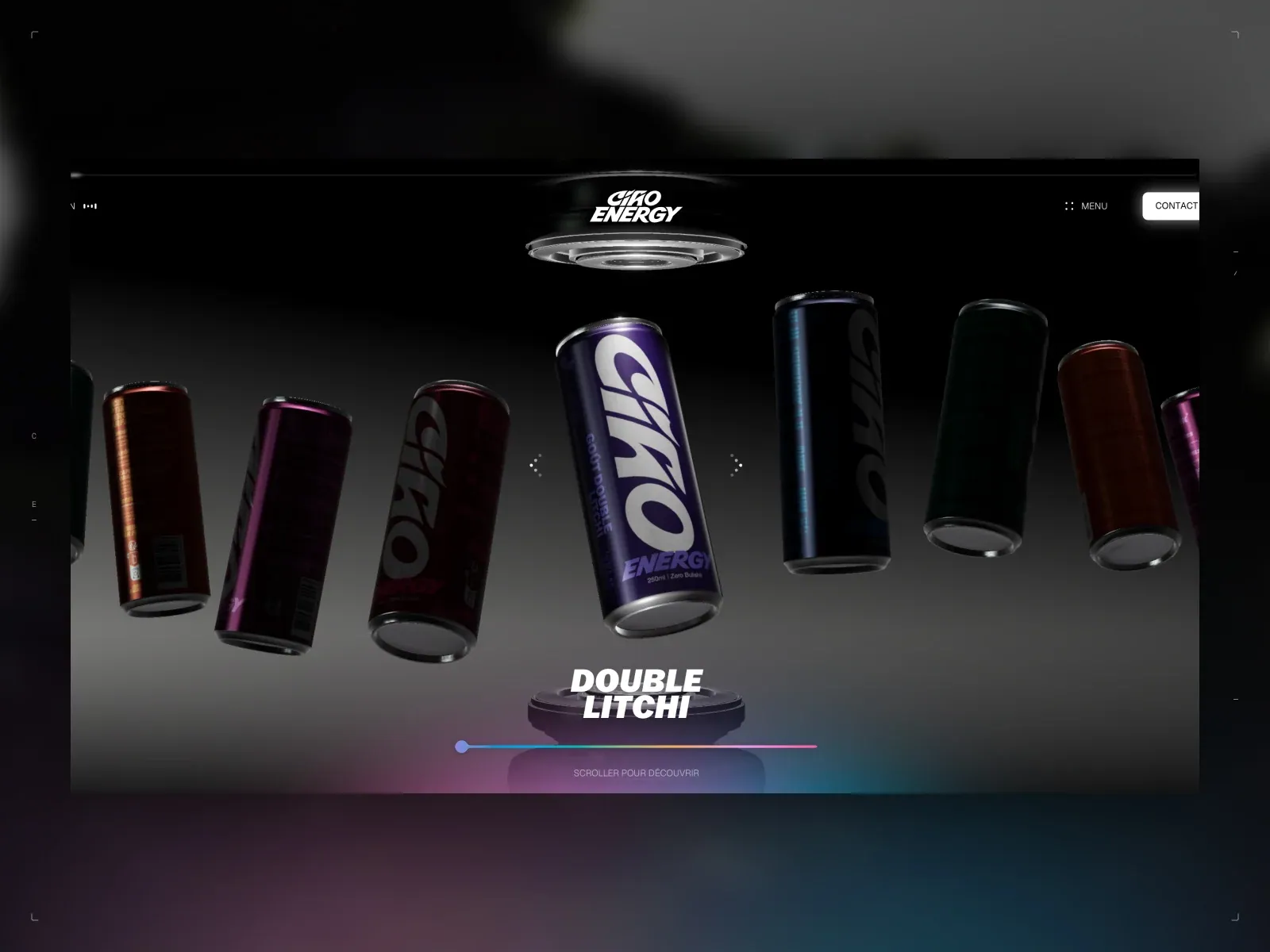
Gallery screenshot, saved 2026-10-24
How it’s built
- Layout
- A wide dark page panel is inset within a soft gray, blurred outer frame. Within the panel, a small centered Ciao Energy mark sits above a dramatic lineup of upright beverage cans floating at different angles over a dark reflective ground. A bright central can is most legible and largest. Near the lower center, bold italic DOUBLE LITCHI product text sits over a small pedestal, followed by a thin blue-to-pink gradient line and faint French scroll instruction. Compact menu/contact controls sit at upper right. The outer blurred frame is not assumed to be site background.
- Type
- Brand mark and nav are small white sans. Product flavor label is bold italic uppercase and much larger than the French instruction below. Exact face and metrics unknown.
- Color and surface
- Black-to-charcoal panel with restrained reflective highlights; colorful can labels punctuate it, while violet, blue and pink light washes the lower ground and gradient progress line. Outer gray blur is uncertain framing.
- Components
- Centered identity; compact top controls; floating product lineup; central product/flavor label; pedestal; gradient line and short instruction.
What makes it work
- Dark reflective display field
- Multiple products arranged as one central scene
- One clearly featured product or label
- Compact identity and utility links
On a new subjectFor an unrelated natural-history museum exhibition, arrange several distinct artifacts together in one cinematic dark display, make one artifact the focal item with a concise exhibition label, and keep venue identity/navigation compact. Preserve the grouped-object composition while replacing cans, flavor and brand.
Live behavior
- Today
- Across all six Oct 29 screenshots, the only captured visual state is a black screen with a centered, outlined vertical CIAO ENERGY mark and a percentage near the lower center. The saved frame labels are 88% at desktop t0; 99% at desktop t2, desktop-scroll, tablet and normal mobile; and 48% in the separate reduced-motion mobile fresh load. The frames do not show the hero, product scene, or other page sections. DOM text in the measurements includes later page copy, but that text is not visual proof that those sections rendered in the saved frames.
- Responsive
- Desktop screenshots at 1440x1000 (DPR 1), tablet at 768x1024 (DPR 1), and mobile at 390x844 (DPR 1) all show the loader only. Their measured document dimensions are respectively 1440x14057 at desktop t0/t2/scroll, 768x14181 at tablet, and 390x12077 for both mobile captures. These measurements describe the browser document; they do not establish visible responsive page layouts beneath the loader.
- Scroll
- The state labelled desktop-scroll records an actual window scrollY of 750 CSS px, with a 1440x1000 viewport and 1440x14057 document. Its screenshot still shows the 99% loader only. The measurement body text contains product and FAQ copy, but that text is not visible in the screenshot and does not support a claim about the page appearance or scroll transition.


