
Gallery screenshot, saved 2026-10-24
How it’s built
- Layout
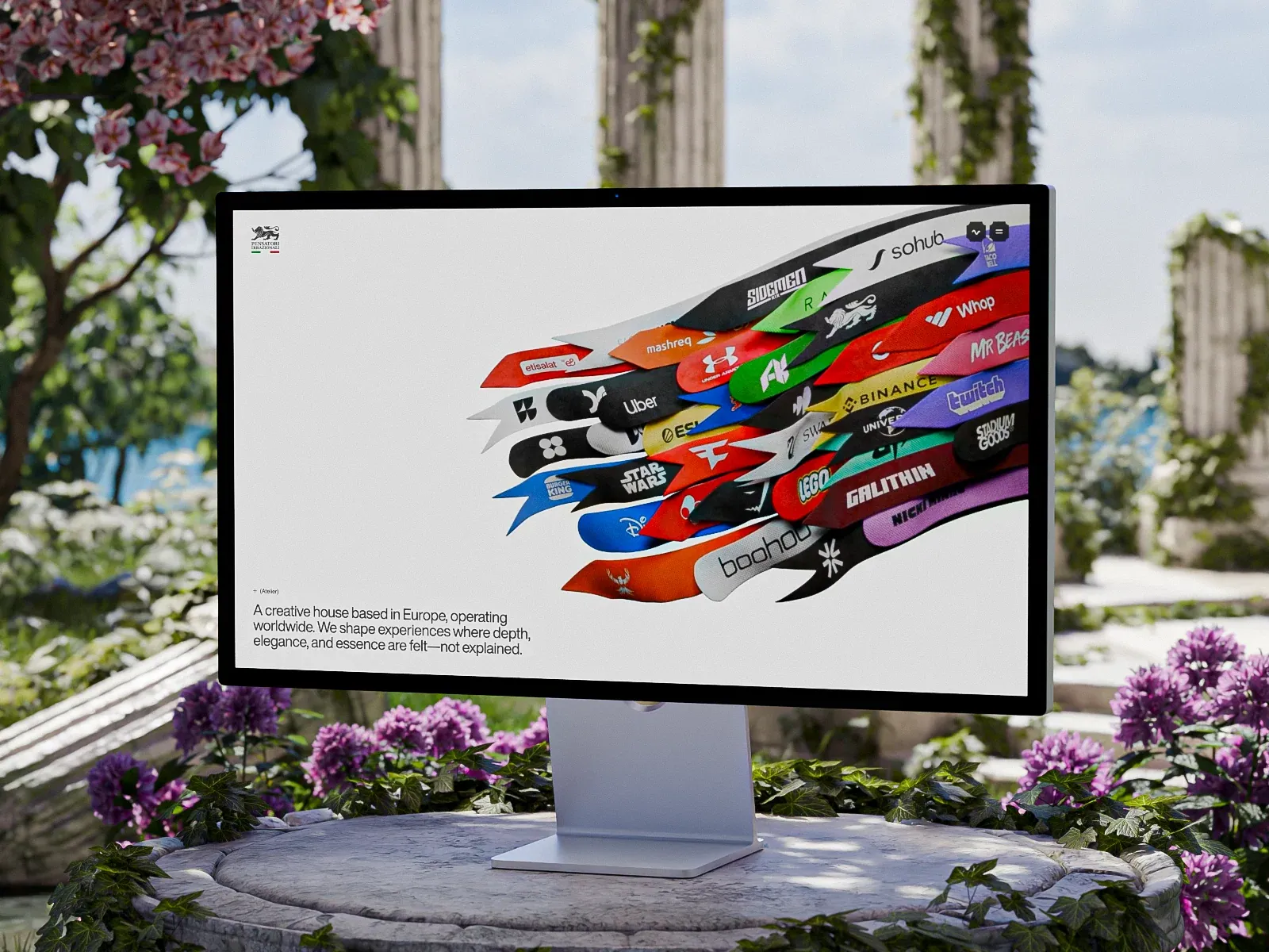
- A bright widescreen monitor is photographed outdoors among garden plants. On the pale screen, many overlapping elongated ribbon/flag shapes bearing varied client logos rise diagonally toward the upper right; a short studio statement sits at lower left and small identity/menu controls near the upper corners. Garden, monitor bezel and stand are photographic presentation framing, not established site layout.
- Type
- Small understated sans intro and controls; client marks carry diverse lettering. No dominant display headline. Exact metrics unknown.
- Color and surface
- Pale screen field, vivid multicolored logo ribbons, black monitor bezel, green/purple garden photograph.
- Components
- On-screen logo-bearing elongated ribbons overlapping into a right-rising cluster, short lower-left studio statement, compact upper-corner identity/menu controls; physical monitor and garden are external framing.
What makes it work
- Large overlapping elongated ribbon/flag forms create a rising directional cluster.
- Partner/client marks appear on the forms, making the collage mark-bearing rather than abstract color alone.
- Short intro at lower left balances the cluster; small controls stay peripheral.
On a new subjectFor an unrelated independent music festival, create original elongated banner forms carrying artist/partner marks and overlap them into a rising cluster toward the right; balance the composition with a concise festival introduction at lower left and small utilities above. Use a direct page view and original logos, not the photographed garden monitor.
Live behavior
- Today
- The captured Pensatori Irrazionali page opens on a pale background with a compact crest at upper left, two small dark controls at upper right, and a large layered cluster of colorful brand ribbons across the upper part of the desktop frame. A short studio statement sits below at left: “A creative house based in Europe, operating worldwide. We shape experiences where depth, elegance, and essence are felt, not explained.” The selected gallery reference is a separate staged monitor image of the ribbon artwork in a garden.
- Responsive
- Desktop measures 1440×1000 with a 13553px document; tablet is 768×1024 with an 819×12005px document; and both phone states are 390×844 with 390×9004px documents. The sampled tablet document is 51px wider than its viewport. Narrower screenshots crop the ribbon composition and reposition the small controls; they do not establish breakpoint thresholds or horizontal-scroll behavior.
- Scroll
- The desktop-scroll state records scrollY=750 in a 1440×1000 viewport and 13553px document. It shows the large “Works” heading, an illustrated figure, and the beginning of a client list. Only this saved position is described.


