
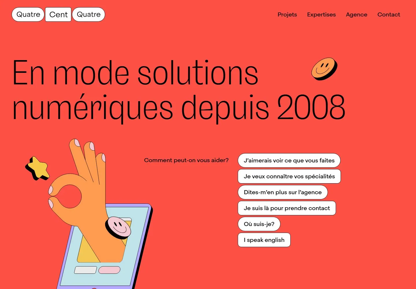
Live capture at 1440px, 2026-10-24
How it’s built
- Layout
- A broad coral-red panel sits inside a substantial pale lavender margin, with rounded outer corners. A three-part pill/block wordmark anchors upper left and four nav labels sit upper right. Oversized French headline spans two lines and almost the full width. A cartoon hand emerging from a phone rises from the lower-left edge and overlaps the headline area; two small smiling/star stickers punctuate the field. Lower right contains a prompt and five vertically stacked response controls, one highlighted lavender. The composition uses strong diagonal opposition between the hand illustration and choice stack, with broad red negative space between them.
- Type
- The headline uses thin, oversized, black sans letters with generous open counters. Choice labels and navigation use much smaller rounded-looking sans text. The label/question and choices form a consistent secondary tier; active selection receives emphasis by fill and arrow, not larger type. No font name or exact size can be established from the gallery still.
- Color and surface
- Coral fills the panel, lavender frames it and marks the selected response. Black outlines make the white pill and rounded-rectangle controls crisp; the hand and phone use peach, yellow, pale blue, and pink fills with thick dark outlines and offset shadow strokes. The colored surfaces are flat, with little tonal shading or material texture.
- Components
- Compact brand lockup, four-link navigation, oversized statement, a hand/phone illustration, small sticker-like marks, a question prompt, and a five-choice stack with one selected state. The choices form the main actionable cluster; only their visible active styling is established.
What makes it work
- Flat color field with strong panel-to-margin contrast.
- Display-scale statement, smaller prompt, and compact choice labels.
- One selection state differentiated through color and arrow cue.
On a new subjectFor an event registration chooser, use a bright framed panel, a large plain-language question, one flat illustration related to the event, and a small set of visibly selectable options. Keep the options distinct from the illustration and use a new palette and subject-specific drawing.
Prompts
Create a visual direction for {{website_name}} in {{industry}} for {{audience}}, shaping {{content}} and supporting {{functionality}}.
COMPOSITION INVARIANTS: Place a rounded central panel inside a contrasting outer margin. Use a large light-weight headline above a short prompt and a clearly grouped list of selectable choices; supporting illustration can occupy open space beside the list. Preserve the observed visual hierarchy and spacing relationships, not the source-specific object inventory.
TYPE: Use a large thin sans statement, medium readable prompt and choice labels, and a visibly distinct selected/focus state. Set a readable scale step between display text, supporting copy, captions, and utilities. Do not name a font family.
SURFACE AND COMPONENTS: Use a two-color frame/panel relationship with a few bright illustrative accents; select hues appropriate to {{website_name}}. Component roles: Inset panel, compact identity/nav, display statement, original illustration, help prompt and grouped choice controls. Keep controls visually distinct and subordinate to the main content.
IMAGE DIRECTION: Use new flat illustration relevant to the service; do not reuse the source hand, device, stickers, or exact palette. Proportion estimate from the selected still: Visual estimate: central panel fills about 90% width and 76% height; headline about 65% panel width; options lower-right third. Treat it as an estimate, not fixed CSS geometry.
VARIABLES: Adapt names, details, image subjects, palette accents, and working actions to {{website_name}}, {{industry}}, {{audience}}, {{content}}, and {{functionality}}.
PROHIBITIONS: Use original copy and assets. Do not reproduce the source brand, exact wording, photographs, illustrations, products, people, or signature artwork; source-specific objects and motifs are optional only when they genuinely fit the new subject.
CONTINUATION: Follow with the appropriate content for the selected choice; preserve the same panel and control language.
RESPONSIVE PROPOSAL: Wrap headline into a shorter measure, place illustration above or beside full-width choices, and keep choices large enough to tap. These are design proposals, not observed mobile behavior. The selected still does not establish source fonts, CSS, implementation technology, motion, or control behavior. Do not present any of those as observed. Implement requested {{functionality}} as working new behavior without implying source validation.
Implement a responsive page for {{website_name}} in {{industry}} for {{audience}}, presenting {{content}} and working {{functionality}}.
INVARIANTS: Place a rounded central panel inside a contrasting outer margin. Use a large light-weight headline above a short prompt and a clearly grouped list of selectable choices; supporting illustration can occupy open space beside the list. Keep the same relative prominence and spacing without requiring the same source objects.
TYPE AND SURFACES: Use a large thin sans statement, medium readable prompt and choice labels, and a visibly distinct selected/focus state. Use a two-color frame/panel relationship with a few bright illustrative accents; select hues appropriate to {{website_name}}. Maintain clear display/body/utility scale, readable line lengths, and sufficient contrast. Components: Inset panel, compact identity/nav, display statement, original illustration, help prompt and grouped choice controls.
IMAGERY AND SCALE: Use new flat illustration relevant to the service; do not reuse the source hand, device, stickers, or exact palette. Visual estimate only: Visual estimate: central panel fills about 90% width and 76% height; headline about 65% panel width; options lower-right third. Use flexible widths and content-led dimensions; do not copy this screenshot's coordinates as fixed values.
VARIABLES: Adapt names, details, image subjects, palette accents, and working actions to {{website_name}}, {{industry}}, {{audience}}, {{content}}, and {{functionality}}.
PROHIBITIONS: Use original copy and assets. Do not reproduce the source brand, exact wording, photographs, illustrations, products, people, or signature artwork; source-specific objects and motifs are optional only when they genuinely fit the new subject.
CONTINUATION: Follow with the appropriate content for the selected choice; preserve the same panel and control language.
RESPONSIVE PROPOSAL: Wrap headline into a shorter measure, place illustration above or beside full-width choices, and keep choices large enough to tap. Use semantic content, keyboard-operable controls, visible focus, meaningful alt text, and no clipped content. The selected still does not establish source fonts, CSS, implementation technology, motion, or control behavior. Do not present any of those as observed. Implement requested {{functionality}} as working new behavior without implying source validation.
Live behavior
- Today
- The opening is a coral-red full-screen hero with a small three-part 4/c/4 mark at upper left, compact desktop links at upper right, and a very large thin black French headline across two lines. A cutout phone-and-hand illustration anchors the lower left; a question and six white outlined pill links sit at the right. Small smiley and star graphics overlap the field. The first white section begins with a small uppercase eyebrow and oversized light-weight French copy.
- Responsive
- At 768px the desktop navigation and mark remain, the headline wraps to three lines, and the illustration sits below-left of the prompt and pill links. At 390px the navigation becomes a menu control, the headline takes four lines, the prompt and links stack, and the coral section ends around y=712 while the last links continue into the white field. Decorative graphics overlap the copy and buttons. These three sampled widths do not establish all breakpoints.
- Scroll
- The desktop-scroll measurement records actual scrollY 750. The viewport shows the clipped tail of the coral hero above the next white section, its small BIENVENUE eyebrow, and several lines of oversized explanatory text. The brand mark and a compact menu control remain at the top; only text visible in this saved viewport is sampled. This position does not establish the remaining page flow.


