
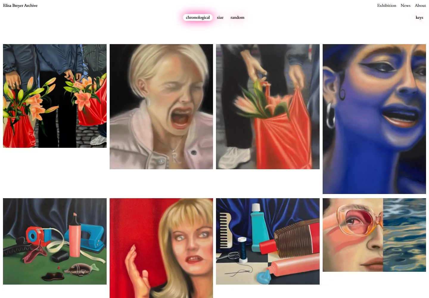
Live capture at 1440px, 2026-10-25
How it’s built
- Layout
- A white field holds vividly colored painted-looking images of clothing, objects and figures in masonry-like columns, with unequal tile heights, staggered row starts and white voids. No conventional controls are visible; full UI unknown.
- Type
- No dominant typography visible.
- Color and surface
- White gutters and saturated blue, green, orange and red images.
- Components
- Saturated painted-looking images of unequal heights occupy staggered masonry-like columns with narrow gutters and white voids.
What makes it work
- White field with narrow gutters and white voids
- Saturated painted-looking image tiles of unequal heights in staggered masonry-like columns
On a new subjectFor a public botanical collection, arrange saturated painted-looking plant images of unequal heights in staggered masonry-like columns with narrow white gutters and voids.
Prompts
Create an original artwork archive for {{website_name}} in {{industry}} for {{audience}}, organizing {{content}} with the supplied {{functionality}}. Invariants: Use the selected recovered capture as the visual evidence: a clean white frame with a tiny archive identity at upper left, a restrained set of links upper right, and a small centered row of arrangement choices above a broad image field. Visual estimate from the 1440x1000 recovery image: artwork begins around 15% down the viewport, spans nearly the full width in four loose columns, and fills most remaining height; top controls occupy under one tenth of the screen. Vary artwork aspect ratios and crops so the grid feels collected rather than rigidly tiled. Artwork supplies almost all color—strong blues, reds, green, painted faces, flowers, and objects—while interface labels stay small and neutral. A subtle pink glow marks the selected option in this capture, but it is optional rather than a required color. The selected file is the admitted recovered live screenshot, not the rejected sparse initial capture; its fresh DOM measurement is research/evidence/div2-0019/measurements-desktop-recovery.json. Variables: use new works, categories, arrangement choices, and labels for {{website_name}}, {{industry}}, {{audience}}, {{content}}, and {{functionality}} while preserving quiet controls and dominant art. Prohibitions: no source identity, paintings, titles, or copied order. Behavior of sorting, zoom, and hover is not tested. Responsive proposal: reduce columns progressively and retain consistent artwork gutters and readable controls.
Implement an artwork archive for {{website_name}} in {{industry}} for {{audience}}, using {{content}} and working {{functionality}}. Preserve the recovered screenshot’s Invariants: hierarchy: tiny identity/navigation at the top edge, compact centered arrangement controls, a large whitespace interval, then a broad gallery with four similarly sized desktop columns and variable image proportions. The 1440x1000 live recovery has a measured header title and top links around 13.6px CSS; see research/evidence/div2-0019/measurements-desktop-recovery.json and entry-recovery.json. These measurements match desktop-recovery.jpg; the original desktop.jpg was rejected and must not supply measurements. Gallery proportions in this prompt are screenshot estimates, not CSS rules. Keep neutral low-profile labels, white surface, and artwork-specific color as the main visual field. Variables: choose original works, category labels, count, organization controls, and narrow-screen behavior to fit {{website_name}}, {{industry}}, {{audience}}, {{content}}, and {{functionality}}. Preserve the control-to-art scale relationship while changing exact art, identity, and hue. Prohibitions: Do not reproduce source paintings, names, titles, grid order, or glow; do not claim reference sorting, zoom, or hover, which remain untested. You may implement new useful organization controls for {{functionality}}. Responsive proposal: move from four columns to fewer columns, protect variable image ratios, maintain gutters, and keep controls visible. Use descriptive alt text, semantic links, keyboard-operable controls, selected/focus states, and readable labels.
Measured
Fonts loadedParagon-Regular, Paragon-Italic
H113.6px / 400
Body text13.6px
Page background#ffffff
Text color#000000
Page height10,391px
Computed CSS at 1440px, 2026-10-25.
Live behavior
- Today
- The 1440px opening is a white archive page with a small title at the upper left, Exhibition / News / About at the upper right, and a centered row of chronological / size / random filters with chronological shown in a white pill and pink glow. Four narrow, image-led columns start at y=148 with white gutters; image heights vary, producing a staggered archive rather than aligned rows. The visible artworks include people, objects and interiors. Image alt text is not treated as screenshot-visible caption copy. A small keys label is also visible in the captured header.
- Responsive
- At the captured 768px tablet width the artwork reflows to two wide columns, beginning at x=5 and x=387; at 390px the two columns are about 188px wide, beginning at x=5 and x=198. The header and filter controls remain above the grid in both screenshots. The ordinary phone screenshot shows the first three staggered rows; the reduced-motion phone screenshot shows the same opening pixels. These are the three captured widths only. The keys label remains visible on the sampled tablet and phone states.
- Scroll
- The desktop scroll capture records scrollY=750 in a 10,391px document. Its screenshot shows a clipped preceding image row at the top and later artwork below, including painted portraits / scenes; it does not show the continuous transition between rows. Tablet and phone captures are at scrollY=0.


