
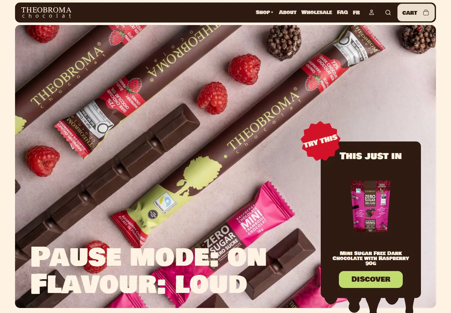
Live capture at 1440px, 2026-10-24
How it’s built
- Layout
- The gallery composition presents a desktop chocolate-product hero and a separate mobile-proportioned product-detail view over external tree/ocean scenery. The desktop view has a dark chocolate header, broad close-up product photograph, heavy cream two-line flavor headline and generous rounded cream edge/surface. The mobile view has a vivid magenta product surface with raspberry image, package tiles and compact product details. These are separate selected viewports in one presentation image, not an overlapping layout within one page; the outer scenery is framing.
- Type
- Very heavy rounded/condensed cream uppercase display over close vivid product photography; compact labels in the dark header and contrasting magenta product-details view. Exact fonts unknown.
- Color and surface
- Dark chocolate brown, pale pink, raspberry red, magenta and cream; product imagery supplies texture.
- Components
- Desktop header and photographic hero with large overlaid display type; a separate mobile-proportioned product-detail view shows selection tiles and compact product information. Gallery arrangement does not establish their simultaneous on-page placement.
What makes it work
- Dark compact header and generous rounded cream edges/surfaces
- Very heavy rounded/condensed cream display type
- Close vivid product photography
- Contrasting bright product-detail surface in a separate view
On a new subjectFor a public seed-saving exchange, use a dark compact header, rounded cream surfaces, close vivid seed-pod photography and a very heavy cream seasonal headline. Give a separate seed-detail view its own contrasting bright surface with seed name, origin and availability; replace chocolate claims and assets without recreating a desktop/mobile montage.
Measured
Fonts loadedBowlby One SC, Figtree, GTStandard-M
H225.6px / 400
Body text16px
Page background#fff4e3
Text color#2f1b12
Page height9,662px
Computed CSS at 1440px, 2026-10-24.
Live behavior
- Today
- Warm cream ground, inset rounded brown navigation and a broad rounded product photograph. Very heavy cream uppercase display text overlaps the photograph at lower left. A brown promotional panel on the right combines a red rotated starburst, centered product cutout, compact uppercase label, lime action and irregular drips extending below the panel. Following sections alternate cream and magenta, with brown/lime heavy statements and small saturated graphic shapes.
- Responsive
- Desktop brown header panel is1344x64px at48,8 with16px corners; phone becomes358x51.953px at16,8 with8px corners. Desktop link row becomes icon controls. Hero heading changes86.4px/86.4px to48px/48px on tablet and phone; phone title wraps four lines. Desktop right overlay becomes a broad centered panel below the title on narrow screens. Product cutout measures256x256px desktop,191.094x191.094px phone; tablet shows a larger product image visually. Phone label remains16px but wraps to32px height; action becomes16px within170.297x48px bounds versus22px within204.172x54px desktop.
- Scroll
- Actual scrollY750 keeps the brown navigation at the top. The lower hero heading and promotional label are partly behind it, while the lime action remains visible below. Drips extend into a cream section with52px/52px brown and lime statement fragments interspersed with small bright shapes. A magenta next section begins near the bottom with86.4px/86.4px cream Our Products. Some category controls are cut by the lower edge and are not fully observed.


