
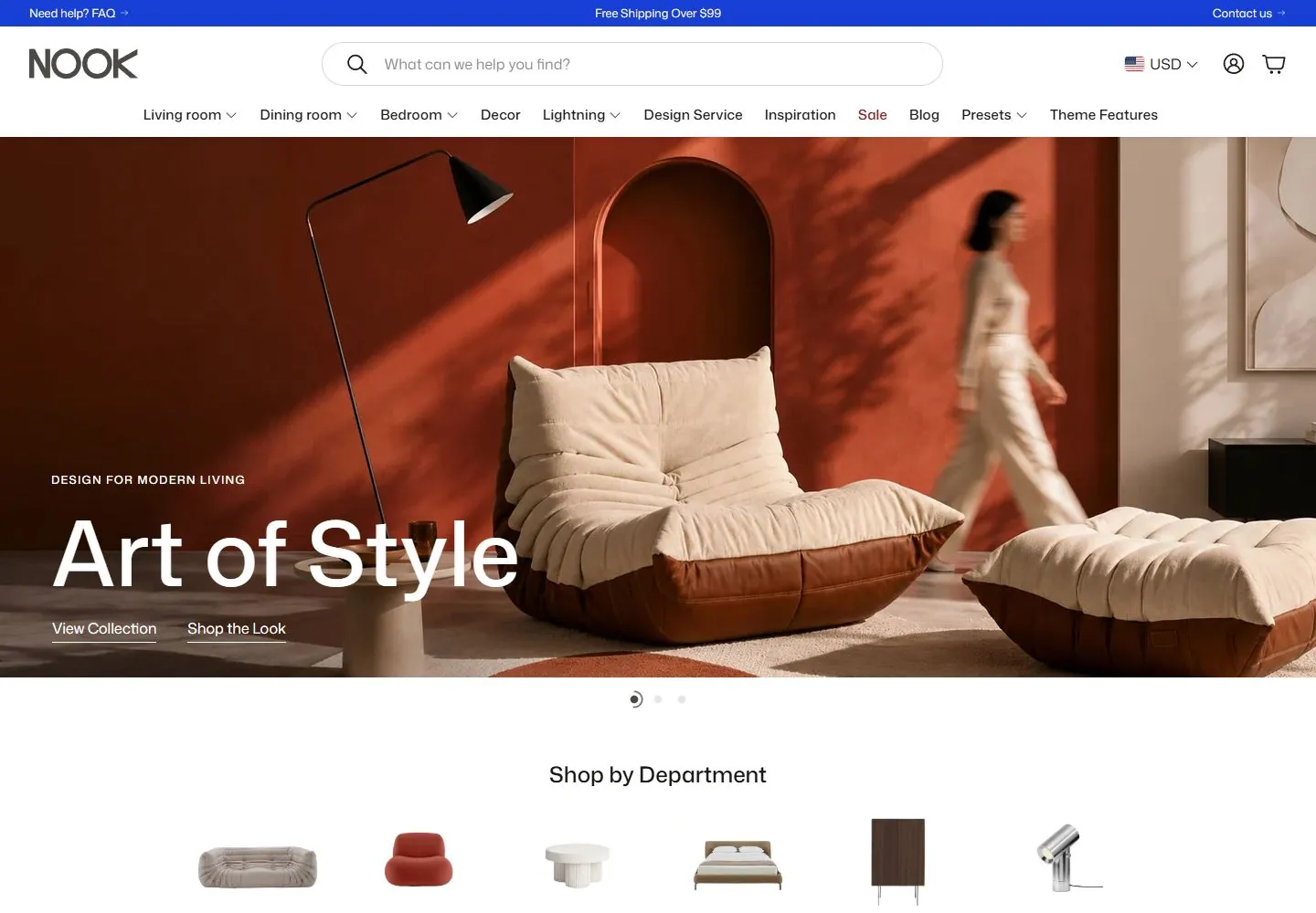
Live capture at 1440px, 2026-10-24
How it’s built
- Layout
- Within a bounded storefront page, a blue announcement strip tops a white NOOK header with centered search, account/cart utilities and department links. A warm rust living-room hero carries a small eyebrow, large white “Art of Style” and two links; dots sit at its lower edge. A white department section with isolated products begins below. Soft-focus furniture outside may be framing.
- Type
- Large clean sans image headline; medium sans navigation/department heading; small utility and product labels. Exact fonts unknown.
- Color and surface
- White store surfaces, rust/cream room photo, vivid blue announcement line and dark icons. Outer blurred furniture is excluded.
- Components
- Announcement/search/category nav, lifestyle hero with eyebrow/headline/links, carousel dots and spacious labeled product-category row.
What makes it work
- Compact announcement/search/category navigation
- Large lifestyle-image hero with overlaid headline and links
- Spacious labeled product-category row below
On a new subjectFor an independent bookstore, use compact shipping/search/category navigation above a warm reading-room photograph with a large overlaid “Find your next story” message and simple links. Follow with spacious labeled book categories; replace furniture and leave carousel behavior unverified.
Measured
Fonts loadedMona Sans, GTStandard-M
H132px / 500
Body text16px
Page background#ffffff
Text color#1e1b18
Page height22,697px
Computed CSS at 1440px, 2026-10-24.
Live behavior
- Today
- White commerce shell with a narrow saturated-blue announcement strip, dark identity, very wide outlined pill search field and light outline account/cart icons. Desktop has a dense category row over broad photographic interiors, large white sans caption and a small underlined action. Below are isolated product silhouettes on white, then an asymmetrical large-photo mosaic with white overlaid text and narrow white gutters.
- Responsive
- Desktop hero caption overlays the lower-left photograph; tablet/phone put a centered caption in a separate muted olive/tan band below the image. Hero sampled type is57.6px/69.12px desktop for Urban/Quiet captions and28px/33.6px narrow. Tablet replaces the category row with hamburger while retaining a search row; phone moves search to its own full row and hides visible currency selection. Desktop search sample is680x48px with30px radius; phone358x48px at x16. Department display shows six silhouettes across desktop and three across the phone frame. Closed drawer and mega-menu DOM samples are not observed open menus.
- Scroll
- At actual scrollY750 the compact white header with hamburger, identity, search and icons remains at top. The department silhouettes and labels precede a roughly two-thirds-width tall photograph beside two stacked smaller images. Recorded photo rectangles are913.234x604.797px at x32, plus454.609x298.391px at x953.391 with about8px gutters. Desktop photo-overlay headings are48px/57.6px on the large tile and38.4px/46.08px on smaller tiles. The compact header is a sampled state, not a complete scroll-threshold specification.


