
Live capture at 1440px, 2026-10-24
How it’s built
- Layout
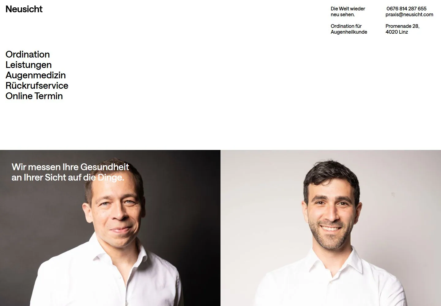
- White field with small upper-left name, compact upper-right details and a large stacked left navigation; two adjacent portraits start below.
- Type
- Black regular sans identity and navigation, small bold details and white text over dark image.
- Color and surface
- White ground, black text, a color portrait at left and a monochrome portrait at right.
- Components
- Identity, contact details, stacked navigation and two portrait panels.
What makes it work
- A sparse white directory with stacked left links and compact right details above two portrait panels.
On a new subjectFor a community theatre directory, use stacked left links and compact right event details above two actor portraits.
Measured
Fonts loadedSaans
H330px / 500
Body text16px
Page background#ffffff
Text color#000000
Page height7,214px
Computed CSS at 1440px, 2026-10-24.
Live behavior
- Today
- The captured Neusicht ophthalmology practice page uses a white background, a bold Neusicht wordmark at upper left, and compact German slogan, specialty and contact details across the upper right. A large left-side vertical menu lists Ordination, Leistungen, Augenmedizin, Rückrufservice and Online Termin. Desktop t0 and t2 show the same full sentence, “Wir messen Ihre Gesundheit an Ihrer Sicht auf die Dinge.”, in white over the darker half of a paired portrait hero; the five menu labels and German contact details also match. At y=750 the screenshot shows a grid of large headshots. Tablet and phone retain the paired portrait layout with narrower crops beneath the sparse header and menu. The selected gallery image shows the same practice and doctor portraits, with different menu/contact details.
- Responsive
- Desktop is 1440×1000 with a 1440×7214 document; desktop-scroll records actual y=750. Tablet is 768×1024 with a 768×10167 document. Ordinary and reduced-motion phones both measure 390×844 in 390×7473 documents at y=0. The paired portraits remain side by side in the tablet and phone opening frames, with tighter image crops; the menu and upper-right information remain in view. All six states report zero sampled animation entries. Three widths do not establish breakpoint rules.
- Scroll
- The desktop-scroll state measures actual scrollY=750 in a 1440×7214 document. It shows a large image grid of male staff portraits in alternating light and dark backgrounds, with a centered white Ordination pill overlay near the first row. This is a saved position only; no menu item or portrait was activated.


