
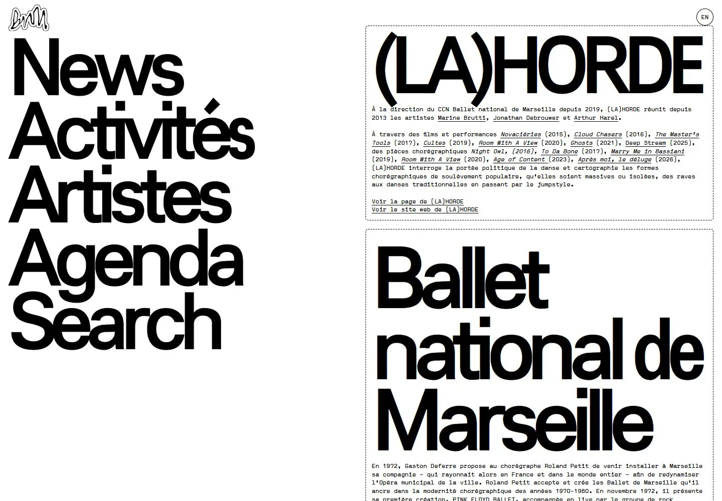
Live capture at 1440px, 2026-10-25
How it’s built
- Layout
- White page with a huge tightly stacked black sans headline across the top and a central black illustrated collage below; tiny corner marks.
- Type
- Huge heavy black sans headline with tight leading.
- Color and surface
- White, black and small yellow illustration lines.
- Components
- A giant tightly stacked headline overlaps a central illustrated collage on white.
What makes it work
- White field
- Giant tightly stacked black sans headline
- Central illustrated collage
On a new subjectFor a public history exhibit, overlap an original illustrated collage with a giant tightly stacked black sans headline on white.
Prompts
Create a contemporary performing-arts program page for {{website_name}} in {{industry}} serving {{audience}}, organizing {{content}} and access to {{functionality}}. Invariants: Preserve the captured live News page’s two-column contrast: a left rail of oversized stacked section labels and a right column of outlined editorial modules. The top module uses a large title/identity with compact explanatory prose and underlined links; a second large heading begins below. Small identity and language controls sit at the upper corners. Visual estimate: navigation and content each claim about half the page width; large nav words take more than half the visible height. Live DOM measurement for this selected capture records the first nav link box at 342x125px, with its surrounding nav beginning x17; use research/evidence/div2-0017/measurements-desktop.json for recorded geometry. Do not treat that box as a cross-device type size. Typography hierarchy is essential: oversized black sans labels against small dense mechanical-looking panel text, fine dashed outlines, white ground, near-black foreground. No large image appears in the selected live opening; do not substitute the gallery feature’s separate visual. Variables: use new identity, labels, program content, accent or language options for {{website_name}}, {{industry}}, {{audience}}, {{content}}, and {{functionality}}, but keep navigation dominant and modules clearly separate. Prohibitions: no source names, logos, French copy, or claim of gallery/live match; actual motion and language control are untested. Responsive proposal: stack a compact accessible section navigator before editorial modules, retaining the oversized-label-to-small-copy hierarchy.
Implement a responsive program and editorial homepage for {{website_name}} in {{industry}} for {{audience}}, containing {{content}} and providing {{functionality}}. Keep the live capture’s Invariants: core geometry: a large stacked navigation region on the left and a separate outlined reading column on the right, with editorial modules separated by thin dashed rules. A small corner identity and language control can be included when useful. Visual estimate puts both columns near half-width; the matching DOM capture measures the first navigation link at 342x125px, starting near x17 in the 1440px layout. See research/evidence/div2-0017/measurements-desktop.json; that is a live box measurement, not an obligatory responsive size. Styling invariant: high-contrast black/white, very large tightly set sans section labels, compact small explanatory text, underlined links, minimal decoration. Keep article copy legible and do not add a large photo hero; the gallery reference is a separate page/view. Adapt the palette only while maintaining equivalent foreground/background contrast and the dominant navigation hierarchy. Replace all names, logos, languages, and copy with those of {{website_name}}, {{industry}}, {{audience}}, and {{content}}. Prohibitions: Motion, hover, scroll choreography, and language switching were not tested; do not claim them as source behavior. Implement any useful new {{functionality}} with semantic markup, keyboard access, focus state, and appropriate labels. Variables: replace identity, language, program text, artists, hue, and actions while retaining dominant left navigation and the bordered right column. Responsive proposal: stack nav and modules in a clear sequence, reduce display scale without losing its priority, and preserve reachable links and content order on narrow screens.
Measured
Fonts loaded__display_4e5b54, __mono_a7c9c7
H2164.16px / 400 / -14.7744px
Body text11.115px
Page background#ffffff
Text color#000000
Page height7,111px
Computed CSS at 1440px, 2026-10-25.
Live behavior
- Today
- A stark white page juxtaposes a huge tightly spaced black sans navigation list on the left with a right-hand column of thin dotted-outline content panels. Each panel combines oversized display headings with small monospaced paragraphs and underlined links. A small graphic mark and circular language control occupy the top corners.
- Responsive
- Desktop presents navigation and panels side by side; tablet and phone stack the navigation above the content. The navigation declares an internal display font alias at 164.16px desktop, 168px tablet and 56px phone. Smaller copy declares a separate internal mono alias; these aliases do not identify actual font files.
- Scroll
- At actual desktop scrollY 750 the large navigation remains visible on the left, while the right column shows lower paragraphs and the next panel heading partially cropped. This is one sampled position.


