
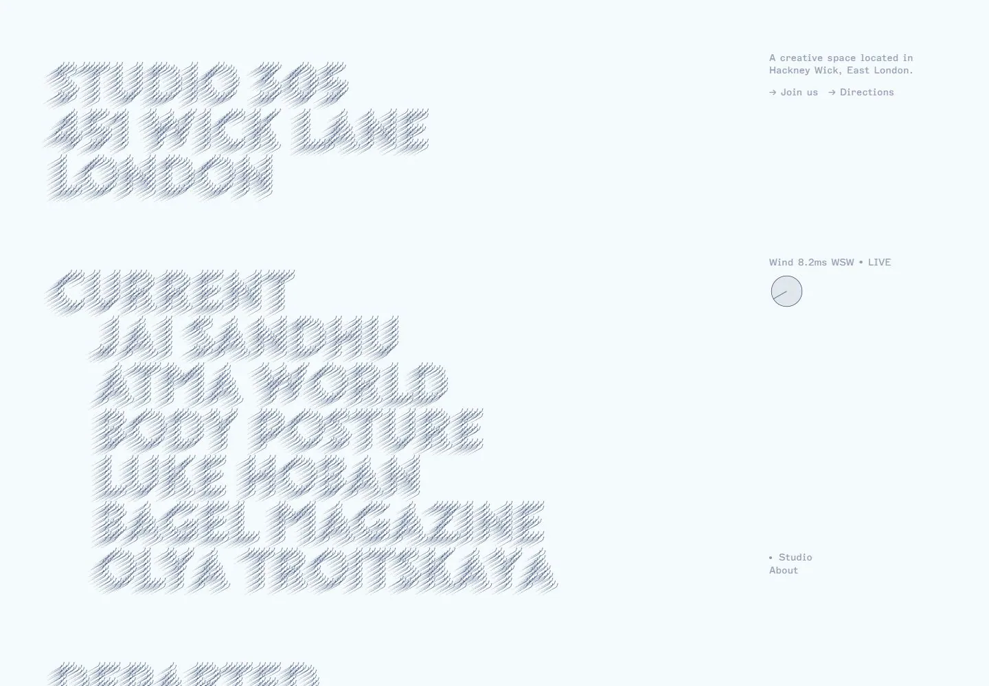
Live capture at 1440px, 2026-10-25
How it’s built
- Layout
- A pale blue-gray field carries large stacked uppercase headings at left rendered as fine diagonal-line texture, with tiny distributed labels and a small circle at right.
- Type
- Large uppercase letters built from fine diagonal line texture; tiny monospaced-looking labels.
- Color and surface
- Pale blue-gray and muted gray linework.
- Components
- Stack textured uppercase headings left on pale blue-gray with tiny right-side labels.
What makes it work
- Pale blue-gray field
- Large stacked uppercase headings with fine diagonal-line texture
- Tiny right-side labels
On a new subjectFor a public wind observatory, stack large diagonal-line-textured uppercase headings at left on pale blue-gray, with tiny right-side labels.
Prompts
Create an original experimental studio homepage for {{website_name}} in {{industry}} serving {{audience}}, communicating {{content}} and signposting {{functionality}}. Invariants: Preserve this capture’s spatial split: pale ice-blue field, huge repeated typographic composition at left, slim utility column at right, and broad open space between. Main words are transformed into fine repeated stroke echoes, so lettering works as texture while remaining recognizable. Small gray utility labels describe location/actions at top; an optional subject-appropriate status marker may sit mid-column; Studio/About links sit lower. Visual estimate: the typographic composition uses a little over half the viewport width and most visible height; the side column about one fifth. Matching live DOM measurement places a utility section at x1120 with width 320, and a nested section at x1120/y76 with width 240; see research/evidence/div2-0022/measurements-desktop.json. These are measured current DOM boxes; text-field proportions are screenshot estimates. Palette relationship: muted blue-gray on near-white blue, no photos/cards. Variables: new identity, words, topic, palette, indicator, actions for {{website_name}}, {{industry}}, {{audience}}, {{content}}, and {{functionality}}, retaining transformed-type dominance and detached utilities. Prohibitions: no source words, mark, location, wind value, or exact letter treatment; do not claim a live feed or animation. Responsive proposal: shrink/reflow text and move utilities below or alongside it without competing for primacy. Keep the main focus legible at a glance.
LATER LIVE EVIDENCE AND PROPOSED ADAPTATION: Later live snapshots at desktop scroll y=750 showed the large typographic field moving while the right information rail retained its screen position. At390×844, type reflowed into vertical bands and the information/weather details moved into columns after a divider. Transfer this responsive hierarchy as a proposed adaptation; short unchanged timed frames do not establish that animation is absent.
CONTENT ADAPTATION: A wind/direction indicator is an optional subject-specific device, not an invariant. Use an appropriate small status/index marker only if the new content warrants it.
Implement an experimental typographic homepage for {{website_name}} in {{industry}} for {{audience}}, expressing {{content}} and supporting {{functionality}}. Invariants: Keep the observed geometry: expansive transformed text at left, compact detached utilities at right, broad negative space, very pale cool ground. Main lettering can use repeated-stroke echoes as an original treatment; secondary labels remain small and muted. Matching live DOM at 1440x1000 places the utility section at x1120, width 320; inner section at x1120/y76, width 240. See research/evidence/div2-0022/measurements-desktop.json. These are measured current live rectangles; overall field proportions are screenshot estimates. Preserve legible contrast if palette adapts for {{website_name}}, {{industry}}, {{audience}}, {{content}}. Prohibitions: Do not copy Three Zero Five wording, identity, location, or values. The capture does not prove data source, font technique, motion, or hover; leave those unclaimed. New interactions for {{functionality}} may be implemented where useful. Variables: adapt identity, primary wording, hue, and utility content while retaining transformed text at left and detached tools at right. Responsive proposal: scale and line-break type, place utilities in a secondary row/column, and prevent overflow. Keep words selectable where possible; provide semantic links, accessible control names, keyboard operation, visible focus, and non-color indicators. Align the utility column to a consistent side margin and space its clusters vertically; the main lettering should stop short rather than collide with it. A small status marker can be a new feature, but should not compete with the text field.
LATER LIVE EVIDENCE AND PROPOSED ADAPTATION: Later live snapshots at desktop scroll y=750 showed the large typographic field moving while the right information rail retained its screen position. At390×844, type reflowed into vertical bands and the information/weather details moved into columns after a divider. Transfer this responsive hierarchy as a proposed adaptation; short unchanged timed frames do not establish that animation is absent.
CONTENT ADAPTATION: A wind/direction indicator is an optional subject-specific device, not an invariant. Use an appropriate small status/index marker only if the new content warrants it.
Measured
Fonts loadedMarfa Semi Mono Regular, Wind Variable
H175px / 400 / -2.25px
Body text10px
Page background#f5fbfc
Text color#1b2e62
Page height1,813px
Computed CSS at 1440px, 2026-10-25.
Live behavior
- Today
- The 1440px page uses a very pale blue-gray field. Large blue-gray lettering with repeated diagonal strokes forms a left-aligned identity and a stacked current-studio list; the right side holds a short location description and Join us / Directions links near the top, a wind reading and circular direction graphic around mid-height, and Studio / About lower down. The measured address block begins at x=80, y=68 and occupies 549.16×225px; its sampled CSS declares 75px type, 67.5px line height and -2.25px tracking.
- Responsive
- At 768px and 390px, the large identity becomes “Studio 305 / 451 Wick Lane / London” near x=15, y=38; the sampled declared type is 42px with 37.8px line height and -1.26px tracking. A thin horizontal divider appears below the tall opening. Beneath it, the location/links and wind/studio details form two columns, with the circular direction graphic at the right. The current list starts below this information block and is only partly visible near the bottom of each saved viewport. These captures cover only the specified widths.
- Scroll
- The desktop scroll state records scrollY=750 in an 1813px document. The screenshot crops the large current-studio list at the top of the viewport and the right-side location, wind and Studio / About utility column is not visible. The raw current-list region begins at y=-367.5 and extends below y=105 in the measured viewport; this supports only the visible fragment, not the full list or a continuous transition.


