
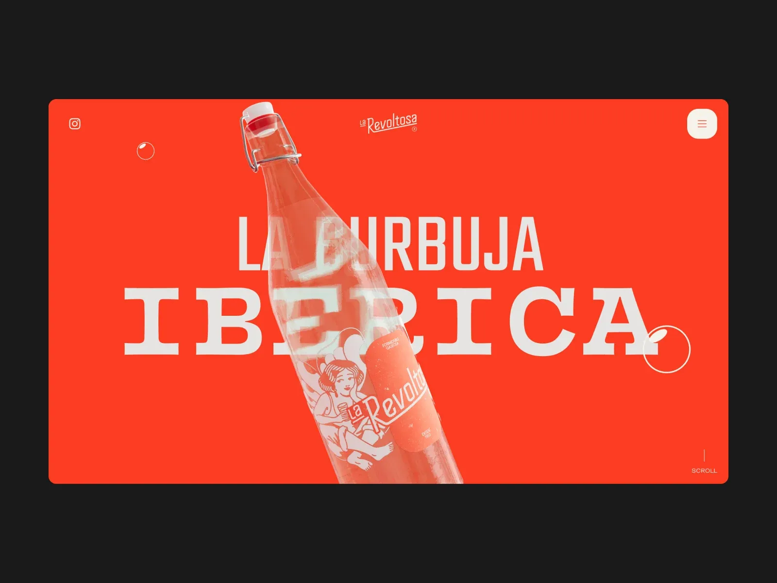
Gallery screenshot, saved 2026-10-24
How it’s built
- Layout
- Saturated orange-red panel with rounded corners against dark surround. Tiny top-corner controls frame centered wordmark. Oversized pale type spans the center, crossed by an angled bottle rendering; outlined circles and a small lower-right scroll cue complete the sparse composition. Transfer product/message overlap and scale contrast. Bottle, copy, exact color, logo and surround are specific; still does not prove movement. The layout uses few elements but strong scale differences: tiny controls, medium brand mark, giant headline, and large product cutout. The visual collision between bottle and lettering is intentional in this image and creates a foreground layer; a transfer should keep essential copy readable instead of reproducing obstruction blindly. The bright field acts as a continuous surface, with no apparent card subdivisions. The dark border is outside the focal panel and may be how the reference was presented. Smaller circular ornaments echo the bottle’s rounded form without competing with it. A different product could occupy the same diagonal crossing relationship, but the illustrated packaging and type treatment should follow its own brand. Hover states, scroll effects, animation timing, and mobile crop cannot be inferred.
- Type
- The title has two scales and characters: a tall narrow uppercase line sits behind a much larger heavy slab-serif-like word. Both are pale against red. The glass bottle crosses their shared center; a fine custom wordmark and tiny corner controls remain peripheral. Exact typeface and metrics are unknown.
- Color and surface
- A continuous vivid vermilion-red field fills a large rounded rectangle, surrounded by charcoal. Pale cream lettering and translucent product imagery contrast with the red; thin white outlined circles add sparse accents. No card or shadow system is visible.
- Components
- Small social icon and rounded menu control at top corners, centered wordmark, two-level display message, large bottle cutout, two outlined decorative circles and lower-right scroll cue.
What makes it work
- Preserve the scale contrast between message and subject
- Let the subject overlap typography without making the main words unreadable
- Keep controls visually subordinate to the central composition
On a new subjectFor a concert announcement, let a musician portrait overlap a large two-part event title on a saturated background. Keep artist and date legible, with compact venue/navigation controls near the edge. The portrait, colors and typography should fit the performer rather than mimic the beverage image.
Prompts
Create a visual direction for {{website_name}} in {{industry}} for {{audience}}, shaping {{content}} and supporting {{functionality}}.
COMPOSITION INVARIANTS: Set a bright inset poster inside a darker outer margin. Let one tilted subject cutout cross large layered lettering; keep tiny navigation at opposite corners and a small directional cue at the lower edge. Preserve the observed visual hierarchy and spacing relationships, not the source-specific object inventory.
TYPE: Combine a large uppercase display face with a contrasting secondary line; keep corner controls and the cue very small but legible. Set a readable scale step between display text, supporting copy, captions, and utilities. Do not name a font family.
SURFACE AND COMPONENTS: Use a high-contrast poster palette chosen for the new subject. A warm red field may be used when appropriate, but is not required. Component roles: Inset rounded panel, small corner controls, layered title, one angled cutout and optional outline accents. Keep controls visually distinct and subordinate to the main content.
IMAGE DIRECTION: Use an original subject/object relevant to {{content}}; do not require a bottle, bubbles, or the source brand. Proportion estimate from the selected still: Visual estimate: poster about 88% frame width and 67% height; bottle spans central 30%; large text covers most panel. Treat it as an estimate, not fixed CSS geometry.
VARIABLES: Adapt names, details, image subjects, palette accents, and working actions to {{website_name}}, {{industry}}, {{audience}}, {{content}}, and {{functionality}}.
PROHIBITIONS: Use original copy and assets. Do not reproduce the source brand, exact wording, photographs, illustrations, products, people, or signature artwork; source-specific objects and motifs are optional only when they genuinely fit the new subject.
CONTINUATION: Continue with another restrained content panel using the same type/object interaction without duplicating the exact hero motif.
RESPONSIVE PROPOSAL: Keep the cutout silhouette visible, use fewer title lines, and move corner controls into a compact top row if space is tight. These are design proposals, not observed mobile behavior. The selected still does not establish source fonts, CSS, implementation technology, motion, or control behavior. Do not present any of those as observed. Implement requested {{functionality}} as working new behavior without implying source validation.
Implement a responsive page for {{website_name}} in {{industry}} for {{audience}}, presenting {{content}} and working {{functionality}}.
INVARIANTS: Set a bright inset poster inside a darker outer margin. Let one tilted subject cutout cross large layered lettering; keep tiny navigation at opposite corners and a small directional cue at the lower edge. Keep the same relative prominence and spacing without requiring the same source objects.
TYPE AND SURFACES: Combine a large uppercase display face with a contrasting secondary line; keep corner controls and the cue very small but legible. Use a high-contrast poster palette chosen for the new subject. A warm red field may be used when appropriate, but is not required. Maintain clear display/body/utility scale, readable line lengths, and sufficient contrast. Components: Inset rounded panel, small corner controls, layered title, one angled cutout and optional outline accents.
IMAGERY AND SCALE: Use an original subject/object relevant to {{content}}; do not require a bottle, bubbles, or the source brand. Visual estimate only: Visual estimate: poster about 88% frame width and 67% height; bottle spans central 30%; large text covers most panel. Use flexible widths and content-led dimensions; do not copy this screenshot's coordinates as fixed values.
VARIABLES: Adapt names, details, image subjects, palette accents, and working actions to {{website_name}}, {{industry}}, {{audience}}, {{content}}, and {{functionality}}.
PROHIBITIONS: Use original copy and assets. Do not reproduce the source brand, exact wording, photographs, illustrations, products, people, or signature artwork; source-specific objects and motifs are optional only when they genuinely fit the new subject.
CONTINUATION: Continue with another restrained content panel using the same type/object interaction without duplicating the exact hero motif.
RESPONSIVE PROPOSAL: Keep the cutout silhouette visible, use fewer title lines, and move corner controls into a compact top row if space is tight. Use semantic content, keyboard-operable controls, visible focus, meaningful alt text, and no clipped content. The selected still does not establish source fonts, CSS, implementation technology, motion, or control behavior. Do not present any of those as observed. Implement requested {{functionality}} as working new behavior without implying source validation.
Live behavior
- Today
- All six saved live screenshots show a uniform red field with a white rounded cookie notice near the bottom, offering Aceptar, Rechazar and Personalizar. No hero, product, navigation or other page sections are visible in those frames. DOM text and loaded fonts do not establish that the corresponding underlying design was visible.
- Responsive
- The saved 1440×1000 and 768×1024 frames show a horizontal cookie banner; at 390×844 its actions stack vertically within the bottom card. These observations describe the banner alone, not responsive site layout behind the red field. Viewport measurements are CSS pixels at DPR 1.
- Scroll
- The desktop-scroll state measures actual scrollY 750 CSS px in a 1440×7275 document, yet its screenshot is byte-identical to desktop t0 and t2 and still shows only the red field and cookie banner. DOM text at the scroll position is not proof that underlying sections were visually rendered.


