
Live capture at 1440px, 2026-10-24
How it’s built
- Layout
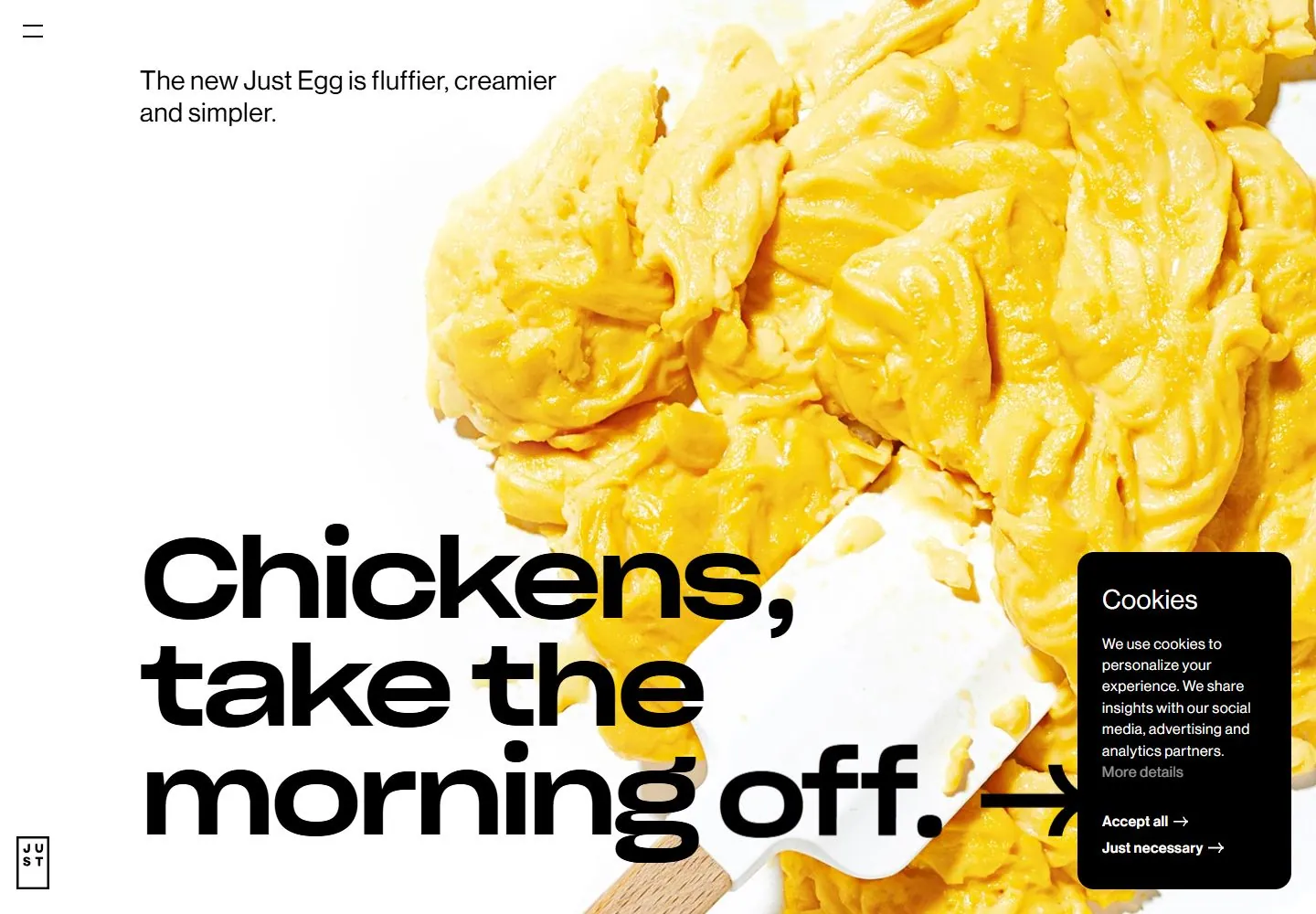
- Full-field close-up of yellow food on a blue patterned surface carries large white bold text at lower left and tiny white marks.
- Type
- Very large bold white sans heading with broad rounded forms; tiny white supporting label.
- Color and surface
- Vivid yellow, white and blue photographic-looking surfaces with white type.
- Components
- Full-field close-up with large lower-left statement and tiny corner marks.
What makes it work
- Vivid yellow/blue close-up
- large bold white lower-left statement
- tiny white marks
On a new subjectFor a public art materials exhibit, show a vivid yellow pigment close-up on blue with large bold white lower-left statement and tiny marks.
Prompts
Create a visual direction for {{website_name}} in {{industry}} for {{audience}}, shaping {{content}} and supporting {{functionality}}.
COMPOSITION INVARIANTS: Combine a large close-cropped subject image across one side/upper area with a small introductory line at the opposite top edge. Let an oversized statement overlap image and clear negative space below. Preserve the observed visual hierarchy and spacing relationships, not the source-specific object inventory.
TYPE: Use very large geometric sans display type for the main statement; keep the introduction small and regular. Give the message deliberate line breaks. Set a readable scale step between display text, supporting copy, captions, and utilities. Do not name a font family.
SURFACE AND COMPONENTS: Use a light surface with a strong subject-led color field and dark type. Maintain contrast at image boundaries; do not let incidental overlays define the palette. Component roles: Small menu, brief introduction, large image, dominant overlapping statement and a directional or action cue only if useful. Any consent notice is incidental. Keep controls visually distinct and subordinate to the main content.
IMAGE DIRECTION: Choose a new close crop tied to {{content}}; the egg-like food image is not an invariant. Proportion estimate from the selected still: Visual estimate: food photo covers roughly 65%, mainly upper-right; headline fills lower-left 45%; consent overlay about 17% lower-right. Treat it as an estimate, not fixed CSS geometry.
VARIABLES: Adapt names, details, image subjects, palette accents, and working actions to {{website_name}}, {{industry}}, {{audience}}, {{content}}, and {{functionality}}.
PROHIBITIONS: Use original copy and assets. Do not reproduce the source brand, exact wording, photographs, illustrations, products, people, or signature artwork; source-specific objects and motifs are optional only when they genuinely fit the new subject.
CONTINUATION: Continue with supporting product explanation on a calm surface, retaining scale contrast without repeating the hero crop.
RESPONSIVE PROPOSAL: Rebreak the statement to fit the narrower width, move action below it, and keep any consent controls outside the text/image focal zone. These are design proposals, not observed mobile behavior. The selected still does not establish source fonts, CSS, implementation technology, motion, or control behavior. Do not present any of those as observed. Implement requested {{functionality}} as working new behavior without implying source validation.
Implement a responsive page for {{website_name}} in {{industry}} for {{audience}}, presenting {{content}} and working {{functionality}}.
INVARIANTS: Combine a large close-cropped subject image across one side/upper area with a small introductory line at the opposite top edge. Let an oversized statement overlap image and clear negative space below. Keep the same relative prominence and spacing without requiring the same source objects.
TYPE AND SURFACES: Use very large geometric sans display type for the main statement; keep the introduction small and regular. Give the message deliberate line breaks. Use a light surface with a strong subject-led color field and dark type. Maintain contrast at image boundaries; do not let incidental overlays define the palette. Maintain clear display/body/utility scale, readable line lengths, and sufficient contrast. Components: Small menu, brief introduction, large image, dominant overlapping statement and a directional or action cue only if useful. Any consent notice is incidental.
IMAGERY AND SCALE: Choose a new close crop tied to {{content}}; the egg-like food image is not an invariant. Visual estimate only: Visual estimate: food photo covers roughly 65%, mainly upper-right; headline fills lower-left 45%; consent overlay about 17% lower-right. Use flexible widths and content-led dimensions; do not copy this screenshot's coordinates as fixed values.
VARIABLES: Adapt names, details, image subjects, palette accents, and working actions to {{website_name}}, {{industry}}, {{audience}}, {{content}}, and {{functionality}}.
PROHIBITIONS: Use original copy and assets. Do not reproduce the source brand, exact wording, photographs, illustrations, products, people, or signature artwork; source-specific objects and motifs are optional only when they genuinely fit the new subject.
CONTINUATION: Continue with supporting product explanation on a calm surface, retaining scale contrast without repeating the hero crop.
RESPONSIVE PROPOSAL: Rebreak the statement to fit the narrower width, move action below it, and keep any consent controls outside the text/image focal zone. Use semantic content, keyboard-operable controls, visible focus, meaningful alt text, and no clipped content. The selected still does not establish source fonts, CSS, implementation technology, motion, or control behavior. Do not present any of those as observed. Implement requested {{functionality}} as working new behavior without implying source validation.
Measured
Fonts loadedHaas Grot Disp R Roman, Haas Grot Disp R Medium, Sharp Grotesk Book 25, Sharp Grotesk Medium 25
H1118.8px / 400 / -5.94px
Body text16.2px
Page background#fffdfa
Text color#000000
Page height10,002px
Computed CSS at 1440px, 2026-10-24.


