
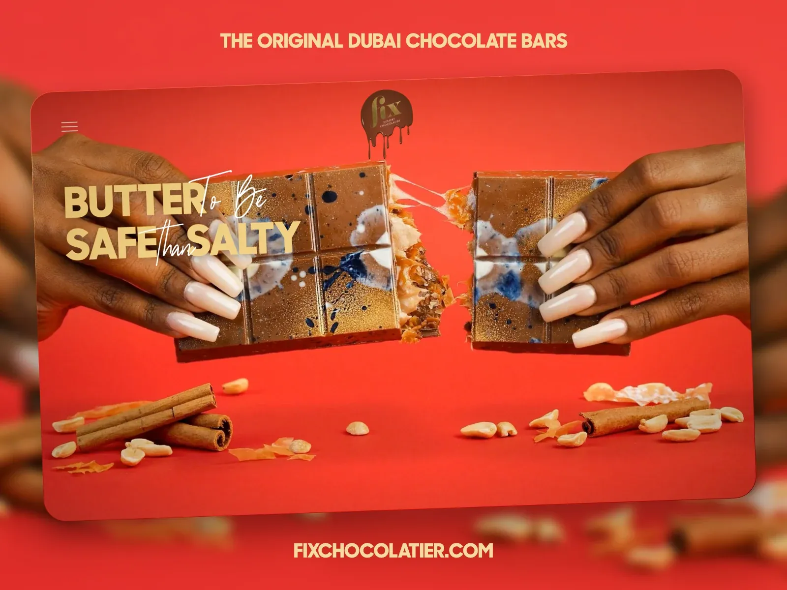
Gallery screenshot, saved 2026-10-24
How it’s built
- Layout
- Warm red confectionery hero: rounded inset image panel, hands pulling apart chocolate bar, scattered ingredients, bold uppercase and handwritten script overlaid at left. Menu and small emblem sit above; strong site label below. Warm continuity binds image and background while type occupies a readable zone. Transfer text over high-impact product image. Product, hands, copy, logo, hue and frame are specific. No responsive or behavior evidence. The outer blur extends the red field beyond the rounded panel, visually enlarging the food photograph without introducing a separate content grid. Hands enter from both sides and bring the product toward the center, while the headline stays on the left where it can sit over less detailed red background. Script lettering crosses the bold message and adds a handmade accent; its legibility depends on size and contrast. The small menu and emblem do not become major focal points. In a transfer, retain a clear product focus and one typographic hierarchy, not necessarily the same split text treatment. The ingredients at the bottom balance the framing hands and support the food context. This single image does not show a purchase flow, navigation overlay, content below the hero, or whether the rounded panel is responsive.
- Type
- A heavy cream uppercase message occupies the left side over the food photo; finer handwritten script is woven across the display words. A small centered uppercase slogan above and site label below sit at lower prominence. The mix of weight and script creates the hierarchy; typeface and CSS metrics are unknown.
- Color and surface
- Red/coral fills both surrounding area and a large rounded inset image panel. Cream text, chocolate browns and food highlights provide contrast. The outer photograph is blurred while the inner image is sharp; no shadow value or border system can be inferred.
- Components
- Small menu mark, top emblem, full-panel product photograph, overlaid mixed-style campaign headline, scattered ingredient props and centered site label below. No separate card grid is visible.
What makes it work
- Make the product the primary visual subject
- Give overlaid copy a readable zone and clear contrast
- Use a limited type contrast to separate the main message from supporting brand copy
On a new subjectFor a skincare launch, show one product in use as the main photograph and place a concise benefit statement over a quieter area. Keep the brand mark and navigation small. Use the product’s own materials and palette, and avoid props that obscure the message.
Prompts
Create a visual direction for {{website_name}} in {{industry}} for {{audience}}, shaping {{content}} and supporting {{functionality}}.
COMPOSITION INVARIANTS: Use a vivid field with one rounded image stage. Center a large subject image and arrange a mixed-weight phrase around or partly across it; short labels frame the top and bottom. Preserve the observed visual hierarchy and spacing relationships, not the source-specific object inventory.
TYPE: Pair heavy display capitals with a lighter handwritten-style accent and small all-cap utility text. Avoid letting the script obscure the subject. Set a readable scale step between display text, supporting copy, captions, and utilities. Do not name a font family.
SURFACE AND COMPONENTS: Choose a vivid background and a complementary light text color; the exact coral/chocolate/cream combination is source-specific. Use photographic detail to offset the flat color. Component roles: Top label, small menu/identity, central rounded image, mixed-type statement, and sparse bottom framing detail. Keep controls visually distinct and subordinate to the main content.
IMAGE DIRECTION: Choose an original subject and supporting details appropriate to the new content; hands breaking food and scattered ingredients are not required. Proportion estimate from the selected still: Visual estimate: inner panel uses around 90% width and 77% height; product and headline share middle two-thirds. Treat it as an estimate, not fixed CSS geometry.
VARIABLES: Adapt names, details, image subjects, palette accents, and working actions to {{website_name}}, {{industry}}, {{audience}}, {{content}}, and {{functionality}}.
PROHIBITIONS: Use original copy and assets. Do not reproduce the source brand, exact wording, photographs, illustrations, products, people, or signature artwork; source-specific objects and motifs are optional only when they genuinely fit the new subject.
CONTINUATION: Continue with a compact product/story section that carries forward the color/type contrast.
RESPONSIVE PROPOSAL: Move the phrase to a quiet image corner or separate strip, keep the subject unobscured, and place top/bottom labels in a readable sequence. These are design proposals, not observed mobile behavior. The selected still does not establish source fonts, CSS, implementation technology, motion, or control behavior. Do not present any of those as observed. Implement requested {{functionality}} as working new behavior without implying source validation.
Implement a responsive page for {{website_name}} in {{industry}} for {{audience}}, presenting {{content}} and working {{functionality}}.
INVARIANTS: Use a vivid field with one rounded image stage. Center a large subject image and arrange a mixed-weight phrase around or partly across it; short labels frame the top and bottom. Keep the same relative prominence and spacing without requiring the same source objects.
TYPE AND SURFACES: Pair heavy display capitals with a lighter handwritten-style accent and small all-cap utility text. Avoid letting the script obscure the subject. Choose a vivid background and a complementary light text color; the exact coral/chocolate/cream combination is source-specific. Use photographic detail to offset the flat color. Maintain clear display/body/utility scale, readable line lengths, and sufficient contrast. Components: Top label, small menu/identity, central rounded image, mixed-type statement, and sparse bottom framing detail.
IMAGERY AND SCALE: Choose an original subject and supporting details appropriate to the new content; hands breaking food and scattered ingredients are not required. Visual estimate only: Visual estimate: inner panel uses around 90% width and 77% height; product and headline share middle two-thirds. Use flexible widths and content-led dimensions; do not copy this screenshot's coordinates as fixed values.
VARIABLES: Adapt names, details, image subjects, palette accents, and working actions to {{website_name}}, {{industry}}, {{audience}}, {{content}}, and {{functionality}}.
PROHIBITIONS: Use original copy and assets. Do not reproduce the source brand, exact wording, photographs, illustrations, products, people, or signature artwork; source-specific objects and motifs are optional only when they genuinely fit the new subject.
CONTINUATION: Continue with a compact product/story section that carries forward the color/type contrast.
RESPONSIVE PROPOSAL: Move the phrase to a quiet image corner or separate strip, keep the subject unobscured, and place top/bottom labels in a readable sequence. Use semantic content, keyboard-operable controls, visible focus, meaningful alt text, and no clipped content. The selected still does not establish source fonts, CSS, implementation technology, motion, or control behavior. Do not present any of those as observed. Implement requested {{functionality}} as working new behavior without implying source validation.


