
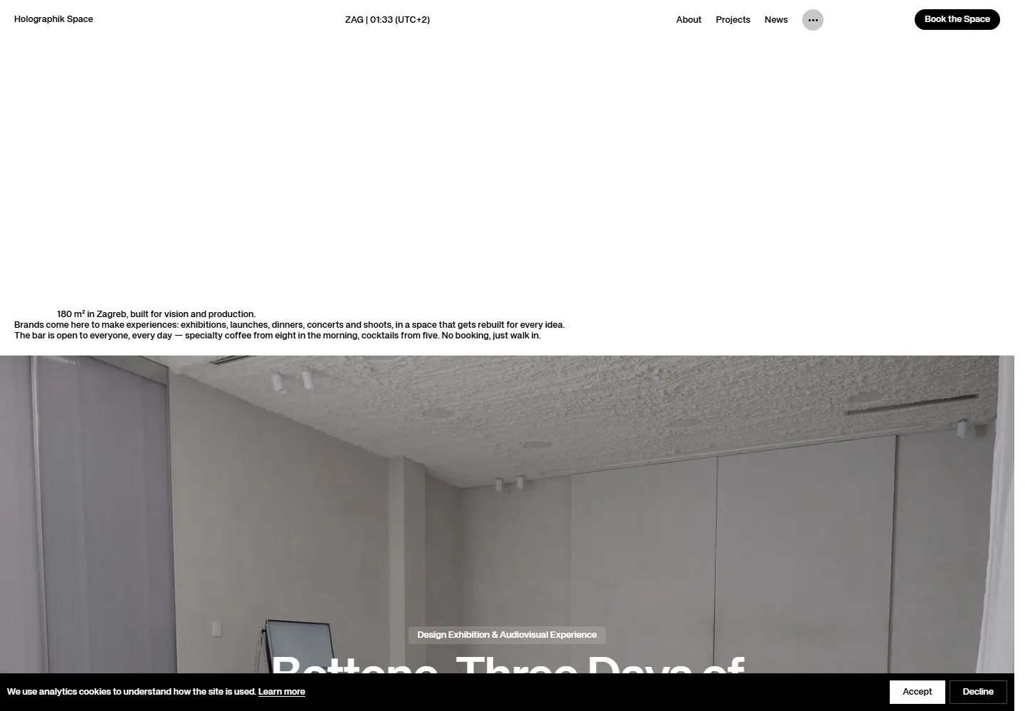
Live capture at 1440px, 2026-10-24
How it’s built
- Layout
- White top region with tiny distributed header, large blank area and a compact introductory paragraph near its lower edge; a full-width interior image begins below with partial white title.
- Type
- Small bold black sans header and introduction, larger white sans image title.
- Color and surface
- White and black above, muted gray interior image below.
- Components
- Top navigation, small introduction and image section.
What makes it work
- A tall white field with compact low introduction above a full-width image section.
On a new subjectFor a public seed bank, place a compact introduction low in a tall white field above a full-width image of seeds.
Measured
Fonts loadedKH Teka
H126px / 700 / 0.052px
Body text13px
Page background#ffffff
Text color#000000
Page height12,904px
Computed CSS at 1440px, 2026-10-24.
Live behavior
- Today
- Holographik Space opens with a white field, small header and compact venue description near mid-page, followed by a large project photograph. A black cookie strip runs along the bottom and a dark event notice overlays the lower right. The desktop scroll frame shows the project image with a large centered white title. Both selected references show the same sparse opening and project image, without the event notice.
- Responsive
- Desktop viewport is 1440×1000 with document 1425×12904; tablet viewport 768×1024 with document 753×13227; phone viewport 390×844 with document 375×7115. The header retains navigation on tablet; phone abbreviates the brand and booking label. The description wraps to a narrow block and the event and cookie overlays cover part of the project image. These are sampled widths, not inferred breakpoints.
- Scroll
- At desktop y=750 the project image fills most of the frame with a centered title and header over it; the event notice and cookie strip remain visible. A single position does not prove persistent behavior over the full page.


