
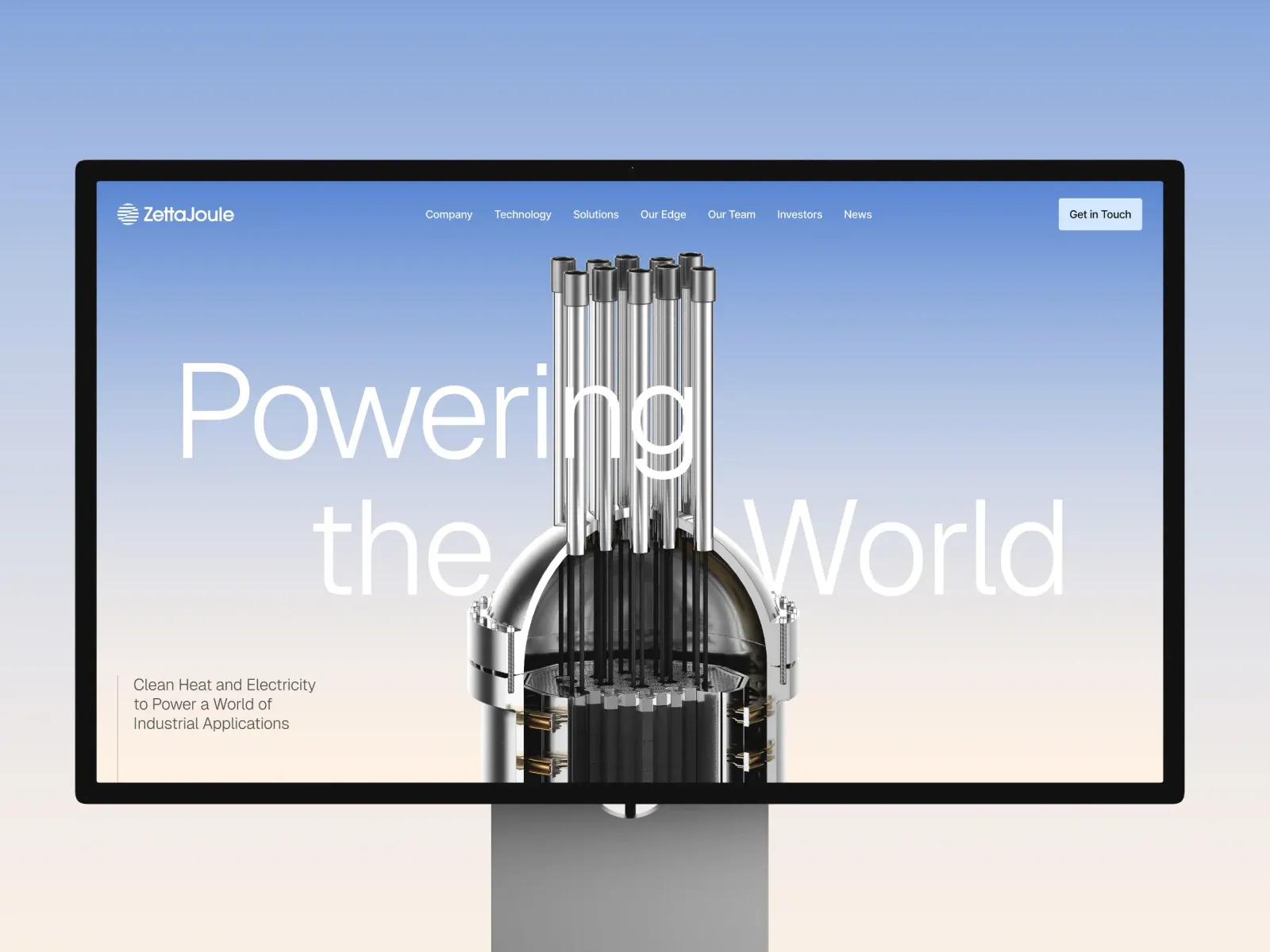
Screenshot from Awwwards, saved 2026-10-24
How it’s built
- Layout
- A pale blue-to-ivory page inside a black desktop-monitor frame shows a large technical energy-system rendering rising from the lower center. Enormous thin white headline words span behind the rendering and are partly obscured by it. Compact navigation crosses the top, a short explanatory claim sits lower left, and a contact action is at upper right. Monitor and stand are staging.
- Type
- Very large thin white sans headline, small white navigation, and compact gray lower-left explanatory copy. Exact face and metrics unknown.
- Color and surface
- Pale cool-blue to warm off-white field, white headline and metallic dark-gray rendering. Monitor hardware is not page color evidence.
- Components
- Oversized background headline, central full-height technical rendering, compact top navigation/contact action and lower-left explanatory block.
What makes it work
- Large central rendered object
- Oversized headline behind and interrupted by object
- Small supporting claim separated from the headline
On a new subjectFor a public transit authority’s new rail line, let a large train rendering rise through oversized route-launch words so the object masks part of the type; keep a concise service summary in a small lower-left block and compact links above. Replace energy-system imagery and claims with accurate transit information.
Live behavior
- Today
- The saved live frames show a blue-to-pale gradient, a central metallic reactor-like object, large “Powering the World” lettering, and supporting copy about clean heat and electricity. The desktop header shows several navigation labels and a Get in Touch control; tablet/mobile use a compact menu control. The scroll capture shows a mission statement, energy-demand paragraph, Discover Our Story control, and city image. The separate Awwwards gallery image presents this material within a computer-monitor mockup and uses a different page composition.
- Responsive
- Direct paired viewport measurements are 1440×1000 desktop, 768×1024 tablet, and 390×844 mobile. Reported document heights are 14326, 8395, and 9635 px respectively. The title, supporting text, central object, and navigation are arranged differently at tablet/mobile widths. These discrete screenshots do not establish breakpoint thresholds or behavior at intermediate widths.
- Scroll
- The desktop-scroll capture and paired measurement record scroll_y=750. It shows a section below the hero with a mission heading, explanatory paragraph, button, and city image. This documents one scroll offset only and does not establish the complete page sequence or scroll-trigger mechanism.


